The New York Times story The Top US Colleges With the Most Economic Diversity (9/7/2023) ranks 286 colleges based on the percentage of Pell grant recipients in the 2020–2021 entering class. Other variables included in the article include endowment per student, net price mid-income (the net price of the cost of attendance for households earning $48,001 to $75,000), total undergraduates, and Pell change since 2011. Inside Higher Ed followed this a few days later with For Selective Institutions, Progress and Backsliding on Socioeconomic Diversity: New York Times database shows some colleges have gained in socioeconomic diversity, but many have declined.
All of this made me wonder if there is a distinguishing feature of universities with a larger percentage of Pell grant recipients. I employed the K-means unsupervised learning algorithm to deal with my curiosity issues. This algorithm attempts to group data based on comparable characteristics. Before I get into the results, I should mention that I ended up using five groups, but it wasn't clear whether this was the best option. Here are four interesting graphs that are more informative than the lengthy list the New York Times offers.
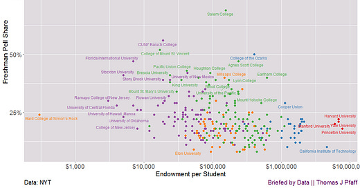
I began by solely considering endowment per student, net price mid-income, and total undergraduates. My hypothesis was that if universities were classified based on these criteria, one of the groups would have a higher proportion of Pell Grant students. Figures 1 and 2 show graphs of Pell Grant percentage vs. endowment per student and mid-income net price. It turns out that none of these categories had a disproportionate number of Pell Grant recipients. They are nonetheless intriguing.
K means without the Pell Grant variable
Except for the green and orange groups, Figure 1 (note the log scale on the x-axis) reveals a significant disparity by endowment per student. It's hardly surprising that we have ivy leagues to the right (again, log scale; they're way farther to the right). Note that both Berea College and Salem College have a high percentage of Pell Grant recipients. In the end, none of the groups had a higher Pell Grant proportion.
Figure 2 depicts the same grouping by the x-axis, which represents the net price for a mid-income family. The red and blue groupings are now on the left, which is not surprising given that institutions with higher endowments per student have more money available for financial aid. The orange group has now split to the right. The orange group could be considered expensive, with a poor endowment. The purple group is more affordable, but it has a lower endowment per student than the orange group, which is likely due to being public colleges. These graphs aren't perfect, but they show the various contexts in which universities exist. Now, I'll include the Pell Grand data and rerun k-means.
K means with the Pell Grant variable
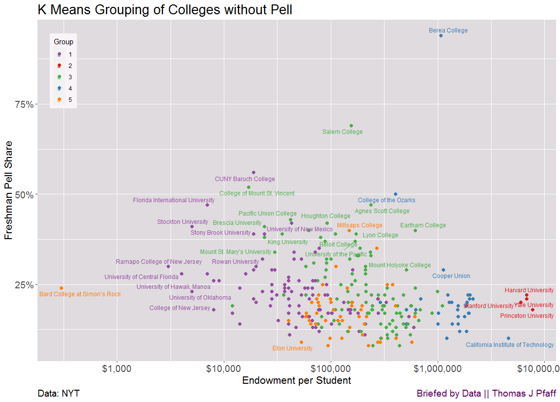
Figures 3 and 4 are identical to Figures 1 and 2, but with different groups due to the addition of the Pell Grant variable. Figure 3 shows that there isn't much of a difference in grouping from Figure 1, except that the (now) blue group is higher on the graph than the rest in terms of freshmen Pell Grant share.
Figure 4 is similar to Figure 2, except that the blue group has a higher Pell Grant share. In fact, that group (I list the blue group colleges below) has on average 40% of freshmen with Pell Grants, whereas the orange group is second with only 23%. The other three groups range from 17 to 18%.
Conclusion
It is easy for Inside Higher Ed to publish a negative piece about socioeconomic diversity in colleges. It probably gets more clicks and is easier to write. But there is a reality they are missing, as well as nuance. Consider the red group. These are highly selective institutions that usually subsidize some or all of the tuition for households earning less than $100,000. The issue is that lower-income families frequently live in poorer school districts, and their students do not have the opportunity to take the courses required for admission to these colleges. This is not the responsibility of the colleges.
Consider the green group in Figures 3 and 4. It might be easy to say they have good endowments (Figure 3—watch that log scale), yet they are really expensive for mid-income families (Figure 4), so shame on them for not having more Pell Grant students. In actuality, a $100,000 endowment per student generates between $4,000 and $5,000 per student. That isn't as much as it appears. They lack the endowment that the purple group possesses, and they appear to be predominantly private schools (despite the fact that this variable was not included).
The orange group appears to be predominately public colleges. Their endowment isn't large, yet they're nevertheless able to keep expenditures down. This gets us to the blue group. Their endowments are not huge, and they are mostly private. They appear to have made decisions in their evolution to be more inexpensive and accessible to Pell Grant students. Good for them, but it's not apparent that many universities can or should do this. Finally, according to the New York Times, these are merely the most selective 286 universities. There are numerous additional colleges that serve a wide range of students. Please let me know in the comments what I missed.
The blue group from Figure 3 and 4
Berea College, Salem College, College of Mount St. Vincent, College of the Ozarks, Agnes Scott College, Pacific Union College, Houghton College, Brescia University, Earlham College, Lake Forest College, Millsaps College, Christian Brothers University, Hampshire College, Lyon College, King University, Loyola University New Orleans, Beloit College, University of the Pacific, Knox College, Mount St. Mary’s University, Southwestern University, Allegheny College, College of the Atlantic, Hanover College, Austin College, Illinois Institute of Technology, William Jewell College, University of Dallas, University of Evansville, Bennington College, Kalamazoo College, Cornell College, Transylvania University, Hobart and William Smith Colleges.
Please share and like
Please help me find readers by forwarding this article to your friends (and even those who aren't your friends), sharing this post on social media, and clicking like. If you're on Twitter, you can find me at BriefedByData. If you have any article ideas, feedback, or other views, please email me at briefedbydata@substack.com.
Thank you
In a crowded media market, it's hard to get people to read your work. I have a long way to go, and I want to say thank you to everyone who has helped me find and attract subscribers.
Disagreeing and using comments
I'd rather know the truth and understand the world than always be right. I'm not writing to upset or antagonize anyone on purpose, though I guess that could happen. I welcome dissent and disagreement in the comments. We all should be forced to articulate our viewpoints and change our minds when we need to, but we should also know that we can respectfully disagree and move on. So, if you think something said is wrong or misrepresented, then please share your viewpoint in the comments.


