Changes in diet by education
Data from the USDA
This is the third post in my series on diet. I first wrote Changes in Diet by Income (9/17/2024) and Changes in Diet by Race/Ethnicity (10/8/2024) using recently updated data (8/21/2024) from the USDA Food Consumption, Nutrient Intakes, and Diet Quality report. The USDA has been sampling food intake since 1977, and the most recent update now includes 2017, which is a rather large lag in data reporting. For some reason, they started segregating out education levels in 1989.
There are seven tables of data, and I’m going to look at Table 4—Nutrient density by food source, U.S. consumers aged 2 and above, 1977–2018, and specifically the results by education. The USDA uses three education levels: Less than High School, meaning people that did not graduate high school; High School, or those with a high school diploma but did not attend college; and Attended College, which is a large category from someone who spent a year in college to someone with Ph.D.
As you look at the 11 charts below, here are a few general thoughts and expectations I had. First, I would expect that the hierarchy of food intake would show that more education leads to better choices. It may be that the data reveals a genuine cultural influence, as the advice on diet evolves over time and those with more education are more likely to follow that advice even if it turns out to be wrong. I tended to wonder if at times income was more of a driver than education. Ultimately, examining this data is akin to conducting an anthropological study, and I found it fascinating.
In many cases, the differences between groups may not be statistically significant. I generally won’t comment on this, but if you are interested, the USDA data does include standard errors along with means.
Let me know your thoughts about the data in the comments, and please share this post. Thank you.
Let’s go to the data.
Calories
As with previous posts, calorie consumption increased for all groups through 2003 (Figure 1). Trends are generally the same for all groups, but I’m surprised that in 2017, the Attended College group consumed the most calories.

The ordering of calories at home and away from home differs. The less than high school group consumes the most calories at home. But they have consumed the fewest calories away from home by a notable amount over the full-time series. I would argue this is more of an income issue. Similary, those that attended college generally consume the most away from home but have been close to the high school group, with the high school group occasionally on top. I wonder if this has to do with jobs that have folks on the road more or eating takeout on the job site. I would have expected a bit more of a separation between the attend college group and the high school group on eating out.

Protein
The interesting thing about protein consumption (Figure 3), measured in grams per 1,000 calories, is that all groups begin at the same point in 1989 and decline through 2003, albeit at different rates. The attended college and high school groups drop faster to 1994 than less than high school, but then attended college declines only a little to 2003. By the time we get to 2017, the order is reversed. I assume this reflects changing diet conventional wisdom and that education makes you more likely to follow it.

Sodium
In figure 4, I have to wonder if there is an error in the 2017 data. Did those with a high school education really jump that high? The less than high school group started at the top in 1989 and are now at the bottom of sodium consumption. I wonder what drove this.

Part of my answer is in Figure 5. Interestingly, the groups generally consumed more sodicum at home than away from home in 1989, and that changed completely by 2017. For whatever reason, the less than high school group chooses food away from home with the least sodium. The dropoff in sodium consumption at home from 1989 to 2003 has to be due to diet advice to reduce sodium intake.

Fat
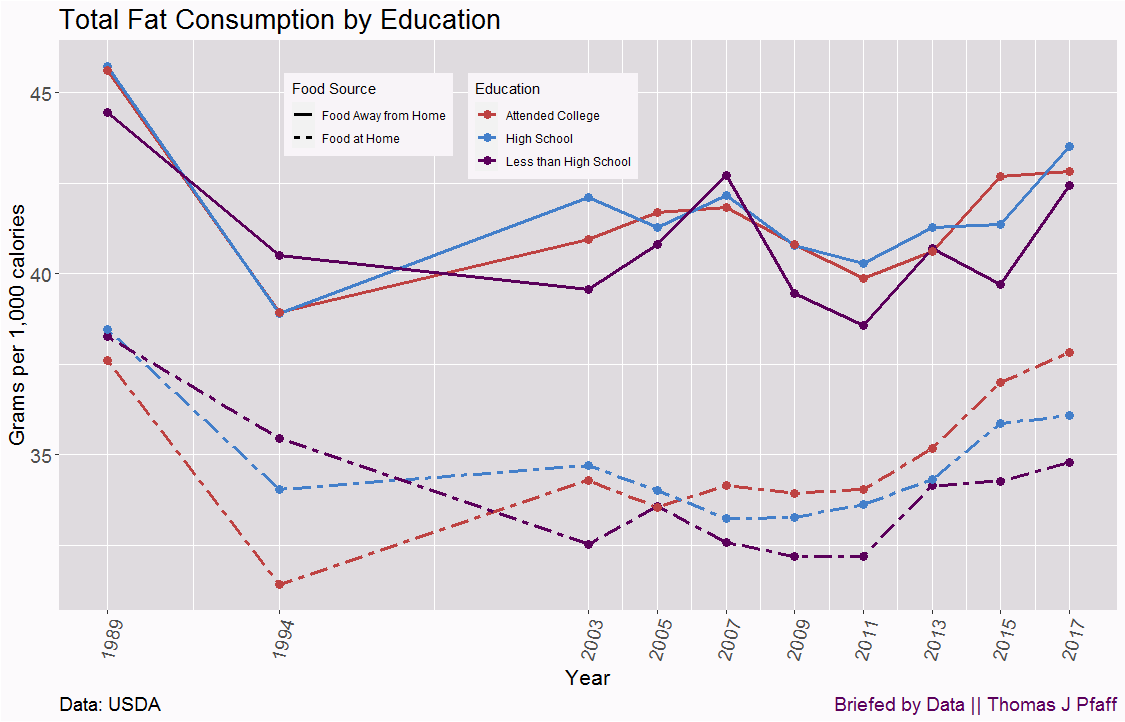
One group is consuming more fat in grams per 1,000 calories now than in 1989; the attended college group. It would be interesting to compare this graph to diet advertising. We see the decrease in fat consumption from 1989 to 1994 for attended college and high school groups, and then it goes up a bit, down a bit, and then a sharp increase starting in 2013. The less than high school group kept going down longer and then didn’t rise as fast. Again, I wonder why?

One interesting fact (Figure 7) is that by food source, the groups are much closer together. Yet, the less than high school group consumes notably less fat at home than the other groups, while the attended college group started at the bottom but now consumes more fat at home.

Iron
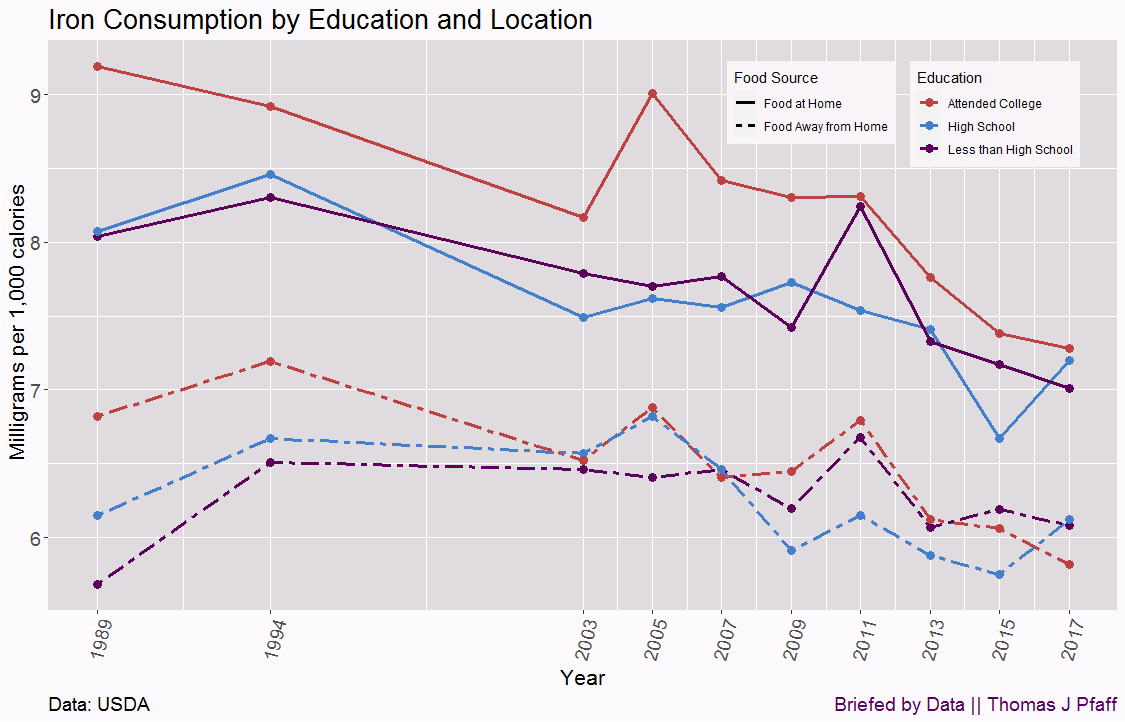
As with previous posts, there has been a decrease in iron consumption based on milligrams per 1,000 calories. What is interesting in Figure 8 is that the attended college group has decreased the most.

When we examine iron consumption at home and away (Figure 9), the group attending college has experienced the largest decrease in both categories. I hypothesize that the advice to eat less red meat and replace it with chicken has had the greatest influence on them.

Calcium
Got Milk (Figure 10) influenced all groups, but the attended college group leveled out in 2011. Once again, we observe a situation where the college attending group, previously consuming the highest amount (in this case, milligrams of calcium per 1,000 calories), is now consuming the least.

Fiber
We end with fiber consumption, Figure 11. Except for a little blip in the middle for the less than high school group, all groups followed the same trends over time, with the differences staying about the same. Whatever changed our fiber eating habits had about the same impact on all groups.

Please share and like
Sharing and liking posts attracts new readers and boosts algorithm performance. I appreciate everything you do to support Briefed by Data.
Comments
Please let me know if you believe I expressed something incorrectly or misinterpreted the data. I'd rather know the truth and understand the world than be correct. I welcome comments and disagreement. We should all be forced to express our opinions and change our minds, but we should also know how to respectfully disagree and move on. Send me article ideas, feedback, or other thoughts at briefedbydata@substack.com.
Bio
I am a tenured mathematics professor at Ithaca College (PhD Math: Stochastic Processes, MS Applied Statistics, MS Math, BS Math, BS Exercise Science), and I consider myself an accidental academic (opinions are my own). I'm a gardener, drummer, rower, runner, inline skater, 46er, and R user. I’ve written the textbooks “R for College Mathematics and Statistics” and “Applied Calculus with R.” I welcome any collaborations.


