


Changes in diet by income
Changes in diet by income
Data from the USDA

The USDA recently updated (8/21/2024) their Food Consumption, Nutrient Intakes, and Diet Quality report. The USDA has been sampling food intake since 1977, and the most recent update now includes 2017, which is a rather large lag in data reporting. There are seven tables of data, and I’m going to take a look at Table 4—Nutrient density by food source, U.S. consumers aged 2 and above, 1977–2018, and specifically the results by income. I’ll do a similar post by race in the near future. There aren’t any brilliant insights in the eleven graphs below (ok, not a great sell to get you to read further), but I found the data interesting, and so hopefully you will. Please leave comments on what I missed.
A quick note on the data. The USDA does their sampling over more than one year. In most instances, it is over two years, and the points (means) on the graphs are the first year of the sampling periods. The periods are 1977-1978, 1989-1991, 1994-1998, 2003-2004, 2005-2006, 2007-2008, 2009-2010, 2011-2012, 2013-2014, 2015-2016, and 2017-2018. Changes from one sampling period to the next may not be statistically significant, as well as group differences. We should focus on trends over time more than differences in any one year. All data is from Table 4 in the USDA report, and so I won’t caption all the figures.
Let’s go to the data.
Calories
Given that we hear about obesity problems in the U.S., it is no surprise that calorie consumption has gone up. What is interesting is that this occurred from 1989 to 2003 for all three income groups at about the same rates. Since then we have been trending down slightly, with only the low income group setting a new max in 2017, although still not above the max for the middle and high income groups that were reached in 2003.
Roughly we are consuming, on average, 200-300 calories a day more than in 1977. On a daily basis, that is easy to do with a quick soft drink or energy bar. By the end of the year, that is an extra 73,000 to 109,500. Keep in mind that an extra 3600 calories is a pound of body weight.
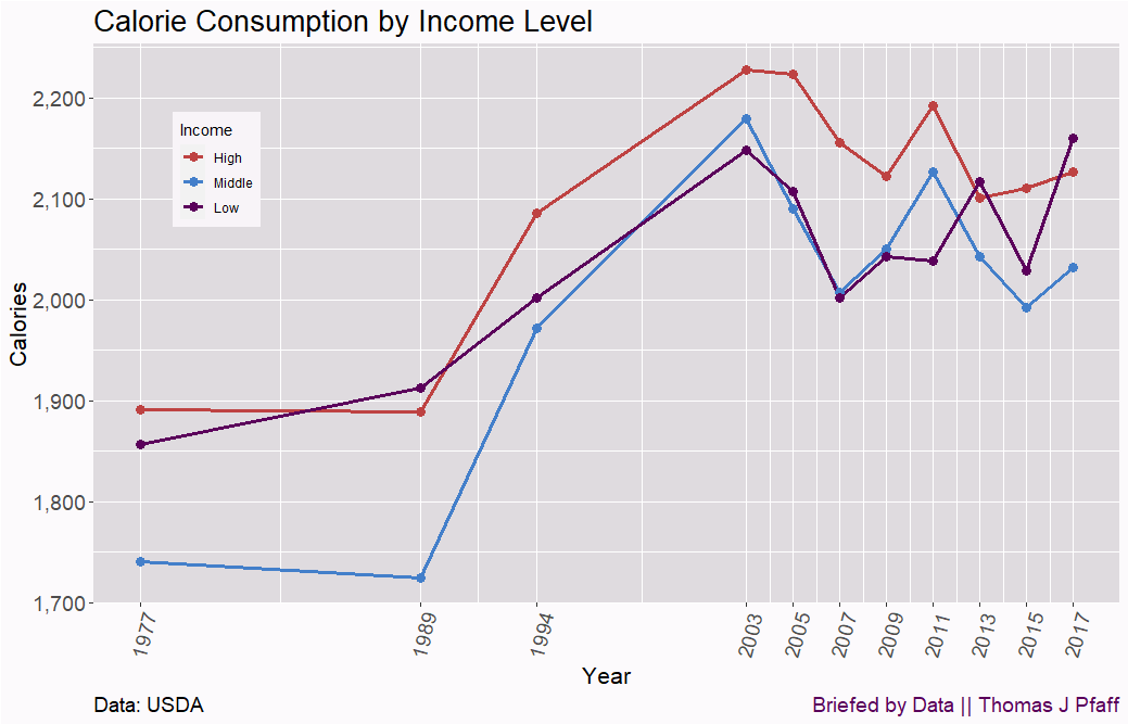
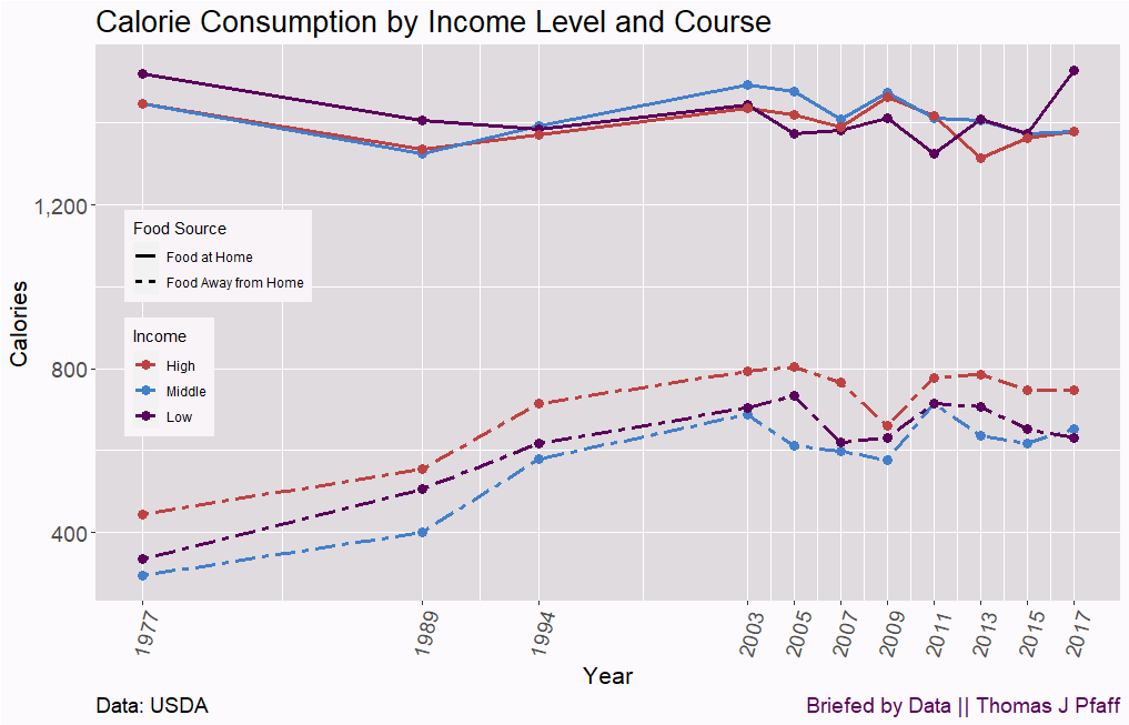
The USDA separates the food intake into food at home and food away from home. Food at home hasn’t changed much, and the increase in calories is mostly from food away from home, and that increased from 1977 through 2003.
Protein
The amount of protein in the food we eat, note the y-axis is grams per 1,000 calories, decreased from 1977 to 2003, except for high-income people, where the decrease stopped in the 1994 survey. Before 1994, all groups ate food with roughly the same protein content, but after that, the high-income group separated from the other two groups.

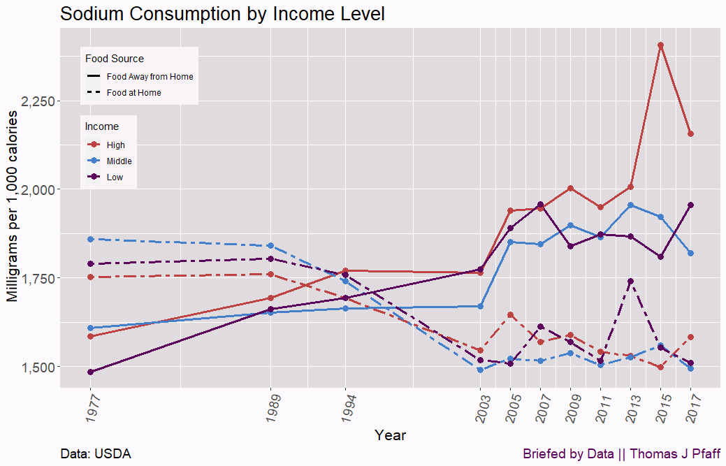
Sodium
This one surprised me a bit. I figured that as we eat more junk food, the sodium consent, milligrams per 1,000 calories, would have increased, but it decreased from 1989 through 2003. Advertising to consume less salt may have had an impact. Now, note the divergence in the last year where the high-income group went up and the others down. Why?

The why seems to be that high-income people are getting a lot more sodium eating out than the other groups. It would be interesting to know the differences in what high-income people are eating away from home as compared to other groups.
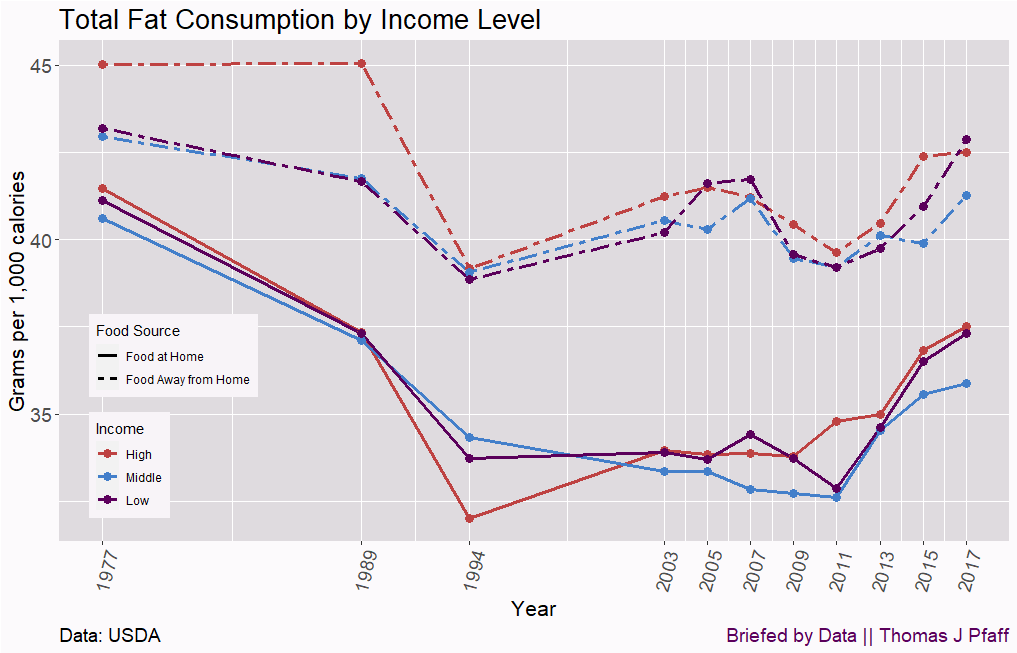
Fat
Total fat consumption, grams per 1,000 calories, drops from 1997 to 1994 for all groups and then goes back up starting around 2009. I have to figure this is the result of healthy eating advertising and fads in eating, as all groups exhibit the same pattern.

When we look at fat consumption eating and home and away, the patterns are very similar, and food we consume away from home is higher in fat, which isn’t a surprise.
Iron
Iron, an important nutrient, consumption in milligrams per 1,000 calories has been dropping for the last decade. It is also interesting that high-income people dropped below all groups in 2013. I wonder if this is due to the push to eat less meat to save the planet for wealthier people, but maybe just due to cost for other groups?
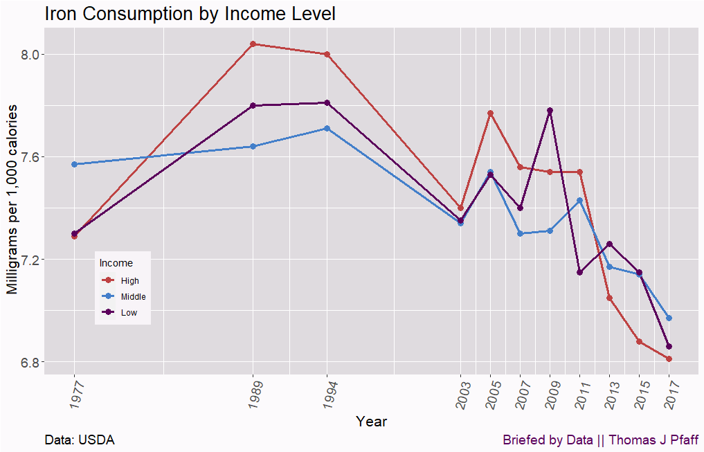
When we look at iron by home and away food consumption, we see decreases in both settings, but more so at home.

Calcium
Got milk? All I can say is that must have worked given the increases in calcium on the order of 20%, in milligrams per 1,000 calories, for all groups from 1994 through 2009. I would say it has levelled off since then with some variability. I suppose we can only drink so much milk.

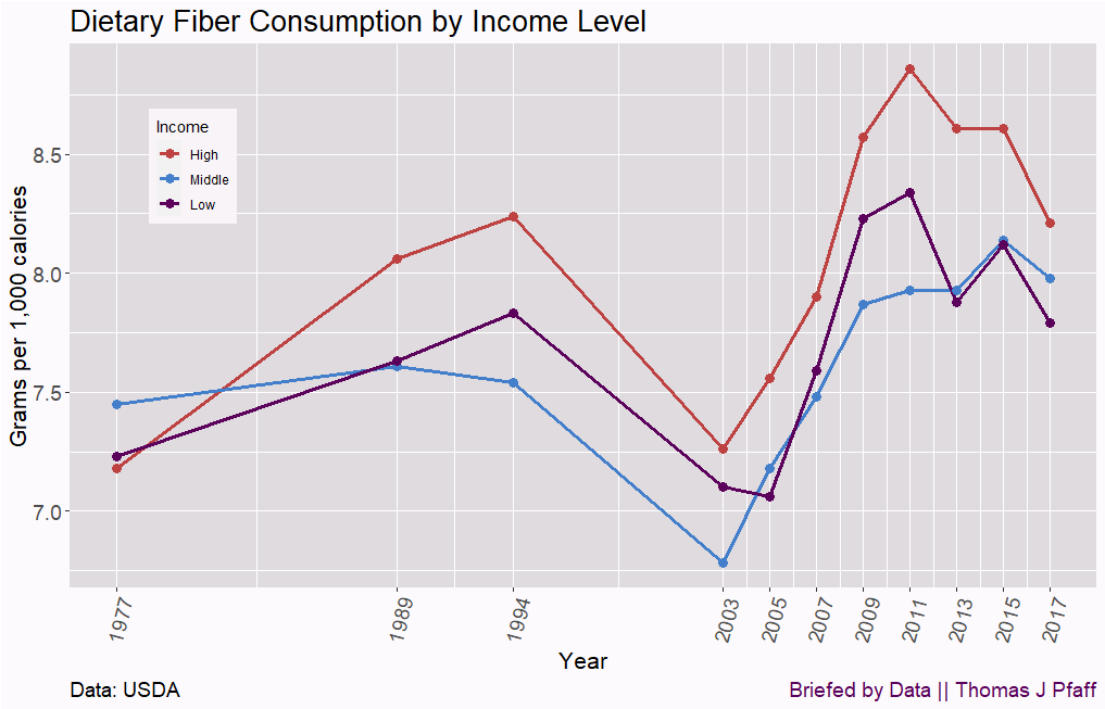
Fiber
I’m not sure how to make sense of dietary fiber, in grams per 1,000 calories. It rose from 1977 to 1994 for all groups, dropped in 2003, and then started rising again until about 2011 and then started going down. There have been pushed to eat more fiber, and so maybe some of the increases are due to that. At some point though, if you eat more of something, you have to get less of something else. All of these graphs are related.
Conclusions
As I go through this, two things come to mind. It appears that fads and advertising have a big influence on us and how we eat. Would calcium consumption really have gone up without the Got Milk ads? It would be interesting to connect these graphs to advertising changes. Second, it is interesting how the density of nutrients has changed over time, and I’m a bit surprised that the difference between groups is generally small. Regardless of income level, we all like to eat similar foods. The USDA has data by education, so I’ll have to see if that makes a difference. A future post.
Please share and like
Sharing and liking posts attracts new readers and boosts algorithm performance. Everything you do is appreciated.
Comments
Please point out if you think something was expressed wrongly or misinterpreted. I'd rather know the truth and understand the world than be correct. I welcome comments and disagreement. We should all be forced to express our opinions and change our minds, but we should also know how to respectfully disagree and move on. Send me article ideas, feedback, or other thoughts at briefedbydata@substack.com.
Bio
I am a tenured mathematics professor at Ithaca College (PhD Math: Stochastic Processes, MS Applied Statistics, MS Math, BS Math, BS Exercise Science), and I consider myself an accidental academic (opinions are my own). I'm a gardener, drummer, rower, runner, inline skater, 46er, and R user. I’ve written the textbooks R for College Mathematics and Statistics and Applied Calculus with R. I welcome any collaborations.