

Classroom Connections May 10, 2025
Content ideas and data for math and statistics classes

With a busy semester, I wasn’t able to get to Saturday post, but with the semester just about over, they are back, starting with a long overdue classroom connections. Enjoy. Cheers, Tom.
Classroom connections are less about immediate application and more about me pointing out resources. I believe that there is a lot of amazing math, statistics, and data out there that might be used in math classrooms and is also intriguing to the curious. At the same time, the next time someone asks what math is used for, well, here are a bunch of examples.
Some of these examples may require some effort to be classroom-ready, and some of the material has appeared in previous posts. I’m ordering the content roughly based on the level of math. Please let me know if you or someone you know uses any of these suggestions in the classroom or has a relevant idea (email me at thomas.pfaff@sustainabilitymath.org). Really, leave a comment (if nothing else, your feedback is encouragement for me to keep doing this) or send me an email if these classroom connection posts are useful. Similarly, if you have an opinion or concept that is relevant, please share it in the comments. Please share, like, and subscribe, and feel free to comment.
Just graphs
If you are looking for a lot of different graphs, in this case related to the state of health in the EU, download the pdf report from Health at a Glance: Europe 2024 (11/18/2024). Here is one such graph.

Sampling issues and correlations (or not)
Great analysis of sampling issues in The Lipid–Heart Hypothesis and the Keys Equation Defined the Dietary Guidelines but Ignored the Impact of Trans-Fat and High Linoleic Acid Consumption (5/11/2024). A key excerpt:
The Seven Countries Study (SCS) (US, Europe, Japan, 1957–1984) was a 25-year longitudinal observational study that was designed and led by Ancel Keys [24]. There were 15 cohorts in the seven countries, namely, US, Italy, Greece, The Netherlands, Finland, Yugoslavia, and Japan. The SCS sought to look for associations between total and specific dietary fat and cholesterol intake, serum cholesterol levels, smoking, blood pressure, and death rates from CHD, cancer, and all causes in men consuming their usual diet. The SCS included 12,763 “healthy” men aged 40 to 59, although many had evidence of heart disease based on EKGs obtained at baseline. The participating countries and cohorts were not representative, and the dietary records were incomplete. For example, the US railroad cohort of men are not representative of the US population, and they only completed a single-day dietary record. Analysis of the diets did not distinguish animal fats from hydrogenated fats, which were widely consumed during this period [88]. The following additional results from the 15-year analysis were obtained [24]:
There was no association of TC levels with CHD deaths.
High PUFA intake had no association with coronary heart deaths: the cohort with the highest CHD death rate of 12/100 men consumed 2.9% PUFA, which was within the same range of 1.9 to 3.5% as the cohorts with the five lowest coronary heart death rates at ≤2/100 men.
Although Keys ignored oleic acid in his previous studies, the results from the SCS showed that all-cause and CHD death rates were low in cohorts that consumed olive oil as the main fat.
There was no association between the percentage of daily calories as total fat and all-cause deaths or CHD deaths (Figure 1A): Crete had the lowest all-cause and CHD deaths but one of the highest fat intakes at 36.1%. However, the East Finland cohort that consumed a comparable amount of fat at 38.5% had the highest coronary heart deaths. The six cohorts with the lowest CHD deaths had a total fat intake ranging from 9 to 36.1%.
Keys claimed that there was an association between CHD deaths and the ratio of the intake of monounsaturated fatty acid to saturated fatty acid (MUFA/SFA). However, the data showed otherwise: two cohorts with the lowest CHD death rates (Tanushimaru and Ushibuka) had the same MUFA/SFA ratio of 1.0 as the cohort which had the second highest number of CHD deaths (US railroad men) (Figure 1B).
A later analysis revealed that the food consumed in the Seven Countries Study included margarine (trans-fats) [26].
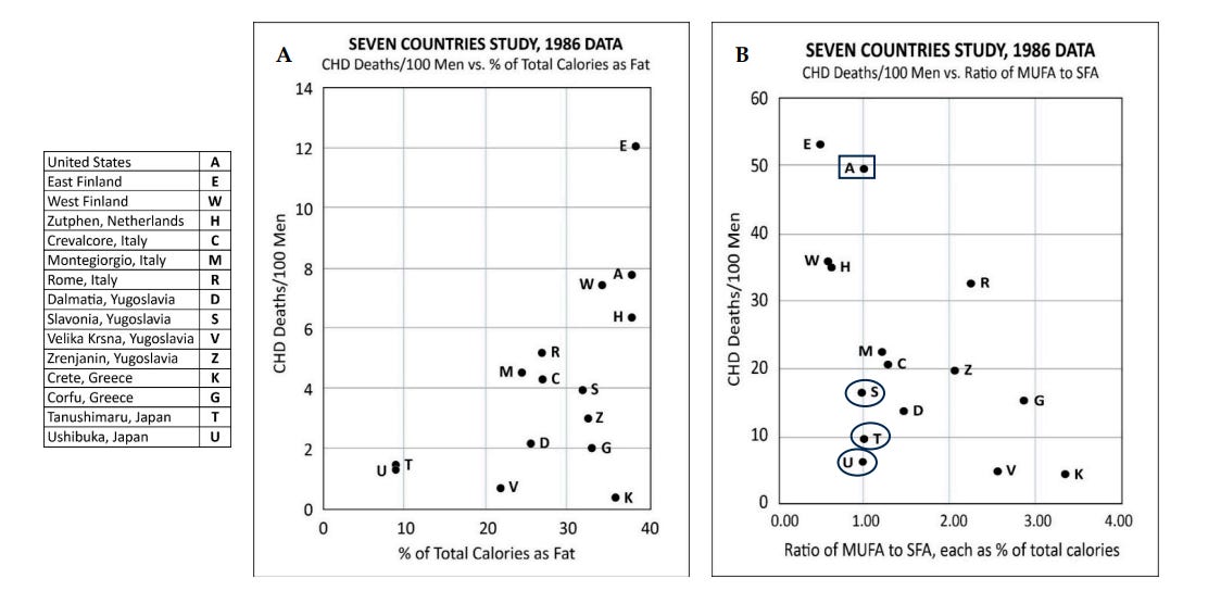
Caption: Figure 1. Results from the Seven Countries Study. (Figure 1A) There was no association between the % of total calories as fat and CHD deaths. Crete (K) had the lowest all-cause and CHD deaths but had one of the highest fat intakes at 36.1%. However, the East Finland (E) cohort consumed a comparable amount of fat at 38.5% and had the highest number of CHD deaths. (Figure 1B) Keys claimed that there was an association between CHD deaths and the ratio of (MUFA/SFA) intake. However, the fifteen-year analysis of data showed otherwise: three cohorts with the lowest CHD death rates (Tanushimaru (T), Ushibuka (U), and Slavonia (S)) had the same MUFA/SFA ratio of 1.0 as the cohort which had the second highest CHD deaths (US railroad men (A)). (The legends are those used in [24]).
Regression
An example of regression from the paper Hotter Temperatures Reduce the Diversity and Alter the Composition of Woody Plants in an Amazonian Forest (10/30/2024) with links to the data at the bottom of the article.

Caption: Scatterplots showing the relationships between mean annual temperature (MAT) and (a) Shannon diversity index, (b) species richness, (c) species evenness, and (d) number of individuals in woody plant inventory plots along the Boiling River's thermal gradient. Each point is a plot. Lines indicate the linear relationship between MAT and each response variable; shaded areas represent 95% confidence intervals.
Reading a graph and ANOVA
Here is a nice graph that includes ANOVA results from the paper Asymmetric effects of hydroclimate extremes on eastern US tree growth: Implications on current demographic shifts and climate variability (8/20/2024). There are other graphs, formulas, and a link to the data at the bottom of the article.

Caption: Species-level responses to hydroclimate extremes in eastern US forests. Effects of species growth to drought (A) and pluvial (B) conditions for seasonal (March–August average; August SPEI6) hydroclimate conditions for mild (SPEI6 = ±1.0; top), moderate (SPEI6 = ±1.5; middle), and extreme (SPEI6 = ±2.0; bottom) events. Lowercase lettering represents statistical significance differences in effect size between species via an ANOVA analysis Tukey HSD post hoc test. Asterisks represent the mean is significantly (p ≤ .05) different from zero using a one-sample t-test. The sample size of the number of extremes experienced by each species is denoted. ACSA, Acer saccharum; CAOV, Carya ovata; LITU, Liriodendron tulipifera; QUAL, Quercus alba; QURU, Quercus rubra.
PCA
Here is one graph of the result of PCA in the paper Heat tolerance varies considerably within a reef-building coral species on the Great Barrier Reef (9/23/2024). There are other graphs and links to the related data at the bottom of the article.

Caption: A Principal Components Analysis of genome-wide SNPs showing four distinct clusters representing four distinct putative species within the A. hyacinthus complex. Group 1 represents the target morphotype, A. hyacinthus “neat” which comprised the majority of colonies sampled (472 of 625 total colonies), with groups 2–4 containing 27, 36, and 90 colonies, respectively. B Colony morphology and branching structure of genomic clusters 1–4 within the A. hyacinthus species complex on the Great Barrier Reef. Colonies pictured to represent groups 1–4 were all sampled on Sykes Reef. C Admixture plot assuming 2–5 ancestral populations (k) within the A. hyacinthus species complex sampled across the Great Barrier Reef, supporting the grouping of these colonies into four putative species clusters.
Please share and like
Sharing and liking posts attract new readers and enhance algorithm performance. I appreciate everything you do to support Briefed by Data.
Comments
Please let me know if you believe I expressed something incorrectly or misinterpreted the data. I'd rather know the truth and understand the world than be correct. I welcome comments and disagreement. We should all be forced to express our opinions and change our minds, but we should also know how to respectfully disagree and move on. Send me article ideas, feedback, or other thoughts at briefedbydata@substack.com.
Bio
I am a tenured mathematics professor at Ithaca College (PhD in Math: Stochastic Processes, MS in Applied Statistics, MS in Math, BS in Math, BS in Exercise Science), and I consider myself an accidental academic (opinions are my own). I'm a gardener, drummer, rower, runner, inline skater, 46er, and R user. I’ve written the textbooks “R for College Mathematics and Statistics” and “Applied Calculus with R.” I welcome any collaborations. I welcome any collaborations.