Classroom connections are less something you can apply right away and more of me pointing out resources. I believe that there is a lot of amazing math, statistics, and data out there that might be used in math classrooms and is also interesting to the curious. At the same time, the next time someone asks what math is used for, well, here are a bunch of examples.
Some of these examples may require some effort to be classroom-ready, and some of this has appeared in previous posts. I’m ordering this roughly based on the level of math. Please let me know if you or someone you know uses any of this in the classroom or has a relevant idea (email me at thomas.pfaff@sustainabilitymath.org). Really, leave a comment or send me an email if these classroom connection posts are useful. Similarly, if you have an opinion or concept that is relevant, please share it in the comments. Please share, like, subscribe, and feel free to comment.
Read this graph and more
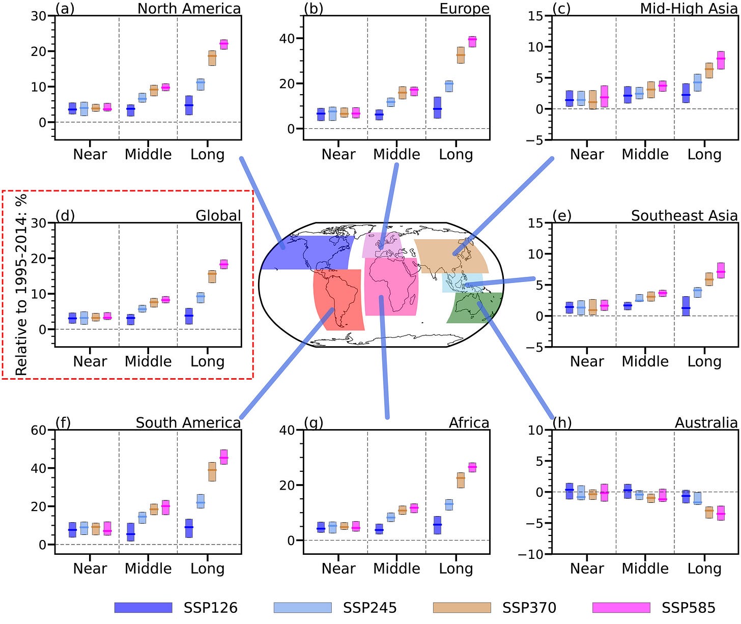
There is some nice modeling and equations that might be useful in the paper Increases of Offshore Wind Potential in a Warming World (7/10/2024), but reading and interpreting this graph is perfect for a statistics or QL course, which I also highlighted in QTRS Aug. 1, 2024.
Caption
Relative changes in the annual-mean offshore wind power density in different future terms. (a) Percentage changes (%) in annual-mean of North American offshore wind power density in the near term (2021–2040), middle term (2041–2060), and long term (2081–2100) relative to the historical period (1995–2014) under SSP1–2.6 (blue), SSP2–4.5 (light-blue), SSP3–7.0 (orange), and SSP5–8.5 (pink) (b–h) The same as that in (a), but for Europe, mid-high latitude Asia, global, Southeast Asia, South America, Africa, and Australia, respectively.
Statistical study
The paper Self-perceived middle-distance race pace is faster in Advanced Footwear Technology spikes (3/27/2024) reports on a statistical study examining different footwear and running. Students could interpret the paper, or it could be used as an example.
Caption
Spike conditions significantly affect running speed and step length, but not step frequency. Panel A shows average running speeds in different spike conditions, for Experiment 1, 2, 3 and 4, from left to right. Panel B shows step frequency was similar across spike conditions. Panel C shows significantly longer step lengths for
Tyrannosaurus Rex and calculus
At what age is T-rex growing the fastest, and what is that rate? You can answer this calculus question with results from the paper Estimation of maximum body size in fossil species: A case study using Tyrannosaurus rex (7/24/2024). There is more than can be done with this paper (calculus and statistics), but I’ll stop with this one example.
Here is the caption and equation:
Integration
A great example of integration being used to understand cardiovascular states is in the paper Dynamic Estimation of Cardiovascular State From Arterial Blood Pressure Recordings (6/10/2024).
Trig, calculus, and modeling
Who knew that anyone would use arctan(x)? The paper Quantifying Earth's Topography: Steeper and Larger Than Projected in Digital Terrain Models (7/20/2024) does. A few screen shots and a figure to get the idea.
Caption
Synthetic landscapes, their true and COSi corrected surface area, or ratio to the planform area, and their slope PDFs at 1, 5, and 30 m resolution (colored, planform = dashed, surface weighted = solid lines). (a–d) display the topographic metrics of Gaussian hills, while (e and f) represent CosSin landscapes of two amplitudes each.
History and stochastic SIR-type modeling
From the abstract of Transoceanic pathogen transfer in the age of sail and steam (7/16/2024):
In the centuries following Christopher Columbus’s 1492 voyage to the Americas, transoceanic travel opened unprecedented pathways in global pathogen circulation. Yet no biological transfer is a single, discrete event. We use mathematical modeling to quantify historical risk of shipborne pathogen introduction, exploring the respective contributions of journey time, ship size, population susceptibility, transmission intensity, density dependence, and pathogen biology.
Mathematical modeling of historical events. Imagine. The general modeling idea is:
We simulate shipboard outbreaks using a stochastic Susceptible-Infectious-Exposed-Recovered (SEIR) model (SI Appendix, Text S3). We implement continuous-time stochastic simulations in R with the Gillespie Algorithm, using the package GillespieSSA (88). All simulations assume a single index case in state E at the time of departure. We define outbreak duration as the time until both state E and state I contain zero individuals.
Caption
Basic dynamics. (A) Outbreak duration, (B) outbreak size and (C) number of transmission generations by R0, assuming a fully susceptible population of N=100 and a theoretical pathogen with μE=μI=5d and kE=kI=3. Solid black lines show median outbreak duration, outbreak size, and number of generations. Top and bottom dashed lines respectively show 95th and fifth percentile outbreak duration, outbreak size, and number of generations. (D) Probability of at least one person in state E or state I (“introduction risk”) for any given journey time by R0, using the same population and pathogen parameters. (E) Outbreak length distribution by R0 in a fully susceptible population of N=100 for influenza, measles, and smallpox, using epidemiological parameters detailed in SI Appendix, Table S1.
PCA, K means, and more
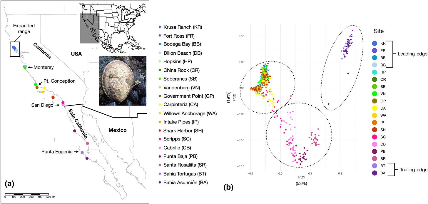
If you need some data for PCA (principle component analysis) or K means, then check out the paper Pushed waves, trailing edges, and extreme events: Eco-evolutionary dynamics of a geographic range shift in the owl limpet, Lottia gigantea (7/23/2024). There are also multiple graphs that could be used for a variety of statistics or data classes.
Sampling sites and population clustering. (a) Map of Lottia gigantea sample sites for genomic sequencing (Table S1) along the Pacific coast of North America, with the expanded range (where increased recruitment occurred in association with marine heatwaves) highlighted by the black box. Locations of common phylogeographic breaks (Monterey Bay, Point Conception, San Diego, and Punta Eugenia) are also indicated with arrows. (b) The first and second components of a principal components analysis (PCA) of SNP data with individuals colored by site, and the three clusters identified by the Kmeans clustering analysis encircled by dashed lines. Leading- and trailing-edge populations are based on abundance trends from Fenberg and Rivadeneira (2011).
Please share and like
Sharing and liking posts attracts new readers and boosts algorithm performance. Everything you do is appreciated.
Comments
Please point out if you think something was expressed wrongly or misinterpreted. I'd rather know the truth and understand the world than be correct. I welcome comments and disagreement. We should all be forced to express our opinions and change our minds, but we should also know how to respectfully disagree and move on. Send me article ideas, feedback, or other thoughts at briefedbydata@substack.com.
Bio
I am a tenured mathematics professor at Ithaca College (PhD Math: Stochastic Processes, MS Applied Statistics, MS Math, BS Math, BS Exercise Science), and I consider myself an accidental academic (opinions are my own). I'm a gardener, drummer, rower, runner, inline skater, 46er, and R user. I welcome any collaboration.


