Classroom connections are less something you can apply right away and more of me pointing out resources. I believe that there is a lot of amazing math, statistics, and data out there that might be used in math classrooms and is also interesting to the curious. At the same time, the next time someone asks what math is used for, well, here are a bunch of examples.
Some of these examples may require some effort to be classroom-ready, and some of this has appeared in previous posts. I’m ordering this roughly based on the level of math. Please let me know if you or someone you know uses any of this in the classroom or has a relevant idea (email me at thomas.pfaff@sustainabilitymath.org). Really, leave a comment or send me an email if these classroom connection posts are useful. Similarly, if you have an opinion or concept that is relevant, please share it in the comments. Please share, like, subscribe, and feel free to comment.
Geometric mean
Who knew anyone used the geometric mean? Well, the BLS does in the article Introducing Producer Price Index research series based on a geometric-mean formula (May 2024)
Most users of Producer Price Index (PPI) data know that PPIs measure the average changes over time in the selling prices received by domestic producers of goods and services. What is less commonly known, however, is how these changes are calculated—which formulas are used, what determines formula choice, and how that choice affects an index. This article explains the motivation behind the U.S. Bureau of Labor Statistics (BLS) PPI research series calculated with a geometric-mean (geomean) formula. In addition, the article presents comparisons between official and geomean PPIs, illustrating the effects of formula choice on index values. Important empirical insights are also introduced by comparing PPI and Consumer Price Index (CPI) data and methods.
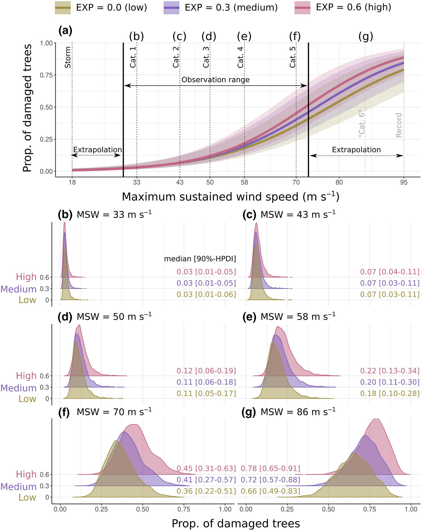
Interpreting graphs and distributions
An assignment can be centered on just interpreting the information and distributions in this graph from Damage to tropical forests caused by cyclones is driven by wind speed but mediated by topographical exposure and tree characteristics (5/15/2024)
T-tests, boxplots, Bayes theorem and more
There are multiple classroom uses in the paper Spontaneous biases enhance generalization in the neonate brain (7/6/2024). This is the baby chicks prefer certain colors paper highlighted in QTRS on July 11, 2024. Here is an example of t-tests in action

Here is Bayes theorem in action:
There is much more in this paper, and it is worth a look if you are teaching statistics at any level. Data is included at the bottom.
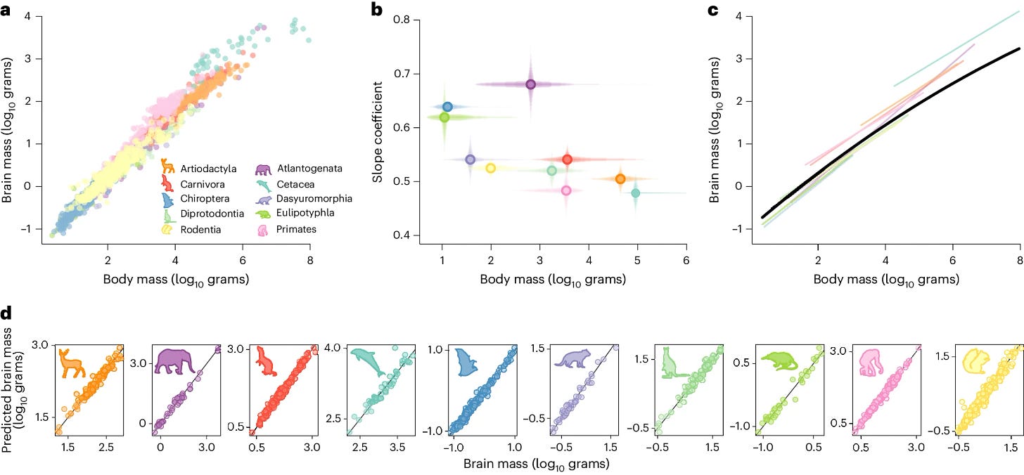
Log graphs, regression, and the Tukey HSD test
I also used the paper Co-evolutionary dynamics of mammalian brain and body size in QTRS July 11, 2024. There are links to the data at the bottom, so you can reproduce this log-log graph.
Plenty of regression is happening in the paper, plus this post hoc test:
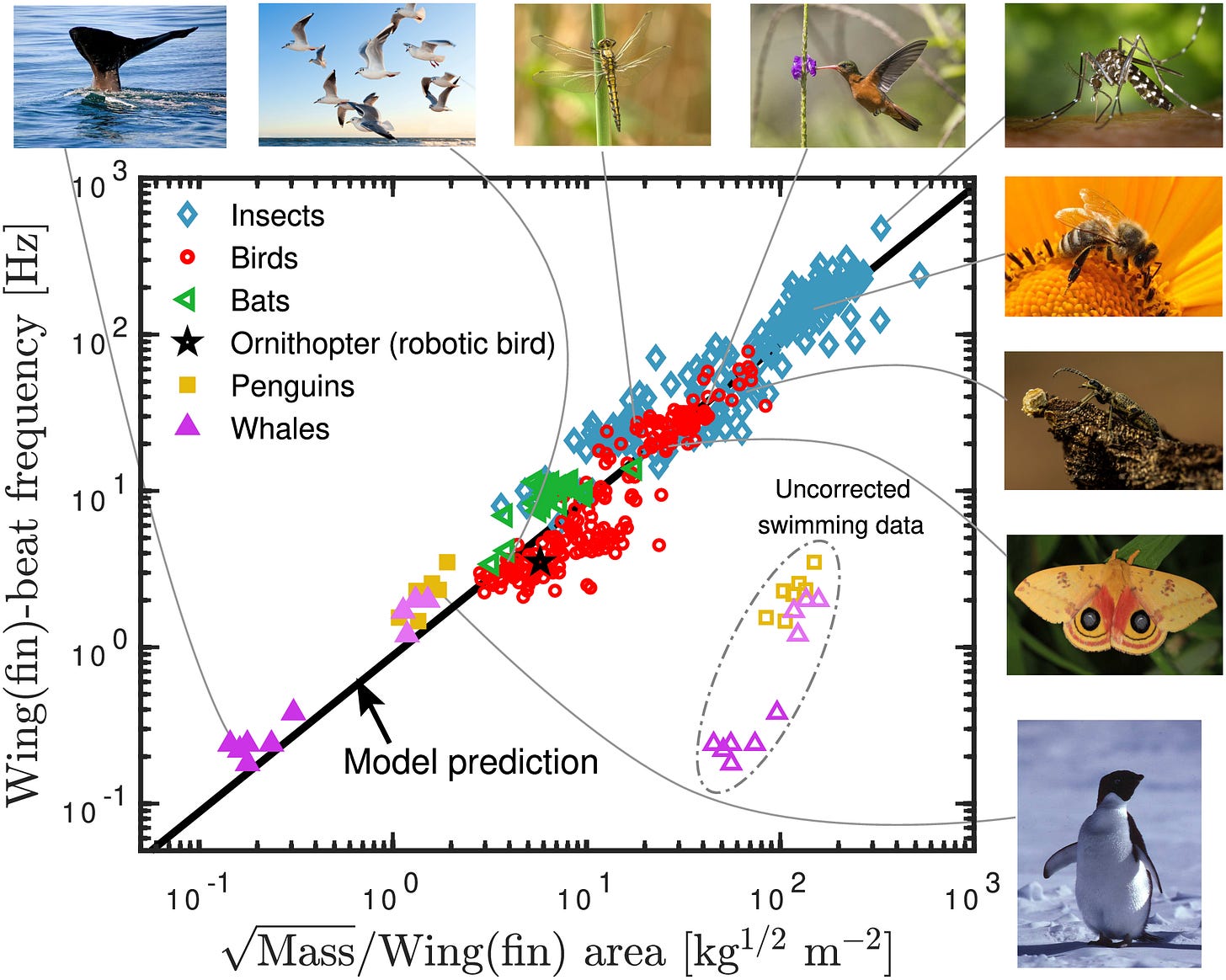
Regression, cool results, and axis scaling
The data for the graphs below are available with the paper Universal wing- and fin-beat frequency scaling. (6/5/2024)

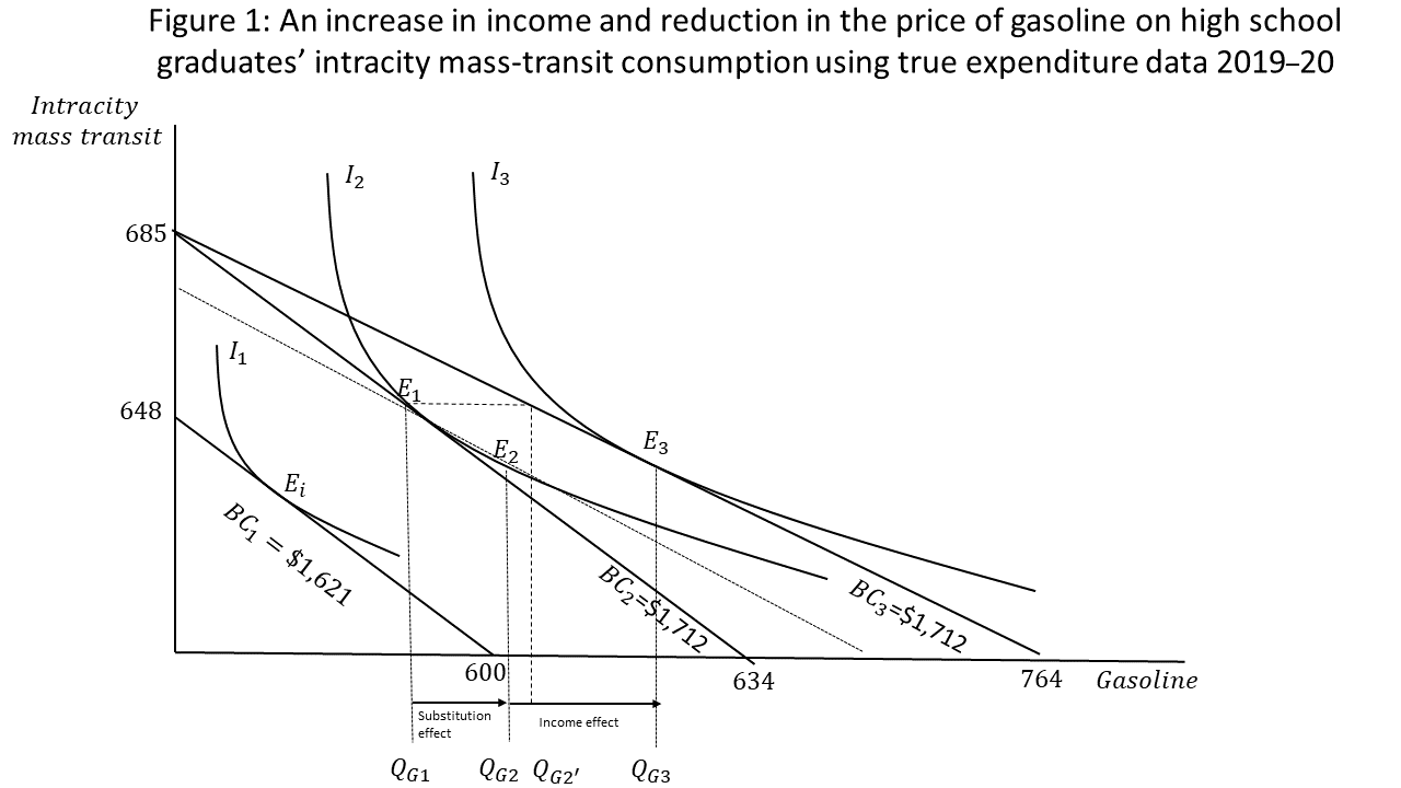
Tangent lines
What is the interpretation of these tangent lines from the paper Two hours to the office, two minutes to the kitchen table: trends in local public-transportation expenditures from 2018 to 2021? (June 2024)
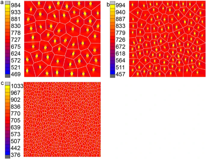
Voronoi tessellation and modeling
The modeling in the paper Voronoi cell finite element method for heat conduction analysis of composite materials (5/27/2024) is probably more than anyone can use, but it does not have cool examples of Voronoi tessellation being used. This is just one of a number of examples in the paper.
Dynamical systems
From the paper Rate-induced tipping to metastable Zombie fires (6/28/2023):


