


Classroom connections June 7, 2025
Content ideas and data for math and statistics classes
Classroom connections are less about immediate application and more about me pointing out resources. I believe that there is a lot of amazing math, statistics, and data out there that might be used in math classrooms and is also intriguing to the curious. Simultaneously, when someone inquires about the applications of math, consider these numerous examples.
Some of these examples may require some effort to be classroom-ready, and some of the material has appeared in previous QTRS posts. I’m ordering the content roughly based on the level of math. Please tell me if you or someone you know uses any of these suggestions in the classroom or has a relevant idea (email me at thomas.pfaff@sustainabilitymath.org). I encourage you to leave a comment, as your feedback motivates me to continue this work, or send me an email if you find these classroom connection posts useful. Similarly, if you have an opinion or concept that is relevant, please share it in the comments. Please share, like, subscribe, and comment.
Reading graphs
This is just one of four graphs in the paper Global scale assessment of urban precipitation anomalies (9/24/2024) that could be used as an assignment on interpreting information in a graph.
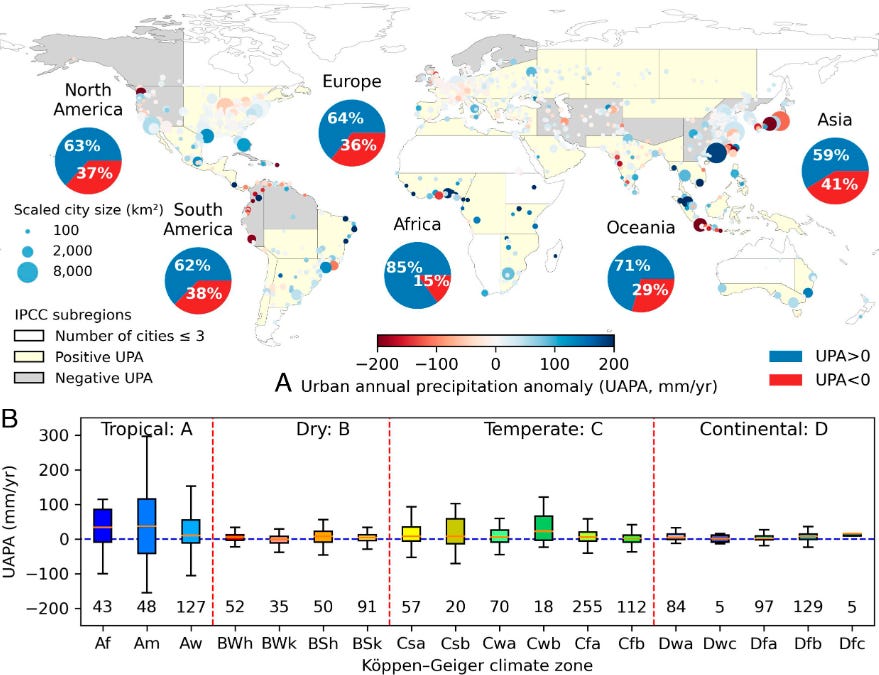
Caption: Global urban annual precipitation anomalies. The urban annual precipitation anomalies according to continents and climate zones. (A) The color of the base map shows that the average of urban precipitation anomalies in the IPCC subregion is positive or negative. Each dot on the base map indicates one city, and the size and color of the dot describe the size and precipitation anomaly extent of the city. The pie charts show the percentage of cities with positive and negative (more or less precipitation over urban grids) urban precipitation anomalies in each continent (the pie charts for each IPCC subregion are shown in SI Appendix, Fig. S15). (B) The box plot for urban annual precipitation anomalies for cities in different climate zones. The numbers above the axis are the number of cities in that climate zone.
Probability and decision support systems
If you don’t know what a decision support system is, then read When it comes to probabilities, don’t trust your intuition. Use a decision support system instead! (10/3/2024) on the ENSO blog. Not only is this a well-done and concise post related to probability, but it is also an excellent supplemental reading for a probability or quantitative reasoning class that could easily be turned into an assignment with questions. A graph from the post to entice you to look at the article.

Maps and spatial interpolation
If you teach a GIS class, work with maps, or simply want to provide students with a different type of graph to interpret, consider looking at the article titled Quantification of Record-Breaking Subsidence in California’s San Joaquin Valley (11/19/204). Here is one graph from the article.

Fig. 3: Map of subsidence generated by interpolating between GNSS measurements using an inverse distance algorithm.
Station locations at which the measurements were obtained are shown as black triangles and “Methods 3” section describes the interpolation process. The black outline shows the San Joaquin Valley; colors inside this outline represent the deformation, whereas colors elsewhere show the elevation. When compared with the subsidence maps in Fig. 1, the subsidence in this interpolated map is spatially diffuse, which we consider to be unrealistic.
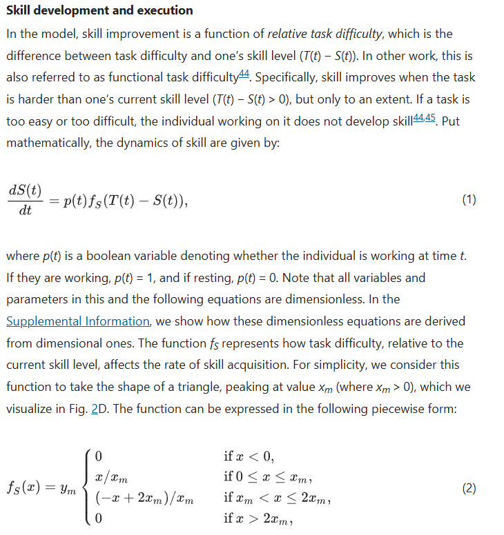
Differential equation in action
There is some challenging modeling in the paper A first-principles mathematical model integrates the disparate timescales of human learning (5/2/2025), but if nothing else, there is this example of a differential equation with a link to how it was developed that could be useful in a DE course.
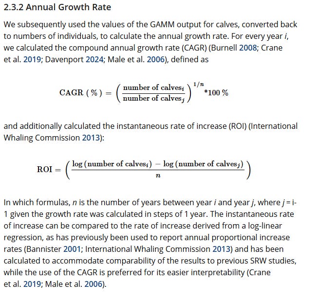
Modeling whale populations
Here are two screenshots from the paper The End of an Era? Trends in Abundance and Reproduction of Australian Southern Right Whales (Eubalaena australis) Suggest Failure to Re-Establish Pre-Whaling Population Size (4/30/2025) to inspire you to explore more if you are looking for an independent study project or examples of modeling.

Please share and like
Sharing and liking posts attracts new readers and boosts algorithm performance. I appreciate everything you do to support Briefed by Data.
Comments
Please tell me if you believe I expressed something incorrectly or misinterpreted the data. I'd rather know the truth and understand the world than be correct. I welcome comments and disagreement. I encourage you to share article ideas, feedback, or any other thoughts at briefedbydata@substack.com.
Bio
I am a tenured mathematics professor at Ithaca College (PhD in Math: Stochastic Processes, MS in Applied Statistics, MS in Math, BS in Math, BS in Exercise Science), and I consider myself an accidental academic (opinions are my own). I'm a gardener, drummer, rower, runner, inline skater, 46er, and R user. I’ve written the textbooks “R for College Mathematics and Statistics” and “Applied Calculus with R.” I welcome any collaborations.