Classroom connections May 25, 2024
Links to data, modeling, and examples of math and statistics applications
Classroom connections are less something you can apply right away and more of me pointing out resources. I believe that there is a lot of amazing math, statistics, and data out there that might be used in math classrooms and is also interesting to the curious. Some of these examples may require some effort to be classroom-ready, and some of this has appeared in previous posts. I’m ordering this roughly based on the level of math. Please let me know if you or someone you know uses any of this in the classroom or has a relevant idea (email me at thomas.pfaff@sustainabilitymath.org). Really, leave a comment or send me an email if these classroom connection posts are useful. Similarly, if you have an opinion or concept that is relevant, please share it in the comments. Please share, like, subscribe, and feel free to comment.
Statistics warmups
What better than ready-to-use quick statistics activities for a statistics or quantitative class? They are ready and waiting. The Census Bureau has a Warm-Up Activities page for statistics. There are currently 27 activities to:
Jump-start your class with these activities. Each one takes approximately 5 minutes to complete, demonstrates the value of data, and inspires discussion about a specific subject.
The landing page looks like this:
Read these graphs
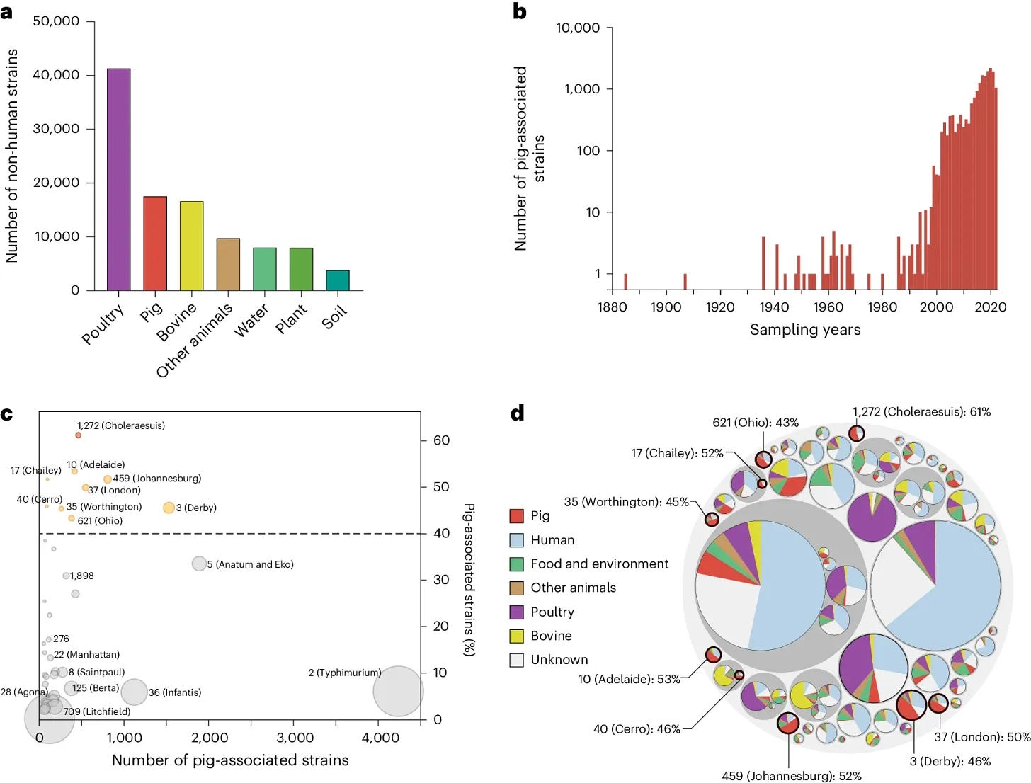
I used the paper Centralized industrialization of pork in Europe and America contributes to the global spread of Salmonella enterica (5/9/2024) in QTRS (5/16/2024). I’ll show the graph here again because I think reading these charts would make a good exercise for a statistics or quantitative literacy course.

Regressions and residuals
I mentioned the paper Suicide in National Collegiate Athletic Association athletes: a 20-year analysis (5/2/2024) in QTRS (5/16/2024). From the perspective of a statistics course, the male suicides look like a line isn’t a good choice. Data has to be requested but one could sketch a residual plot from the graph and discuss better models. A curve? Piecewise with two lines?
Regression data and modeling
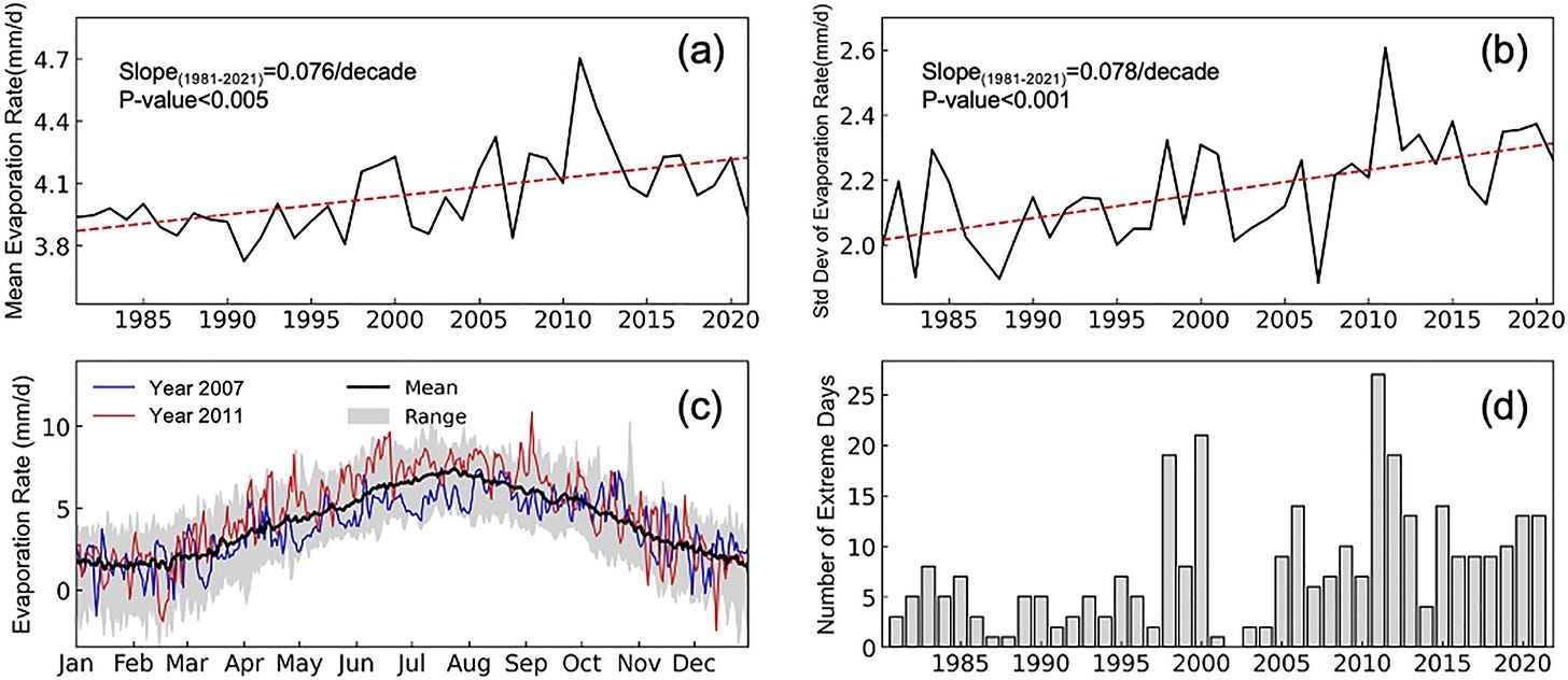
Developing a General Daily Lake Evaporation Model and Demonstrating Its Application in the State of Texas (3/11/2024) has some nice modeling but also the data for regression, as seen here:
What you don’t see very often in (b) is the trend of the standard deviation of evaporation. These charts could be used in an introduction to statistics course where questions are asked to interpret the information.
Honeybees, modeling, and an inflection point
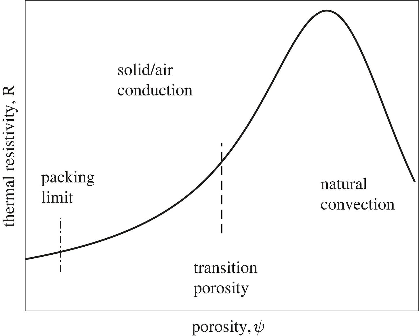
The paper Honeybee cluster—not insulation but stressful heat sink (11/22/2023) has some neat differential equation modeling, but it also has this graph:
The transition porosity is an inflection point. This gives an idea of what is going on:
When the distance between the objects is relatively large (porosity close to 1) then convection currents, set up within the air between the objects, dominate the heat transfer. These currents decrease as the porosity decreases. When the porosity falls below a particular value (dependent on the gas properties, temperature differences, geometry, etc.), the convection currents stop, then heat transfer takes place by conduction only, both though the air and importantly, the objects. As the porosity decreases further, the thermal conductivity becomes more like the object and less like that of air. If the objects have a high conductivity compared with air, it results in a variation of thermal resistance to porosity like that shown in figure 2, where the thermal resistance peaks near the cessation of convection currents and falls on either side, at lower porosities due to conduction, at higher porosities due to convection. The porosity has a lower limit determined by geometry of the objects.
Triple integral and slope field
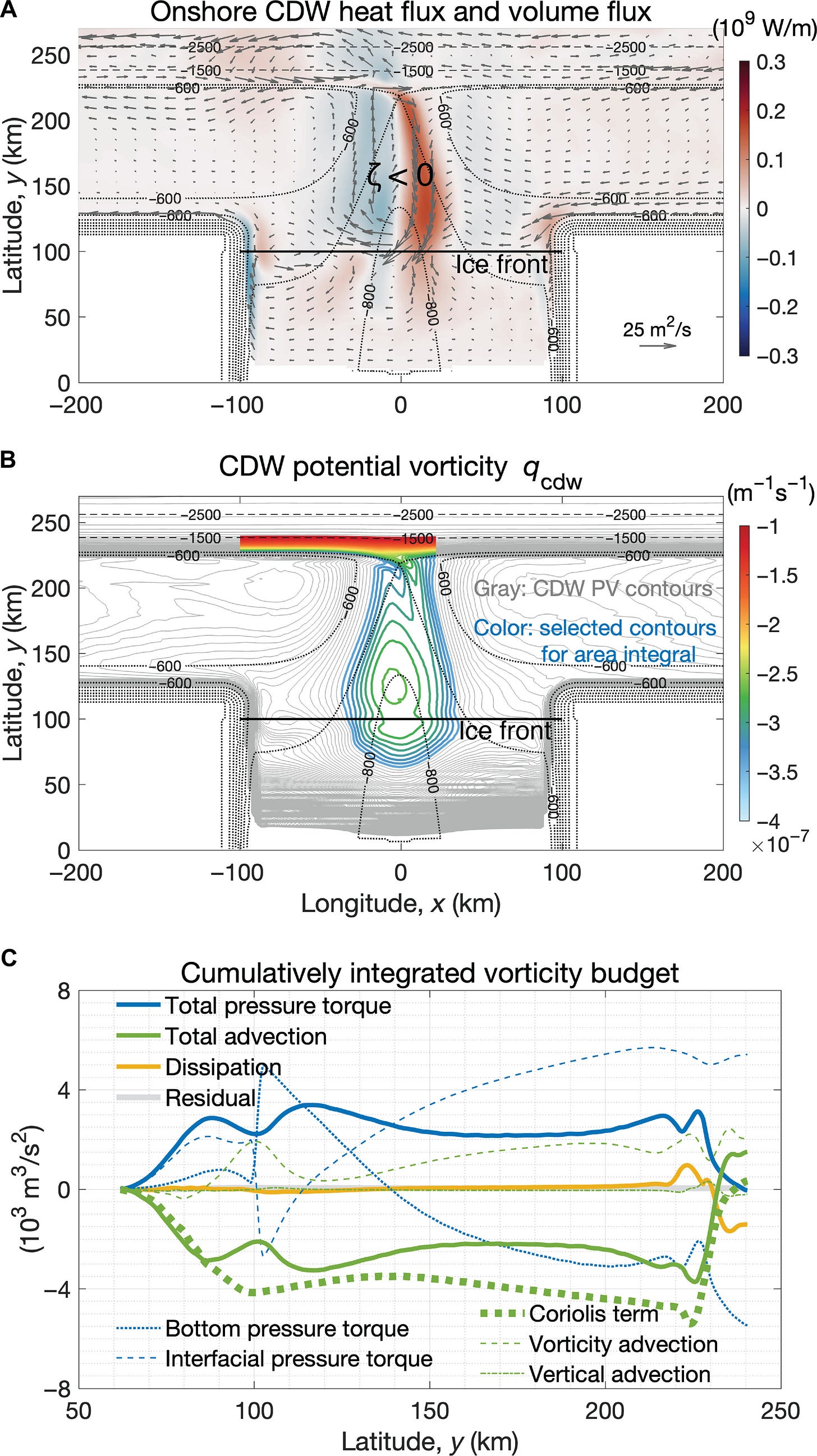
One might turn Antarctic Slope Undercurrent and onshore heat transport driven by ice shelf melting (4/17/2024) into a challenging independent project, but if not, you can give an example of a triple integral used in modeling
and a slope field:
UMAP vs t-SNE
The page Understanding UMAP has a number of interactive charts to help understand dimension reduction by UMAP or t-SNE. They are fun to play with, even if you don’t know much about the topic, but they are very useful for teaching about dimension reduction.
Dimensionality reduction is a powerful tool for machine learning practitioners to visualize and understand large, high dimensional datasets. One of the most widely used techniques for visualization is t-SNE, but its performance suffers with large datasets and using it correctly can be challenging.
UMAP is a new technique by McInnes et al. that offers a number of advantages over t-SNE, most notably increased speed and better preservation of the data's global structure. In this article, we'll take a look at the theory behind UMAP in order to better understand how the algorithm works, how to use it effectively, and how its performance compares with t-SNE.
Please share and like
Please help me find readers by forwarding this article to your friends (and even those who aren't your friends), sharing this post on social media, and clicking like. If you're on Twitter, you can find me at BriefedByData. If you have any article ideas, feedback, or other views, please email me at briefedbydata@substack.com.
Thank you
In a crowded media market, it's hard to get people to read your work. I have a long way to go and I want to say thank you to everyone who has helped me find and attract subscribers.
Disagreeing and using comments
I'd rather know the truth and understand the world than always be right. I'm not writing to upset or antagonize anyone on purpose, though I guess that could happen. I welcome dissent and disagreement in the comments. We all should be forced to articulate our viewpoints and change our minds when we need to, but we should also know that we can respectfully disagree and move on. So, if you think something said is wrong or misrepresented, then please share your viewpoint in the comments.


