

Constructing a datasauRus data set
An animation and R code

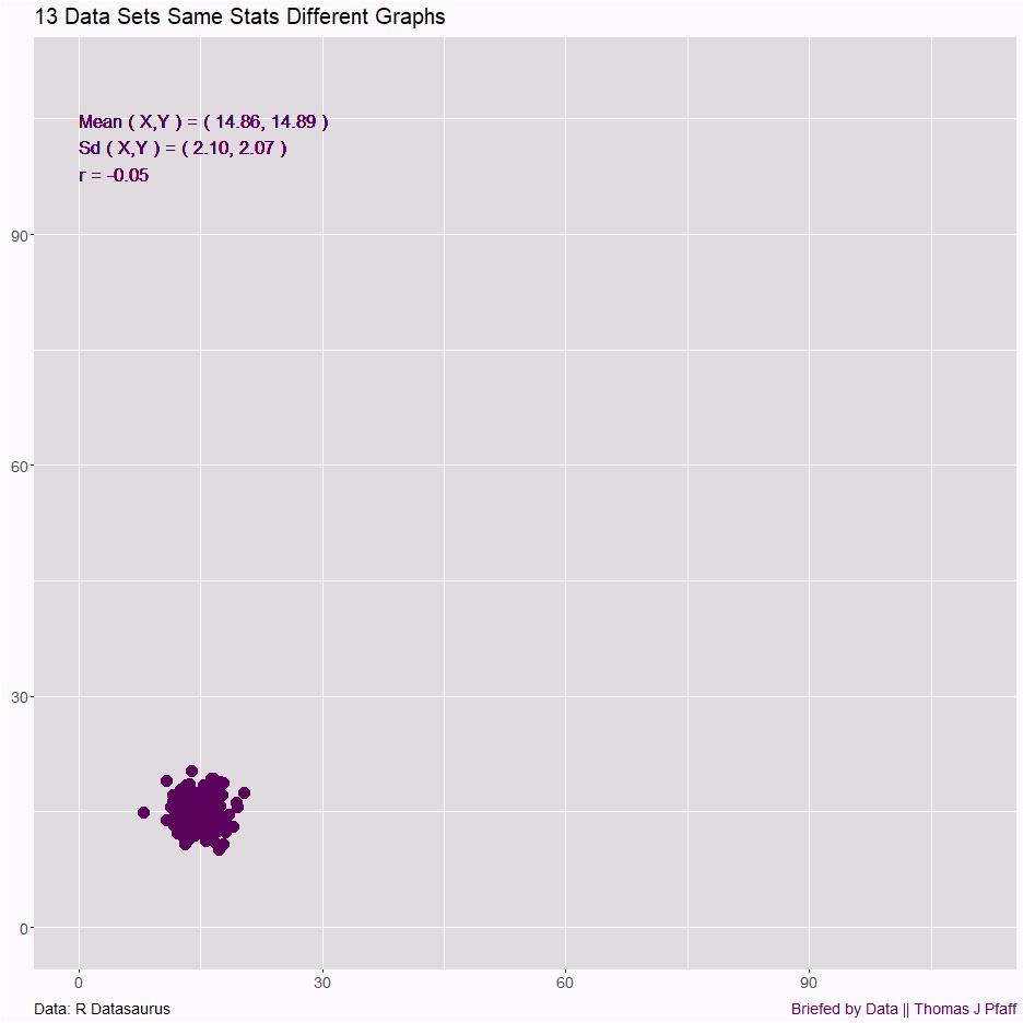
In December I posted This is why you must graph data (12/14/2024), which animated the data from the R package datasauRus, which was created by Alberto Cairo. If you missed it, Figure 2 below has the animation. If you are interested in the details, I noted that you can read Same Stats, Different Graphs.
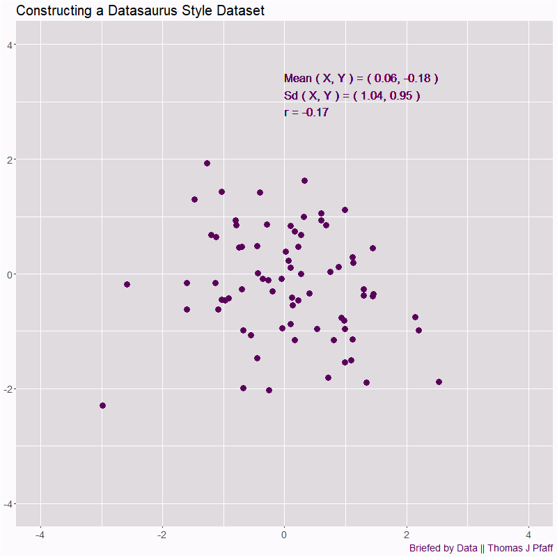
With the help of a colleague, we looked to create simple code to get the idea of how the data was constructed. The goal would be to have code that runs fairly quickly and is easy enough to follow. Figure 1 has an animated example of what was done.
If you enjoy this post and data in general, please consider subscribing and sharing this post.
We start with 75 random points where both the x and y values are drawn from a standard normal distribution.
X <- rnorm(n)
Y <- rnorm(n)
You then randomly move each point by a small amount towards your desired shape, in this case a circle with radius one centered on the origin.
error <- 0.01
X <- rnorm(n)
Y <- rnorm(n)
A <- X
B <- Y
R <- rnorm(n,error,5*error)
XD <- R*A*(1/sqrt(A^2+B^2)-1)
YD <- R*B*(1/sqrt(A^2+B^2)-1)
Now, check to see if the proposed new points have the same statistical values as the original ones. If so, keep them and repeat.
select <- sqrt(A^2 + B^2) > 1.1

  if(max(abs(mean(X)-mean(A+XD)),
         abs(mean(Y)-mean(B+YD)),
         abs(sd(X)-sd(A+XD)),
         abs(sd(Y)-sd(B+YD)),
         abs(cor(X,Y)-cor(A+XD,B+YD))
        ) < 0.01 &
     max( pmax( sqrt( A[select]^2 + B[select]^2 ) -
                sqrt( (A[select]+XD[select])^2 +
                      (B[select]+YD[select])^2 ))) < 0.06
    ) {
    A <- A+XD
    B <- B+YD
    moves <- moves+1
  }
This almost works, but we found that you get points that stray far away to compensate for moving all the other points around. In the code above, any point that was more than 1.1 units from the origin, we limited how far away they could move (the 0.06). This helps, but you can see in Figure 1 that some points don’t fall in line. The problem is the more you make this restriction smaller, the more iterations you’d have to do.
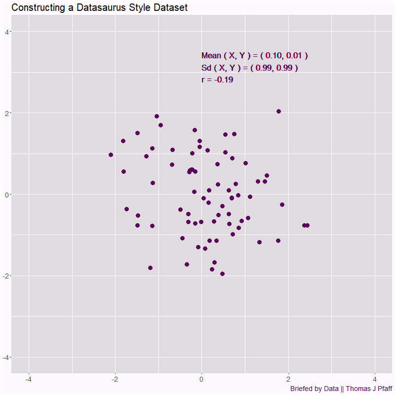
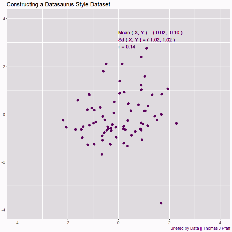
The full code is available on my GitHub page, or go to DatasauRus-Construction-Animation. It took a few trials to get a decent animation. Two other trials are in Figures 3 and 4.
Two extra runs to perturb the data.
Please share and like
Sharing and liking posts attracts new readers and boosts algorithm performance. I appreciate everything you do to support Briefed by Data.
Comments
Please let me know if you believe I expressed something incorrectly or misinterpreted the data. I'd rather know the truth and understand the world than be correct. I welcome comments and disagreement. We should all be forced to express our opinions and change our minds, but we should also know how to respectfully disagree and move on. Send me article ideas, feedback, or other thoughts at briefedbydata@substack.com.
Bio
I am a tenured mathematics professor at Ithaca College (PhD Math: Stochastic Processes, MS Applied Statistics, MS Math, BS Math, BS Exercise Science), and I consider myself an accidental academic (opinions are my own). I'm a gardener, drummer, rower, runner, inline skater, 46er, and R user. I’ve written the textbooks “R for College Mathematics and Statistics” and “Applied Calculus with R.” I welcome any collaborations.