


Food inflation and wages
A little nuance to a complicated story

Kevin Drum’s post, Food inflation is close to zero (4/13/2024), is a response to a CBS News report saying (bold by Drum):
Prices in March rose 3.5% from a year ago, accelerating inflation for the third straight month. For U.S. consumers, that means spending more, but actually buying less. CBS News' (at)jolingkent breaks down prices where some Americans are feeling it the most: the grocery store.
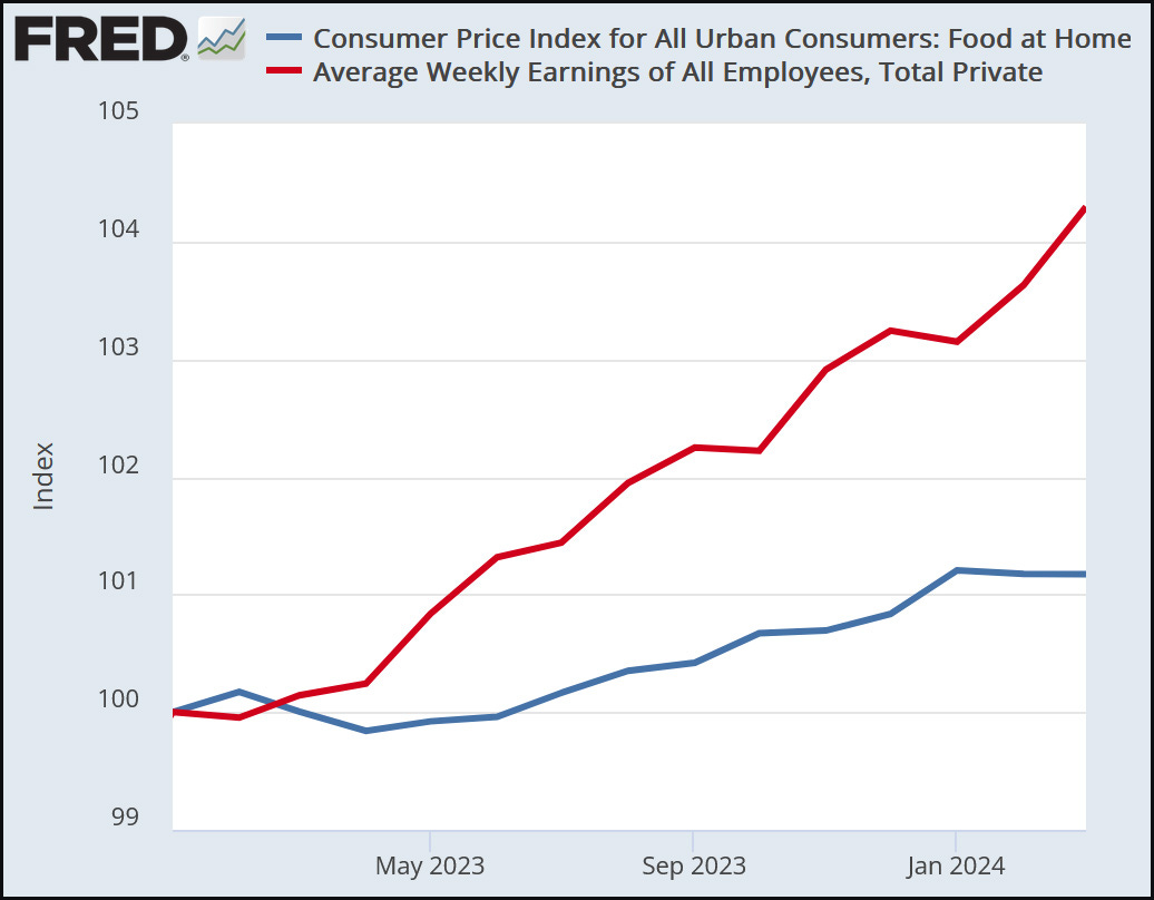
Now Drum is correct in noting that average wages and food inflation have been close this past year and provides a BLS graph to prove it (Figure 1) and notes
Since the start of 2023, the price of food has increased 1.2%. Average earnings have gone up 4.3%.
I have two issues here. First, average earnings beating out food inflation doesn’t imply that everyone’s earnings are beating out food inflation. In other words, we need to apply the data rule “know the distribution, not just the mean and median.”

Figure 2 has the original data from Figure 1 in the red and blue lines but adds weekly earnings for different groups and percentiles. Unfortunately, that data stops in Oct 2023, but it still serves our purpose. The additional lines are not seasonal-adjusted data, but we can still get the idea. The black line is the median for all workers aged 25 and older. Interestingly, it is above the mean of all employees. Lines with squares are high school graduates, and triangles are college graduates. Note the bright pink line, which is the third quartile of college graduate earnings and is below food at home. The main point here is that just because the average wage is above food inflation, that doesn’t mean everyone is.
This doesn’t excuse the CBS news story because it is generally wrong. On the other hand, the newsroom is dominated by those with a college degree, so maybe the story isn’t surprising, and we know the media doesn’t do much research.
My second issue is the time period. Sure, maybe folks have done okay for the last year, partly because food inflation has been flat, but that doesn’t mean they have caught up from the last few years. Drum, in his story, gives a second graph that starts before the pandemic, and the results are similar to Figure 1. I’m not sure why he chose that, as I think a good place to start is when food prices started increasing in 2021.
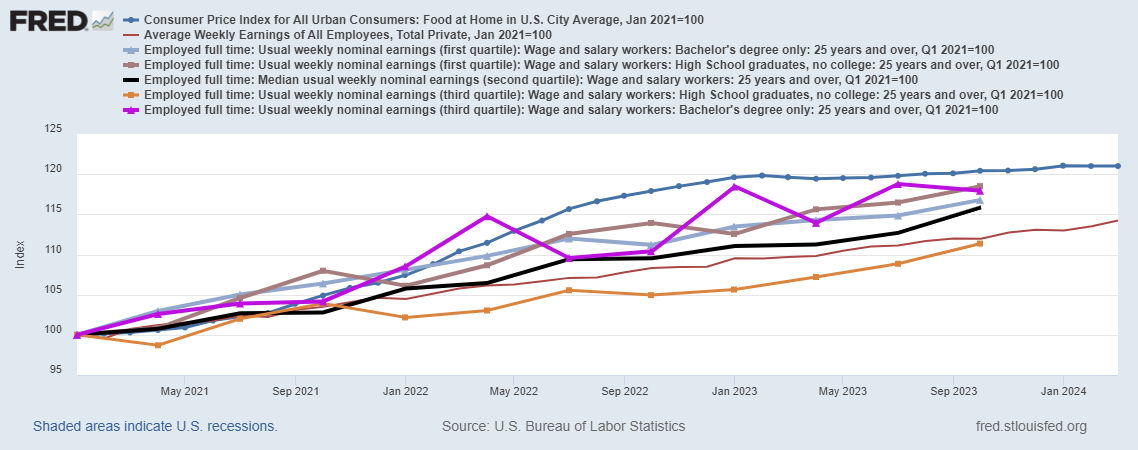
Figure 3 starts in 2021 and has the same groups as in Figure 2. Now none of the groups have had their wages catch up to food. In some sense, the CBS story is correct in spirit. People still see food inflation as a problem because their wages over the last few years haven’t caught up, even if the last year has been a win.
The interesting thing here is the psychology of inflation and matching that with the correct time period. If your wage fell below food inflation 20 years ago but that loss has remained constant for the last 15 years, is that something people would still know about or be upset about? Probably not. On the other hand, I would think that people are still aware of the inflation pressures and losses over the last few years, especially given how quickly food prices went up.
How much a household spends on food is one last thing to take into account in all of this. I don’t really worry much about rich people’s salaries lagging behind food inflation, but this is a big deal for poor people.
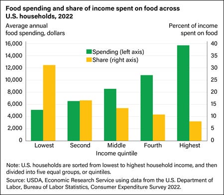
Figure 4 is from the USDA article Food Prices and Spending (2/14/2024). For those in the lowest quintile of income, food consumes 30% of their income, even though they spend less than all other groups on food. Moving to the second income quintile cuts food expenditures almost in half to just over 15% of income. In other words, the lowest-income group is very sensitive to food inflation. In Figure 3, the first quintile group’s wages aren’t that far behind food inflation since 2021, but that small gap has a big impact on their lives.
In my mind, neither Drum nor CBS did justice to this issue. In fact, I would say I’ve only scratched the surface. For example, food inflation itself is not simple to measure, as an increase in different foods may impact different groups more or less. Hopefully, I’ve added a bit of nuance to the issue, and FRED does have price increases for specific food products if you want to explore, or maybe I’ll get to this someday.
Please share and like
Please help me find readers by forwarding this article to your friends (and even those who aren't your friends), sharing this post on social media, and clicking like. If you're on Twitter, you can find me at BriefedByData. If you have any article ideas, feedback, or other views, please email me at briefedbydata@substack.com.
Thank you
In a crowded media market, it's hard to get people to read your work. I have a long way to go and I want to say thank you to everyone who has helped me find and attract subscribers.
Disagreeing and using comments
I'd rather know the truth and understand the world than always be right. I'm not writing to upset or antagonize anyone on purpose, though I guess that could happen. I welcome dissent and disagreement in the comments. We all should be forced to articulate our viewpoints and change our minds when we need to, but we should also know that we can respectfully disagree and move on. So, if you think something said is wrong or misrepresented, then please share your viewpoint in the comments.
Professor! I was thinking that a better comparison would be CPI against Real Median Household Income. I know it takes some time until the data gets published... I wonder if Census has a proxy. And my reason on recommending such variable is because most employees (I believe) have dependents. So, the game is not about an employee beating inflation, but the household.
Thank you for your blog, always a pleasure to read it.