GDP and Fertility
An interesting animation
Sometimes, I become curious about data but am unsure whether I will discover anything meaningful. I figured there should be some relationship between declining fertility and GDP per capita. There is also likely a long lag, as once fertility goes below replacement, a country’s economy is likely to shrink unless there is immigration to maintain population.
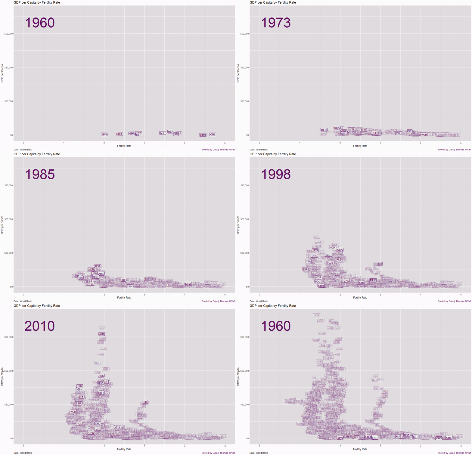
To explore this relationship, I created an animated graphic with fertility on the x-axis and GDP per capita, animating over time. I started with OECD countries but had to reduce the number of countries further to keep the graphic from becoming too cluttered. I chose countries that I thought people would find interesting and that were somewhat representative of various countries' behaviors.
The data, which includes GDP in current US$ and fertility rates, is sourced from the World Bank and covers the period from 1960 to 2023. The data, including countries I didn’t use, is available on GitHub, as well as the R code to produce the graphic (one can easily add or subtract countries).

There is no obvious relationship between fertility rate and GDP per capita, but there is ample intriguing information and plenty of questions. Mexico's fertility rate dropped quickly after it entered the graph in 1980 at a rate of 5 per woman.
All countries see a general trend of decreasing fertility rates, except for Israel, which has held steady at around 3. Countries such as USA, NOR, IRL, and AUS have stayed closer to a fertility of 2, near replacement, and have pushed their GDP per capita higher than those closer to 1.5, such as JPN, DEU, ITA, and ESP. Did a well below replacement fertility play a role? I believe the answer is yes, and I’m sure there is research available on this topic. You can also see the general drop in GDP in the recession year of 2008.
Please let me know your thoughts in the comments. I’m also open to suggestions for other animations. Maybe GDP vs. population? What else?
Please share and like
Sharing and liking posts attracts new readers and boosts algorithm performance. I appreciate everything you do to support Briefed by Data.
Comments
Please tell me if you believe I expressed something incorrectly or misinterpreted the data. I'd rather know the truth and understand the world than be correct. I welcome comments and disagreement. I encourage you to share article ideas, feedback, or any other thoughts at briefedbydata@substack.com.
Bio
I am a tenured mathematics professor at Ithaca College (PhD in Math: Stochastic Processes, MS in Applied Statistics, MS in Math, BS in Math, BS in Exercise Science), and I consider myself an accidental academic (opinions are my own). I'm a gardener, drummer, rower, runner, inline skater, 46er, and R user. I’ve written the textbooks “R for College Mathematics and Statistics” and “Applied Calculus with R.” I welcome any collaborations, and I’m open to job offers (a full vita is available on my faculty page).


The times when fertility rises in these countries seem to be mainly when GDP per capita is rising quickly. (Slight rightward lean to the up-surges). Not every time, but the boxes seem more inclined to drift to the right only when they are rising if at all.
Not every upward surge drifts rightward (Japan), but the overall leftward drift of fertility seems more noticeable when GDP/capita isn't rising very quickly, or is falling. (Norway, USA)
Would a semilog chart show things better? (log GDP per capita.)
I wish I had the coding chops to display panel data like this. A famous example is Hans Rosling: https://www.youtube.com/watch?v=hVimVzgtD6w&t=176s
It's awesome to hear a data scientist say "Start the world!"