


In October, I responded to a New York Times piece claiming that global warming is accelerating. For a long time, yearly or monthly temperature anomalies have been growing more than linearly, roughly quadratically. In other words, global warming has been accelerating. This isn't anything new. The Washington Post has now joined the fray with a story. Is climate change speeding up? Here’s what the science says. This year’s record temperatures have some scientists concerned that the pace of warming may be accelerating. But not everyone agrees. (12/26/2023).
I'm going to argue that it's not only not speeding up, but that it's really slowing down. Let me first address a couple points in the article.
For the past several years, a small group of scientists has warned that sometime early this century, the rate of global warming — which has remained largely steady for decades — might accelerate.
This is nonsense. Figure 1 is a graph from the 2007 IPCC report. The IPCC stated in 2007 that the global mean temperature was increasing at a quicker rate. The red line increased at a rate of 0.045 °C per decade, while the yellow line increased at a rate of 0.177 °C per decade. In calculus terms, the data is concave up.

When the Washington Post includes this graph, Figure 2, they aren’t doing anything that hasn’t been done before. One issue with using yearly temperatures is that ENSO status cannot be displayed because it is measured on a monthly rather than yearly scale. Because ENSO has such a large impact on global temperature, I believe you should look at monthly data. I'll get to that eventually.

The rest of the first paragraph is this:
Temperatures could rise higher, faster. The drumbeat of weather disasters may become more insistent.
This is simply more climate alarmism, and I don’t think this helps anyone. I’ll repeat this from last Thursday’s Quick Takes
This, What If People Don’t Need to Care About Climate Change to Fix It? (12/28/2023) is a great interview with Dr. Hannah Ritchie, editor of Our World in Data (which is great) and author of the upcoming book, “Not the End of the World.”
The real question is buried in the article.
But the data is murkier when it comes to whether the pace of warming over the past few decades has quickened even more — an increase that could accelerate the wildfires, floods, heat waves and other impacts around the globe. It may require more years of evidence to clear the statistical hurdles that climate science demands.
In calculus terms, we are asking if there is more concavity in the data now than before (ignore the alarmist parts of the quote). In other words, does the data represent a steeper quadratic shape than earlier? I don’t think so, and in fact, the opposite appears to be true. To clarify the question, consider Figure 3.

I applied two quadratic fits to the data (similar to regression lines but with an x^2 function), each stopping at a different point. I stopped one at a low La Niña month, Dec. 2022, and the other at a higher El Niño month, Feb. 1998. These dates were chosen to illustrate the point here. I used only the data up to those dates for each curve. Note that the curve that ends in 1998 would predict a warmer December 2022. In comparing the two curves in terms of calculus, the tangent line to the curve that ends in February 1998 is steeper than the tangent line to the curve that ends in December 2022. The implication here is that temperatures were increasing faster in 1998 than in 2022. The issue here is that the curve fit to the data will fluctuate depending on where it ends. If we end during an El Niño, it is going to be steeper than ending during a La Niña period.
I used a quadratic fit to the data from 1950 to the month shown on the x-axis in Figure 4. At the end of the quadratic function, I determined the slope of the tangent line. In other words, the y-axis represents the rate of climatic change at the end date on the x-axis from 1950 to the x-axis date using a quadratic fit.
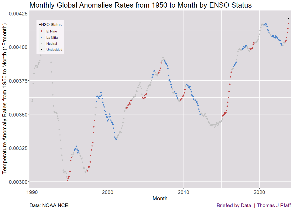
For example, for March 2000, we have a dot at 0.00350°F per month. In other words, if we go back to March 2000 and use the data from 1950 until then, we would estimate that warming is happening at a rate of 0.00350°F per month.
A few words regarding Figure 4. There appears to be a lot of variation; however, keep in mind that the y-axis range is fairly small. Second, notice how the graph generally decreases during La Niña periods and increases during El Niño periods. The graph's general trend is rising, as expected, because global temperatures are rising about quadratically. However, we would expect this graph to be roughly linear (a quadratic's derivative is linear), and it appears to have a slight concave down form. This shows that global warming may be slowing. This is difficult to observe in this graph, so let's switch to Figure 5.

Figure 5 uses the quadratic fits to the data from Figure 4, but extrapolates them out to 2050. For example, if we applied a quadratic fit to the data from 1990 to January 2010 and utilized the curve to forecast the temperature anomaly in 2050, we would expect a 3.6°F anomaly. Overall, the trend is downward. Yes, it rises during El Niño events and falls during La Niña events. As we have more data, we have less variability. Take note of how the data steadied at 3.5°F from about 2017 to 2021. An extended La Nia period beginning around 2021 dropped the prediction slightly, whereas the present strong La Nia has raised it a little.
My current takeaway is that the data indicates a slowing of temperature increases. It's possible that there are underlying changes that the data hasn't picked up on yet that indicate a faster rate of global temperature rise. However, based on current data, my forecast for 2050 is a bit less than 3.5°F, depending on the ENSO condition. This is bad enough as it is, and we don't need alarmism to make it appear even worse.
Another graph about ENSO. Figure 6 is similar to Figure 5, but I only used data from months with an El Niño status.

There are a few things to note about Figure 6. As with Figure 5, we have a downward trend, suggesting that warming is slowing. The predictions are higher than when using all of the data as expected because El Niño months are warmer. At the end of the graph, we have a prediction for 2050 of an anomaly of just under 5°F, a good 1°F more than when using all of the data. In other words, ENSO has a significant influence on temperature. We can't talk about global temperatures without including ENSO.
Back to the Washington Post article with a quote and another graph, Figure 7.
Richardson looked at each 30-year trend in the NASA temperature record, starting with the period from 1880 to 1909 and ending with the period from 1994 to 2023. Higher values indicate higher rates of global warming. Here, we show the result from the period between 1941 and 1970 onward, to better tease out how the rate of warming changed in the second half of the 20th century, and whether it is still changing now:
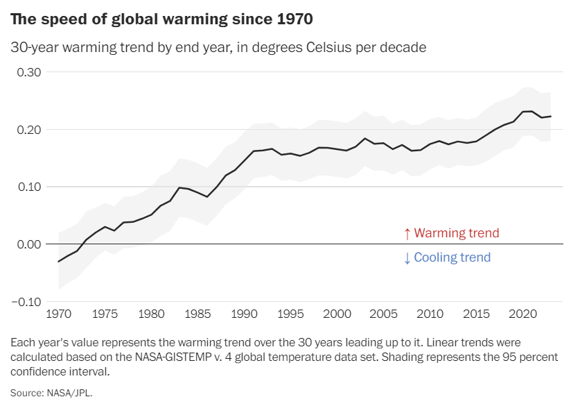
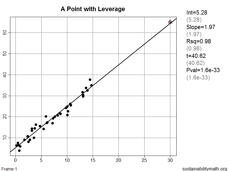
I'd want to make two observations about Figure 7. The first is that an ENSO event at the beginning or end of the time period could affect the regression over 30 years. This is referred to as leverage (see Figure 8, which I created many years ago and should update). For example, suppose a 30-year span begins with La Niña and ends with El Niño. In this case the regression line would be steeper. Second, we know that temperature increases have been accelerating (see Figure 1); hence, Figure 7 should show a linear increase. It is slower than that, indicating that temperature increases are slowing.
Thanks for reading this one. If I’m wrong about temperature increases slowing down, then I’d like to know where I’m wrong. However, in the above-mentioned Hannah Ritchie interview, she stated:
We’re currently on track for two and a half to three degrees, which is a terrible position to be in. That is catastrophic. Part of why I have optimism is that if you look at the trajectory we’re on, a decade ago it was in the range of three and a half to four degrees. We’ve chopped a degree off our trajectory based on solutions that we’ve implemented, but that’s not enough.
It's strange to me that there's such a divide about whether or not temperature rises are accelerating or slowing. Part of the problem is that typical journalists don’t have the quantitative background for what they are writing, along with a preferred narrative.
Please share and like
Please help me find readers by forwarding this article to your friends (and even those who aren't your friends), sharing this post on social media, and clicking like. If you're on Twitter, you can find me at BriefedByData. If you have any article ideas, feedback, or other views, please email me at briefedbydata@substack.com.
Thank you
In a crowded media market, it's hard to get people to read your work. I have a long way to go, and I want to say thank you to everyone who has helped me find and attract subscribers.
Disagreeing and using comments
I'd rather know the truth and understand the world than always be right. I'm not writing to upset or antagonize anyone on purpose, though I guess that could happen. I welcome dissent and disagreement in the comments. We all should be forced to articulate our viewpoints and change our minds when we need to, but we should also know that we can respectfully disagree and move on. So, if you think something said is wrong or misrepresented, then please share your viewpoint in the comments.