


K-12 Spending and Results—Part 2
Adjusted state scores, animations, R code

I hadn’t originally intended to create a follow-up post on K-12 spending and results (6/10/2025), but reader JG directed me to the adjusted reading and math scores published by the Urban Institute. Why adjust the scores? They explain:
NAEP is the only nationally comparable measure of student achievement that is reported for every state on a regular basis, but comparing states’ NAEP scores is misleading for many purposes because states serve very different student populations. For example, more than 20 percent of children live in poverty in Alabama and Mississippi, compared with less than 10 percent in New Hampshire and Vermont.
We determine these adjustments by calculating how each individual student who takes the NAEP scores relative to students nationwide who are the same gender, age, and race or ethnicity and have the same free and reduced-price lunch receipt status, special education status, and English language learner status.
The Urban Institute’s adjusted scores are a fairer way to compare state performances. I have four graphs today. The first two are the adjusted scores for math and reading based on total school spending. These two graphs show who performs best relative to their demographics, but they don’t show who is overperforming or underperforming relative to demographics. To illustrate this, I’ve added two animations that display which states perform better or worse after adjusting for demographics.
The data is from the Census Bureau, the Nation’s Report Card, and the Urban Institute mentioned above. State political leanings are from the Cook’s Partisan Voting Index (PVI). The most recent PVI had Michigan and Wisconsin as even, and so I coded them based on their previous PVI result. The graphs and animations' data and R code are on GitHub.
Let’s go to the data.
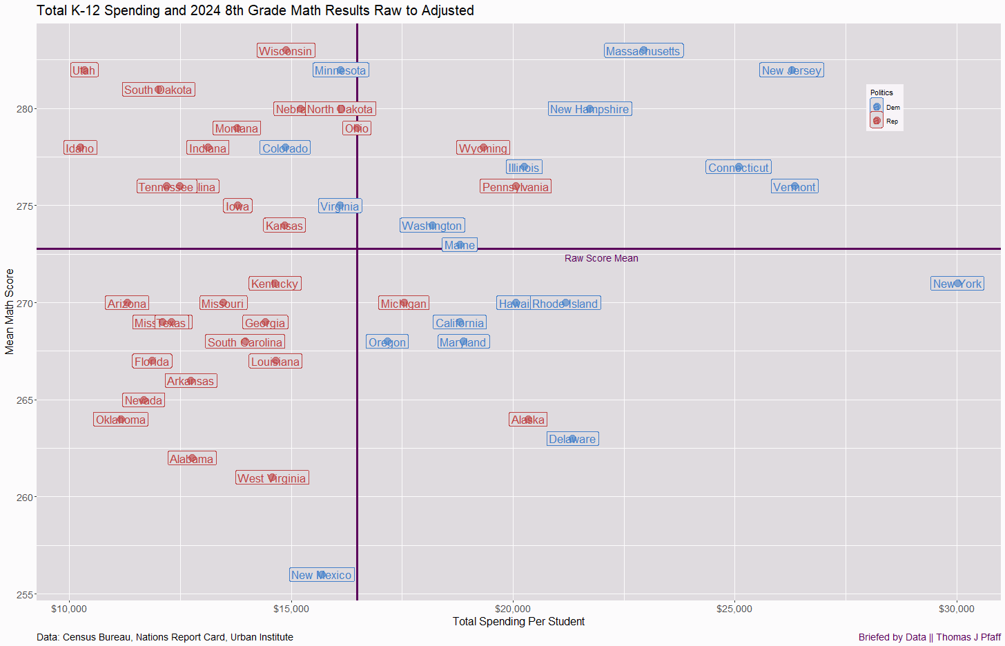
Math scores
Figure 1 shows that Mississippi has the best math scores when adjusted for demographics, despite being in the bottom 10 in spending. Meanwhile, only five blue states are above average. despite generally spending above average. New York spends the most money on slightly below average results. Some of the spending differences are due to cost of living; still, only one blue state got into the top left quadrant (below spending, above scores), while the bottom right (high spending, low scores) is dominated by blue states. Everyone should be talking to Mississippi to learn a thing or two.

Figure 2 is an animation that moves each state from its raw 8th grade math score to the adjusted score. Notice how the states in the top right (high spending, high scores) all drop except for Illinois. Most of these are blue states, but the red states also dropped. We have a similar effect in the top left. It seems that most states that score well at first are helped by demographics, and once we adjust for that, their scores drop, some by quite a lot—New Hampshire, for example. Let me know what you see in the comments.
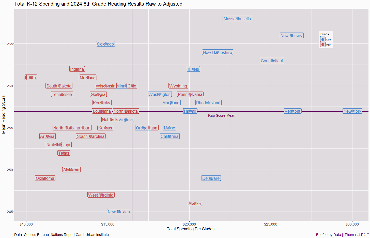
Reading scores
Mississippi achieves “only” a top 4 score here, but it spends the least amount of money to reach that result. Massachusetts deserves some recognition. Yes, Massachusetts is a top spender, but at least it achieves results: first place for reading and second place for math. Other than that, the results are very similar. Red states spend less, blue states more. Despite this, red states hold a majority of above-average adjusted scores. The key takeaway is that we have evidence that spending isn’t going to improve education alone. There are clearly other factors, as there always are.

Figure 4 is the corresponding animation for reading, similar to Figure 3 for math. The patterns are similar to those for math. Above-average raw scores drop as we move to adjusted scores, except for Illinois. Similar to math, Mississippi shows significant improvement. Note New Mexico in both graphs; although still below average, its scores increased a lot. Let me know what you see in the comments.
Please share and like
Sharing and liking posts attracts new readers and boosts algorithm performance. I appreciate everything you do to support Briefed by Data.
Comments
Please tell me if you believe I expressed something incorrectly or misinterpreted the data. I'd rather know the truth and understand the world than be correct. I welcome comments and disagreement. I encourage you to share article ideas, feedback, or any other thoughts at briefedbydata@substack.com.
Bio
I am a tenured mathematics professor at Ithaca College (PhD in Math: Stochastic Processes, MS in Applied Statistics, MS in Math, BS in Math, BS in Exercise Science), and I consider myself an accidental academic (opinions are my own). I'm a gardener, drummer, rower, runner, inline skater, 46er, and R user. I’ve written the textbooks “R for College Mathematics and Statistics” and “Applied Calculus with R.” I welcome any collaborations.