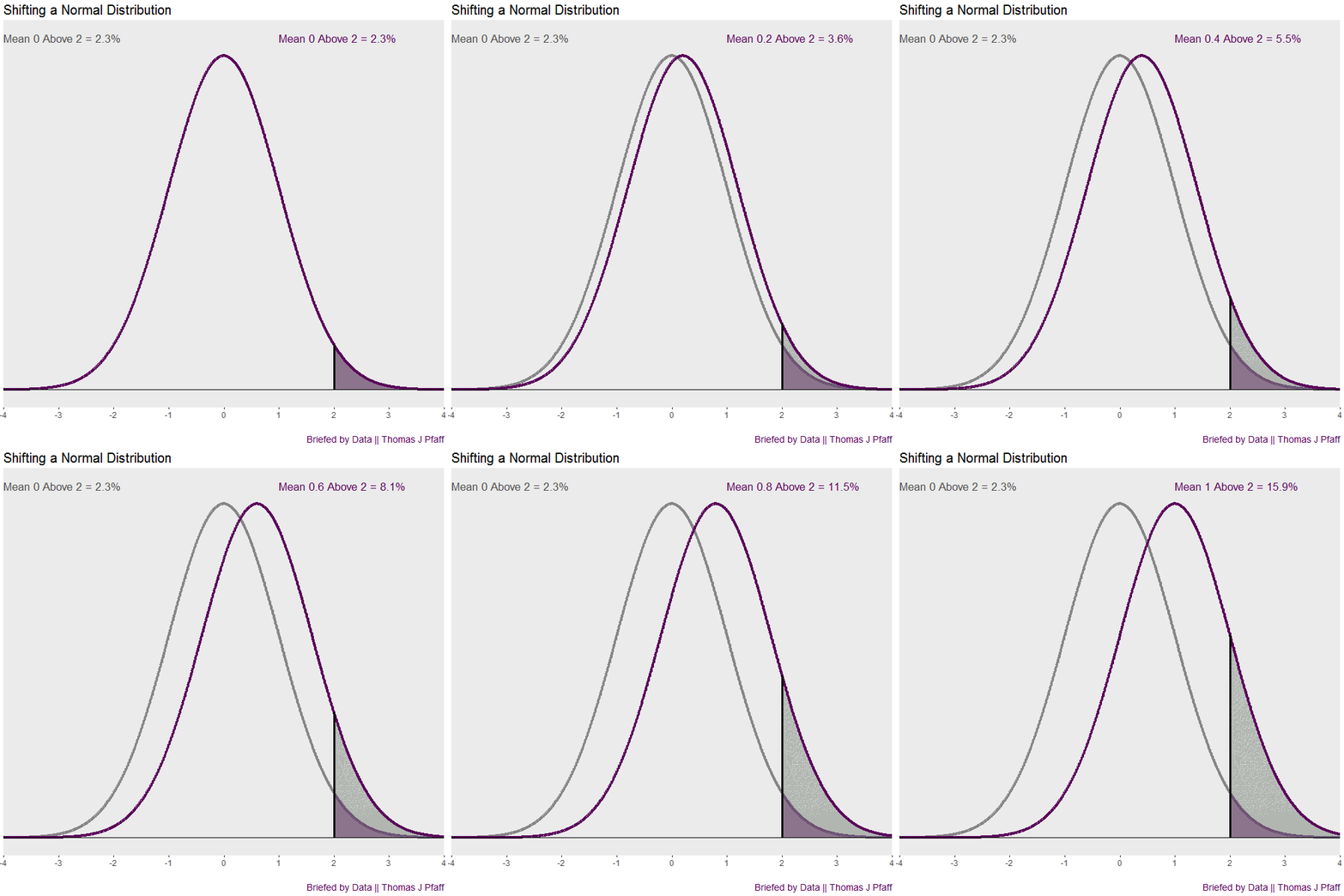
The normal density, or bell curve, is a well-known distribution. It is the foundation of typical first-semester statistics courses. Unfortunately, comparing two normal densities is not so common. Let’s start with an example and return to the cool animation in figure 1.
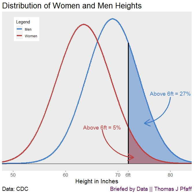
The Centers for Disease Control and Prevention (CDC) reports that the average height of a woman in the United States who is 20 years old or older is 62.5 inches (5' 3.5''), with a standard deviation of 5.2 inches. The average height of males was found to be 69.0 inches (5' 9''), with a standard deviation of 5.0 inches. The difference is more than one standard deviation, and it is fair to assume heights are normally distributed or at least close. There is, of course, some overlap, given that there are a significant number of women who are taller than men. But what about people who are considered “tall”?
Figure 2 shows normal densities for women and men. We can see that there is a significant amount of overlap in heights; but, when we look at people whose heights are above six feet, we find that just five percent of the females are above six feet, whereas twenty-seven percent of the males are above six feet. To put it another way, if there are approximately equal numbers of males and females in the population, for every six people who are taller than six feet there will be five men and one woman.

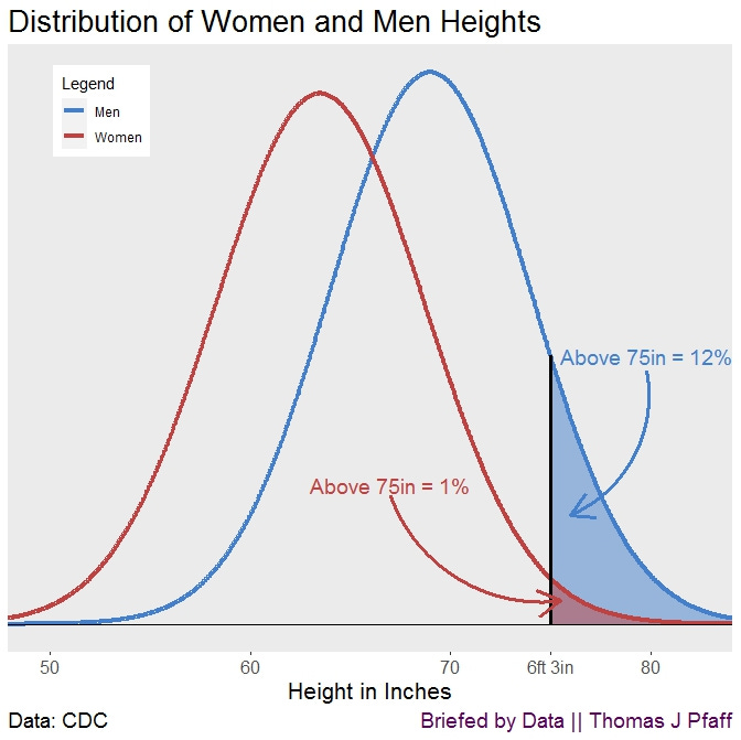
If we look at those above 6 feet 3 inches (Figure 3) the ratio becomes 12 to 1. The takeaway from this is that any characteristic that differs, even by a little, between two groups can cause significant disparities in the tails, and the tails are often where we find the exceptional (in this example, the exceptionally tall).

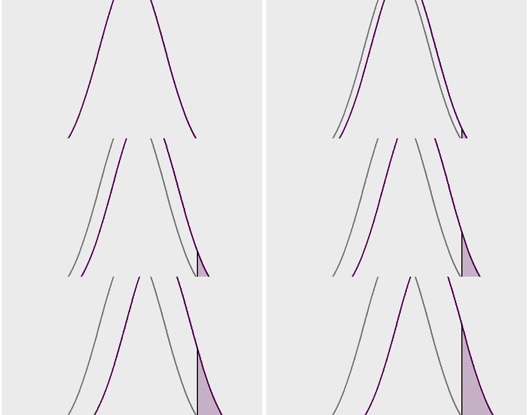
When we look back at Figure 1, we can see that this offers a general illustration of shifting a normal density. The animation demonstrates how rapidly the “tail” of the shifted density expands. The ratio above 2 is 15.9 to 2.3, which is almost 7 to 1, when there is a movement of one standard deviation. That’s the briefing on shifting normal curves and tails.
Please Share
Share this post with your friends (or those who aren't friends of yours) and on social media to help get the word out about Briefed by Data. You may follow me on Twitter at @BriefedByData. Thanks. Cheers, Tom.
References
Data from the National Center for Health Statistics, Vital and Health Statistics Series 3, Number 46. January 2021


