


QTRS Dec 12, 2024
Graphs and interesting content for the curious

If you enjoyed this content, please press the like button above and share it. This really helps spread the word about Briefed by Data. Of course, if you are not already a subscriber, please consider becoming one.
As we are in the holiday season, I’ll ask you to consider becoming a paid subscriber to Briefed by Data. Consider it a gift or tip to a favorite writer. I’d like to keep Briefed by Data free, but at the same time it is a fair amount of work.
As I see it . . .
One of my themes has been that there is no evidence that society is willing to do anything to reduce emmisions. I’m in the camp that climate change is real and outcomes, at some point, are likely to be bad. At the same time, the world keeps burning more fossil fuels and simply wants more of things that require energy. Tuesday’s post showed that we want to fly on planes to places more, with 1 billion travelers coming soon.
In today’s QTRS, we see projections for a major increase in electricity demand, not for electric cars so much but for data centers. We want our AI, our internet, and the ability to save every last picture we take on our phones. Meanwhile, the growth of electric vehicles is small in the U.S., but when we include hybrid vehicles, which still use plenty of gas, it looks better.
As I see it, we need to focus our energy on adaptation to a world with a different climate. The positive news, as you’ll see below, is that there are things we can do, such as rotate crops more. On the other hand, we have to figure out how to deal with the ground in CA compressing due to aquifer depletion and how to feed poor people around the world, which will require more energy. The positive sign to me is that I’m starting to see the word adoption more.
I encourage you to share these posts. I like data, making graphs, and writing. I’m not good at playing the marketing game to spread the word about Briefed by Data. I’m counting on my readers to help me out with that. So please share and like, and what not. It really does help me. If you aren’t a subscriber, please subscribe. It may seem like it doesn’t matter, but subscriber numbers do matter, even if they are subscribing for free. Enjoy today’s post and let me know what you think in the comments. Also, look forward to a cool data animation on Saturday. Cheers, Tom
Electricity demand
Grid Strategies has an updated electricity demand forecast (Dec 2024) for 2029, which is 10% higher than last year’s prediction. Where is the growth coming from?

You might think, Great, we need this for all those electric vehicles. Not so much. The big driver, and you won’t be surprised if you are a regular reader of Briefed by Data, is data centers.
The main drivers are investment in data centers and manufacturing. High-end sector forecasts suggest current load forecasts may not have caught up with growth
• Data center growth forecasts vary, with some tech industry analysts anticipating growth of 65 GW, while updated utility forecasts suggest over 90 GW.
• Manufacturing demand forecasts are unavailable – indicators suggest up to 20 GW growth.
• Other sources of load growth, including electrification, could be another 20 GW.
More on data centers
Since we are talking about data centers, here are some updates. Mr. Wonderful backs off-grid power venture for Alberta data center: The partners have signed a letter of intent to purchase thousands of acres in Northwestern Alberta, Canada (12/10/2024)
According to a spokesperson, the GIG will reach full buildout in 2027-2028. At that time, it will have a total capacity of 8.5GW and produce 1 billion cubic feet of natural gas. The project will also host up to 58 data centers.
Yes, data centers need for energy is so great that this project is set up to extract natural gas to generate electricity just for data centers.
Report claims data centers could cause Virginia energy prices to rise 75 percent this decade: State could face regular blackouts and brownouts (12/2/2024) To be fair, the article actually says, “Energy prices in Virginia will increase by 25-75 percent by the end of the decade to meet data centers' growing energy needs, claims a new report.”
Microsoft buys another 43 acres in Pataskala, Ohio, for $11.4m: Adjacent to previously purchased parcel (12/5/2024)
I realize my regular reporting on data centers might seem like a bit of an obsessive, but I think it is a positive indicator of or desire for more energy. Corporations are not only buying up lots of property, but we now have reports of the impact on household electricity prices and buying property to extract natural gas just for data centers.
EV sales
The eia has a slightly deceptive headline in their article: U.S. share of electric and hybrid vehicle sales reached a record in the third quarter (12/4/2024). When we look at the left side of the chart below, you see a slight increase in the hybrid, electric, and plug-in hybrid categories. They are a long way from being the majority of sales. The problem I have here is that the hybrid cars are largely gas cars. Their mpg is better than a typical ICE car, ranging from 40 to 55 mpg, but they are still burning gas.
When you look at the graph on the right, you realize that electric vehicles are only 9% of sales, and their growth was somewhat at the expense of plug-in hybrids. In the end, the 21% on the left is only about 10% if we are concerned about stopping the use of oil I don’t think hybrid vehicles should be lumped in this category. It’s deceptive.

Even with warming, we can still grow more corn and soybeans
It seems that climate change may not destroy our ability to grow corn and soybeans. The quote below is from the abstract of Changes in the Yield Effect of the Preceding Crop in the US Corn Belt Under a Warming Climate (11/12/2024), and notice that the last word is adaptation, which should be our focus.
By 2051–2070, we project that warming climates will reduce corn rotation benefits by 6.74% under Shared Socioeconomic Pathway (SSP) 1-2.6 and 17.18% under SSP 5-8.5. For soybeans, warming climates are expected to increase rotation benefits by 8.36% under SSP 1-2.6 and 13.83% under SSP 5-8.5. Despite these diverse climate impacts on both crops, increasing crop rotation could still improve county-average yields, as neither corn nor soybean was fully rotated. If we project that all continuous corn and continuous soybeans are rotated by 2051–2070, county-average corn yields will increase by 0.265 t/ha under SSP 1-2.6 and 0.164 t/ha under SSP 5-8.5, while county-average soybean yields will gain 0.064 t/ha under SSP 1-2.6 and 0.076 t/ha under SSP 5-8.5. These findings highlight the effectiveness of crop rotation in the face of warming NGS and GS in the future and can help evaluate opportunities for adaptation.

Caption:
The impact of different thermal and moisture conditions (i.e., GT, GP, NGT, and NGP) on corn (a, b) and soybean (c, d) rotation benefits. The driest 40% and wettest 40% samples were selected based on the total precipitation (GP or NGP), where GP is used to identify dry and wet samples for (a) and (c), and NGP is used for (b) and (d). The size of the symbols indicates the fraction of samples, and vertical bars indicate the 25%–75% spread of the rotation benefits.
The impacts of drought and water use in CA
It is amazing that we can measure land height accurately enough to measure the subsidence of land due to using water from aquifers. This is the point of the paper Quantification of record-breaking subsidence in California’s San Joaquin Valley (11/19/2024).
Here, we used satellite geodetic subsidence measurements to quantify the Valley-wide subsidence volume during 2006–2022. We found a total subsidence volume of 14 km3 over the 16 years, the same as was measured during 24 years of monitoring in the historic period.
Note in the graph below that the land subsidence was up to 2 meters in places.

Caption:
a A timeline showing the statewide drought intensity index during the period 2006–2022 with the two periods of InSAR coverage (2006–2010 and 2015-2022) marked. Background shading indicates periods of low/no, moderate, and severe drought; see “Methods 5” section for a description of how these drought periods were classified. b Maps illustrating the spatial patterns of subsidence during the two periods of InSAR coverage. Period 2006–2010, in the left panel, is illustrated by the ALOS-derived subsidence data from Farr et al.19, which span June 2007–December 2010. Period 2015–2022, in the right panel, is illustrated by the Sentinel-derived TRE Altamira data, which span June 2015–December 2022. In both maps, the black outline is the boundary of the San Joaquin Valley, and shading within that boundary represents deformation. Note that a negative deformation corresponds to subsidence and positive deformation to uplift. Shading outside the black outline corresponds to the topographic elevation. Black triangles represent the locations of GNSS stations with measurements of 2011–2015 subsidence, which were obtained as described in “Methods 3” section.
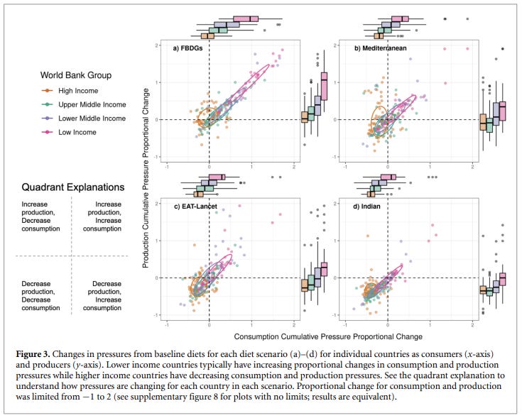
Graph of the week
It takes a little time, but this graph from The distribution of environmental pressures from global dietary shift (10/28/2024) is largely self-explanatory. (Bold mine)
Here we combine new food flow data linking producing to consuming country with environmental pressures to estimate how a global shift to each of four diets (Indian, EAT-Lancet, Mediterranean, and mean Food Based Dietary Guidelines (FBDGs)) could affect environmental pressures at the global, country income group, and country level. Globally, cumulative pressures decrease under the Indian, EAT-Lancet, and Mediterranean scenarios and increase under FBDGs. On average, low income countries increase their cumulative consumption and production pressures while high income countries decrease their consumption pressures, and typically decrease their production pressures. Increases in low income countries are likely due to the nutritional inadequacy of current diets and the corresponding increases in consumption quantities with a shift to our diet scenarios. Despite these increases, we believe that three out four of our simulated dietary shifts can be seen as a net benefit by decreasing global pressures while low income countries increase pressures to adequately feed their populations.
One takeaway here for me is further evidence that low-income countries want to live like weather countries, and that will mean greater energy consumption. Another indication that decreasing emissions is a challenge unless you are ok with poor people staying poor. Either way, this graph is well done with the box plots on the margins.
What we use to do
From the Library of Congress, Paper Pastimes of Past Times (12/6/2024):
This print from 1881 was an arts and crafts project and entitled Pastime for Little Fingers. As the goal was to cut out all of the detailed items around the border, some quite small, and then paste them into place, those little fingers had to be very good with scissors!

The spinning CD
Please share and like
Sharing and liking posts attracts new readers and boosts algorithm performance. I appreciate everything you do to support Briefed by Data.
Comments
Please let me know if you believe I expressed something incorrectly or misinterpreted the data. I'd rather know the truth and understand the world than be correct. I welcome comments and disagreement. We should all be forced to express our opinions and change our minds, but we should also know how to respectfully disagree and move on. Send me article ideas, feedback, or other thoughts at briefedbydata@substack.com.
Bio
I am a tenured mathematics professor at Ithaca College (PhD Math: Stochastic Processes, MS Applied Statistics, MS Math, BS Math, BS Exercise Science), and I consider myself an accidental academic (opinions are my own). I'm a gardener, drummer, rower, runner, inline skater, 46er, and R user. I’ve written the textbooks “R for College Mathematics and Statistics” and “Applied Calculus with R.” I welcome any collaborations. I welcome any collaborations.