


QTRS Dec 5, 2024
Graphs and interesting content for the curious

If you enjoyed this content, please press the like button above and share it. This really helps spread the word about Briefed by Data. Of course, if you are not already a subscriber, please consider becoming one.
As we are in the holiday season, I’ll ask you to consider becoming a paid subscriber to Briefed by Data. Consider it a gift or tip to a favorite writer. I’d like to keep Briefed by Data free, but at the same time it is a fair amount of work.
As I see it . . .
I was listening the Chronicles podcast Is Loneliness as Bad for Students as Smoking?
Cap down. Earbuds in. Eyes on phones. Despite what you may see in college viewbooks, many students say they feel lonely on campus — isolated in dorm rooms or walled off in tech bubbles. But talking about student loneliness is a tricky issue for colleges.
As I see it, they overlooked the changes that stopped students from serendipitously interacting with others on campus. When I first taught a GIS course using ESRI’s ArcMap, students had to go to a lab on campus to use the software. It was too expensive to buy a copy for the semester. At the end of the semester, students told me that they were initially upset about having to use a computer lab, but about halfway through, they began to see it as a positive opportunity to interact with other students in the class. They got to know each other as well as help each other.
I call this the fitness center effect. People that use fitness centers tend to go at similar times during the day and week. You’ll start to see the same people on the same schedule. After a few weeks, you might even exchange names. Eventually you start to chat a bit. It takes time, just like in the computer lab, but you get to know other people.
A couple of years after running the GIS course for the first time, our ITS people were excited to tell me that students could remotely access the software and wouldn’t have to go to the lab. I told them it was a terrible idea. They didn’t want to hear it, and now we have few if any computer labs, if any, on campus. This is not the only example where we've encouraged students to stay in their dorms and avoid people.
One of our administrative assistants informed me that she stopped interacting with many students when the requirement to submit time cards for TA work changed from in-person to online. Again, the fitness center effect. The first few times a student would drop off a time card, it would be quick. Eventually it would become more friendly, and small talk would occur. Now the students know another person on campus to go to when they have a question or simply have a friendly fact to interact with regularly.
As we have moved processes to more efficient online systems, we have stopped this type of human interaction. One other related example I have is Spotify. Back in the day we had CD collections (I still buy them, and my kids make fun of me for it). The advantage of CDs (or records or tapes) was that they represented an obvious interest. If you walked by another student’s room with a collection, it would get your attention. At some point, you look through their collection, and now you have something in common to discuss. You might even borrow a CD. I doubt people are asking to look through other’s Spotify lists. This holds true for both physical books as opposed to Kindles. The same rule applies to online textbooks. If you see a textbook in another student’s room, you might have something to talk about. Online textbooks are invisible to others.
This loneliness issue extends beyond the simple concept of “Earbuds in, eyes on phones,” as it also involves transitioning from systems that promote human interaction to those that do not. I'd love to hear similar examples in education or other settings, and if you think I'm mistaken, please let me know. BTW, having comments to read makes writing this newsletter more fun and engaging.
Ok, back to data.
Life expectancy
This chart comes from the OECD (11/18/2024; download the report to find it and many others). We know women live longer than men, but it seems that healthy life expectancy is about the same. Is the extra 5 years worth it? I suppose it depends on the disability.

To ban or not to ban handguns
This chart from Gallup (11/18/2024) surprised me. I would not have expected this to be trending downward for all partisan groups.

To be fair, there is much more support for stricter laws. Only 33% of Democrats support banning handguns, while 89% do support stricter gun laws. That’s a big swing, although stricter gun laws apply to more than just handguns.

Time unemployed
This week was a week of surprising data. I like to say that we collect data to understand the way the world really is as opposed to what we think it is. The BLS has a collection of graphs, Unemployment Duration in the COVID-19 Pandemic: A Look at Jobseeker Demographics. (12/2024) Here are two of the twelve that caught my attention.

My general view of the U.S. is that Asians excel at everything. It turns out that Asians tend to remain unemployed for longer periods of time than other groups. At the same time, White and Hispanic groups are unemployed about the same time.
How about by education? It would have expected a bigger difference, but it turns out that except for the pandemic year, median unemployed time is about the same for all groups.

Teqball
What you don’t know what teqball is? Me either until a few days ago. This is a 4-year-old video, but it is a fantastic rally.
White flight from education
The Chronicle of Higher Education article Affluent White Students Are Skipping College, and No One Is Sure Why: Their attendance rate has seen the steepest drop among any demographic in recent years. (12/3/2024) has some intriguing data. The overall view is in the graph below, where White students dropped from 47% of undegrduate enrollment in 2018 to 39% in 2024. They also have it by income, showing that for the top income quintile, White enrollment dropped from 58.4% to 45.8% over the same time period.
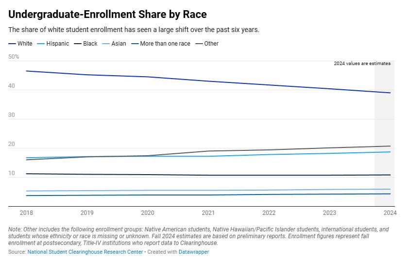
In this case, the data may be misleading because it is expressed as a percentage of enrolled students. If one group increases in number, the other will decrease in percent even if the numbers stay the same. The second issue is that this should be normalized by population. Let’s see if we can understand this better. Here is my most recent demographic graph.

Roughly 50% of college-age students were White in 2023, and this hasn’t changed much in 6 years. This now suggests the drop in White students is meaningful. Interestingly, only Asians have a proportionate representation as we compare the data in the two graphs. All other groups, except for Others, exhibit underrepresentation. This raises the question of who is truly filling out the other box. Are a large number of these really White students? Maybe, but given that the other students have only increased by 5 points and the White students have decreased by 8 points, the entire drop cannot be attributed to White students checking Other.
I’m now convinced that White students are less likely to go to college. The fact that, in particular, wealthier White students are doing this is somewhat perplexing. I'm curious about their political leanings, and I'm confident that a majority of them lean to the right. If so, this would not be surprising, as despite all of the rhetoric of inclusion in high education, inclusion does not include those with conservative views. If you are wealthy, you may be able to give your kids other options and forgo college.
If I’m wrong and there are wealthy, left-leaning White families not going to college as much, then higher education has an even bigger problem. Either way, higher education can’t afford to lose wealthy families regardless of their race or ethnicity. Regardless of wealth, the decline in college attendance rates among a large demographic such as White students is detrimental to higher education, even though it may not necessarily affect the students themselves that choose other paths.
Graph of the week
This comes from the paper A Physical Activity and Sitting Time Balance Index and All-Cause Mortality Risk (12/2024). The chart numbers are the ratio of physical activity minutes to sitting hours. Green is a favorable ratio, yellow could be better, and red is bad.
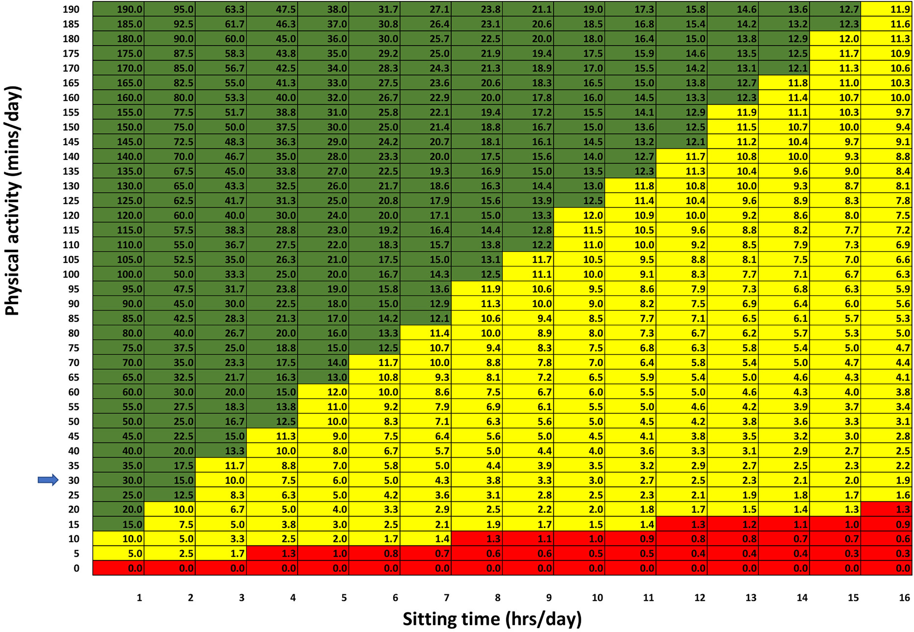
If you’d like, here are some technical details.
During 78,406 person-years of follow-up (median follow-up of 14.3 years), there were 885 deaths (15%). In the fully adjusted model, compared to those in the highest PASTBI category (Quartile 4 - high PA/low ST), participants from the lowest PASTBI category (Quartile 1 - low PA/high ST) were at a higher risk of all-cause mortality [HR (95% CI) = 1.47 (1.21–1.79)].
Note that the green in the chart is quartile 4, while yellow is quartiles 2 and 3.
The spinning CD
Please share and like
Sharing and liking posts attracts new readers and boosts algorithm performance. I appreciate everything you do to support Briefed by Data.
Comments
Please let me know if you believe I expressed something incorrectly or misinterpreted the data. I'd rather know the truth and understand the world than be correct. I welcome comments and disagreement. We should all be forced to express our opinions and change our minds, but we should also know how to respectfully disagree and move on. Send me article ideas, feedback, or other thoughts at briefedbydata@substack.com.
Bio
I am a tenured mathematics professor at Ithaca College (PhD Math: Stochastic Processes, MS Applied Statistics, MS Math, BS Math, BS Exercise Science), and I consider myself an accidental academic (opinions are my own). I'm a gardener, drummer, rower, runner, inline skater, 46er, and R user. I’ve written the textbooks “R for College Mathematics and Statistics” and “Applied Calculus with R.” I welcome any collaborations. I welcome any collaborations.