


QTRS May 8, 2025
Graphs, commentary, and interesting content for the curious

As I see it…
There are times when the creativity of criminals is almost impressive. I know it sounds wrong, but would you have thought of this scam reported in the Chronicle article Is Your Online Student a Bot? As AI gets better, online education becomes more vulnerable to fraud. Just ask instructors in California. (5/1/2025)
Here is how it goes. You create an AI bot that can automatically apply to a college, get accepted, sign up for courses, and take those courses. You do this to get the financial aid, which is more than the cost of attending community college. Pocket the financial aid. California and other states are in an arms race to figure out which applicants and “students” in class are real. How much is this costing?
It may be impossible to know the extent of the financial loss caused by these scams, but some news organizations have attempted to add up the cost. EdSource reported last year that since 2021, California community colleges have distributed more than $14 million in aid — mostly federal — that they ultimately wrote off as being fraudulent.
The competition is now between the criminals, who need to make more realistic bots, and the colleges, which need to constantly improve bot detection. However, while reading this article, I realized that it misses a larger issue facing higher education.
As I see it, if bots can fake being a student starting with the application, then how long, if not already, do students just pay for a bot to do an online college degree for them? We know AI is already doing a lot of the work in many instances, which is already a problem. Why?
As employers increasingly question the actual accomplishments of graduates, the perceived value and significance of holding a diploma diminish. For example, we know that employers in programming jobs conduct in-person coding tests to verify whether prospective employees have actually learned to code. In other words, the degree is already suspect.
This is even worse for online education, where you never see the student in person. Who is going to then pay for a degree with little to no value?
I frequently encounter discussions and articles about how to teach students to use AI. I’m really not sure what that means. Are we supposed to teach them how to cite using AI? How to create good prompts? I don’t think so. In fact, in the age of AI, the most important thing is to know when AI is giving you nonsense. In other words, students need old school type content knowledge because at the moment AI is hallucinating more, as reported in the NYT A.I. Is Getting More Powerful, but Its Hallucinations Are Getting Worse (5/6/2025)
A college degree only has value if the students with the piece of paper have skills and knowledge. How do we know if students know stuff? You test them in a classroom with a proctor. Many of my colleagues may not want to hear this, but cheating has become far too easy these days; AI functions like CliffNotes on steroids and more.
The value of online education could collapse completely without verifying what students know. These issues are easier to handle on campus, but we must verify if the student has learned. Will we? I’m not always so sure we’ll catch on in time. Faculty really don’t keep up with changes in the world.
Please let me know your thoughts. I’d like to hear what the real world thinks. How does higher ed deal with AI?
Let’s go to some data.
Marriage, jobs, and education
The graph here from the IFS article Good Jobs, Strong Families in Working-class America (4/29/2025) is interesting. Marriage is declining in the US, but the working class's 25-point drop is striking compared to the 11-point drop for college grads. It would seem that marriage's economic support systems would be more valuable for the working class. What does the article give as a reason?

One reason is that working-class males tend to have lower-quality jobs, which makes them less desirable as mates.
When we examine all three of these factors together, we find that only 23% of working-class men ages 25–54 meet the threshold of earning more than $60,000 per year, having health insurance, and holding a full-time job without being laid off—compared to 56% of college-educated men.
However, what caught my attention in this quote is that males with college degrees have only a 56% chance of securing one of these good jobs, which offer salaries of $60k or more, health insurance, and job security. This percentage is more than double that of the working class, but it's still unimpressive given the cost of higher education. I’ll also point out that the comparison is flawed. Within the working class, some individuals have invested in their own development by learning a trade, much like attending college. We need a separate category for individuals who have invested in their development to make fair comparisons.
Graph of the week
The US is by far the biggest draw of people, as seen in this graph from the paper Measuring Global Migration Flows using Online Data (4/16/2025), but who would have guessed the #2 would be the United Arab Emirates?

How to read this graph
The Census Bureau has an intriguing report, Birth Cohort Geographic Mobility in the United States: 2005–2023 (5/6/2025), with a graph below that one could easily misinterpret. Look at the graph, and what is our quick takeaway? If you said each generation cohort moves at a different rate, you are missing a key variable.

For example, in reading this graph, the dark blue line at the bottom represents the silent generation born between 1928 and 1945. In 2005, the youngest person in this generation was 60 years old. I expect this generation to move less as they age, so it's no surprise they rank last.
On the other end is Gen Alpha, born after 2012. In 2014, the oldest member of Gen Alpha was two years old. Their movements are based on those of their parents. In other words, the graph needs to reflect age in some way. At a minimum, they could have used dotted lines to represent the cohort of individuals aged between, say, 25 and 55, or whatever age at which people move the most.
Ultimately, the graph looks like it compares birth cohorts, but you really can’t compare the groups. The report provides additional information, including adjustments for age, if you are interested.
Two from eia
The first is state gas prices; CA wins. But why?
Several factors contribute to this high price, including state taxes and fees, environmental requirements, special fuel requirements, and isolated petroleum markets.
Effectively, environmental requirements and special fuel requirements are a form of taxes and fees. The isolation is also partly a form of tax (bold mine).
California is geographically isolated from other U.S. refining centers because no pipelines supply California from across the Rocky Mountains and only a limited number of pipelines deliver to the West Coast from the Gulf Coast. Of the refineries outside of California with physical access to the state’s gasoline markets, only a few can meet California’s stringent fuel blending requirements.

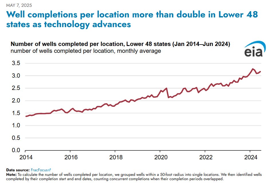
The second graph illustrates advancements in technology aimed at increasing fossil fuel production. I think we often underestimate technological advancements.
We estimate that the average number of wells completed simultaneously at the same location in the Lower 48 states has more than doubled, increasing from 1.5 wells in December 2014 to more than 3.0 wells in June 2024. By completing multiple wells at once rather than sequentially, operators can accelerate their production timeline and reduce their cost per well. The increasing number of simultaneous completions reflects significant technological advances in hydraulic fracturing operations, particularly in equipment capabilities and operational strategies.
Data center update
I keep doing data center posts because, as an industry, they are a big player in current and future energy demands.
If we go down this path, that’s a lot of extra electricity. To put the situation in perspective, in 2023 the world had 1,400 GW of installed solar capacity, but capacity isn’t the same as what is produced. For solar, you get about 25% of capacity, which puts production at about 350 GW. 219 GW would be over 60% of current solar production.
Meanwhile, not everyone is pleased with data centers, sort of: Group claims $64bn in US data center projects impacted by local opposition in last two years (5/6/2025).
It turns out that this is a terrible headline, and the $64 billion claim seems grossly exaggerated. For example,
The report claimed that $18bn worth of projects were ‘blocked’ and a further $46bn more were ‘delayed’ in the two years prior to March 2025.
The key word in the headline is “impacted.” However, some opposition exists, which is expected in any large industry.
The spinning CD
Please share and like
Sharing and liking posts attract new readers and enhance algorithm performance. I appreciate everything you do to support Briefed by Data.
Comments
Please let me know if you believe I expressed something incorrectly or misinterpreted the data. I'd rather know the truth and understand the world than be correct. I welcome comments and disagreement. We should all be forced to express our opinions and change our minds, but we should also know how to respectfully disagree and move on. Send me article ideas, feedback, or other thoughts at briefedbydata@substack.com.
Bio
I am a tenured mathematics professor at Ithaca College (PhD in Math: Stochastic Processes, MS in Applied Statistics, MS in Math, BS in Math, BS in Exercise Science), and I consider myself an accidental academic (opinions are my own). I'm a gardener, drummer, rower, runner, inline skater, 46er, and R user. I’ve written the textbooks “R for College Mathematics and Statistics” and “Applied Calculus with R.” I welcome any collaborations. I welcome any collaborations.