


QTRS Nov 14, 2024
Graphs and interesting content for the curious

If you enjoyed this content, please press the like button above and share it. This really helps spread the word about Briefed by Data. Of course, if you are not already a subscriber, please consider becoming one.
Graph of the week
The graph here from the paper Keeping the global consumption within the planetary boundaries (11/13/2024) shows how much each decile of income’s footprint (the bars) in each category (the colors) is beyond what is considered sustainable (the red circle) as a percentage. The outside ring is each decile’s contribution to the category.
For example, in the Climate Change (C02 emissions category, red), the top deciles emissions are over 1500% beyond sustainable and contribute 43% of all emissions.
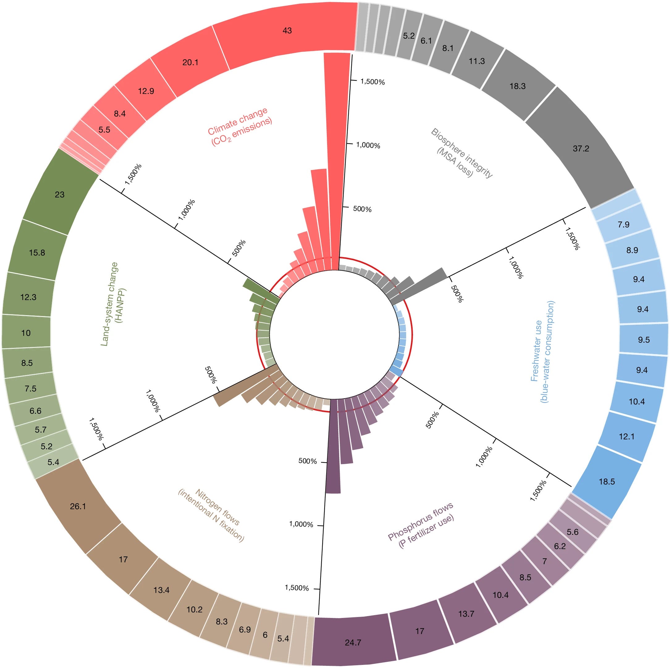
From the abstract:
We show that 31–67% and 51–91% of the planetary boundary breaching responsibility could be attributed to the global top 10% and top 20% of consumers, respectively, from both developed and developing countries. By following an effective mitigation pathway, the global top 20% of consumers could adopt the consumption levels and patterns that have the lowest environmental impacts within their quintile, yielding a reduction of 25–53% in environmental pressure.
The hypocrisy here is that it is generally the wealthier people talking about the perils of climate change, yet those are the people that can reduce their footprint the most and slow climate change.
Our study highlights the critical need to focus on high-expenditure consumers for effectively addressing planetary boundary transgressions.
Yeah, good luck with that.
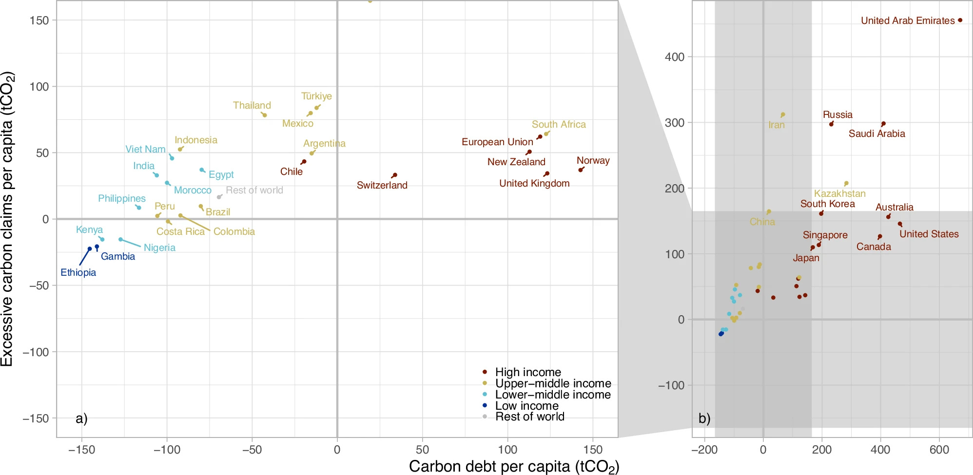
Related to this is the graph here from the paper Estimating countries’ additional carbon accountability for closing the mitigation gap based on past and future emissions (11/9/2024).
Loosely, the x-axis here is the carbon a country has put into the atmosphere from 1990-2022 on a per capita basis. The US is the second highest. The y-axis looks at how much more or less they will emit from 2023 to 2070. The way to think about it is, positive in the y-axis means a country will be using more than its fair share on a per capita basis.
To me, the key here is the dark red dots, the high-income countries. All but one has a positive debt, and all of them expect to use more than a fair share in the future. In other words, the wealthier aren’t interested in giving up much. In fact, almost all countries are positive on the y-axis.
Again, good luck reversing or even slowing emissions, barring some technical innovation.
More Trump data
The American Communities Project uses a principle component analysis and a variety of metrics to categorize each county by type. They arrived at 15 types of communities, such as big cities, college towns, African American south, etc. I noted on Tuesday that Trump gained in almost every demographic category and in many cases over three election cycles. The American Community Project has the election results for Trump for 2020 and 2024 by community type. I changed their bar plots and added how much Trump gained in each community and ordered the bars by the gain. As you see, Trump gained in all community types, even in places you might not expect it, such as big cities and college towns.

Trust in media
No one should be surprised that trust in mass media continues to decline. According to Gallup (10/14/2024), only 33% of people have a great deal/fair amount of trust in mass media, while 33% and 36% have not very much or none at all, respectively.
What is interesting is the partisan splits. I guess when the mass media tells you what you want to hear, trust is much higher. The 54% to 12% Democrats vs. Republicans is astonishing. Mass media’s obvious bias isn’t helping the country.

Hydro issues
Just in case you didn’t think hydropower isn’t impacted by Mother Nature, then here is a graph from the eia (11/7/2024). Wind and solar have daily variations, while hydropower has longer variations, but they still happen.

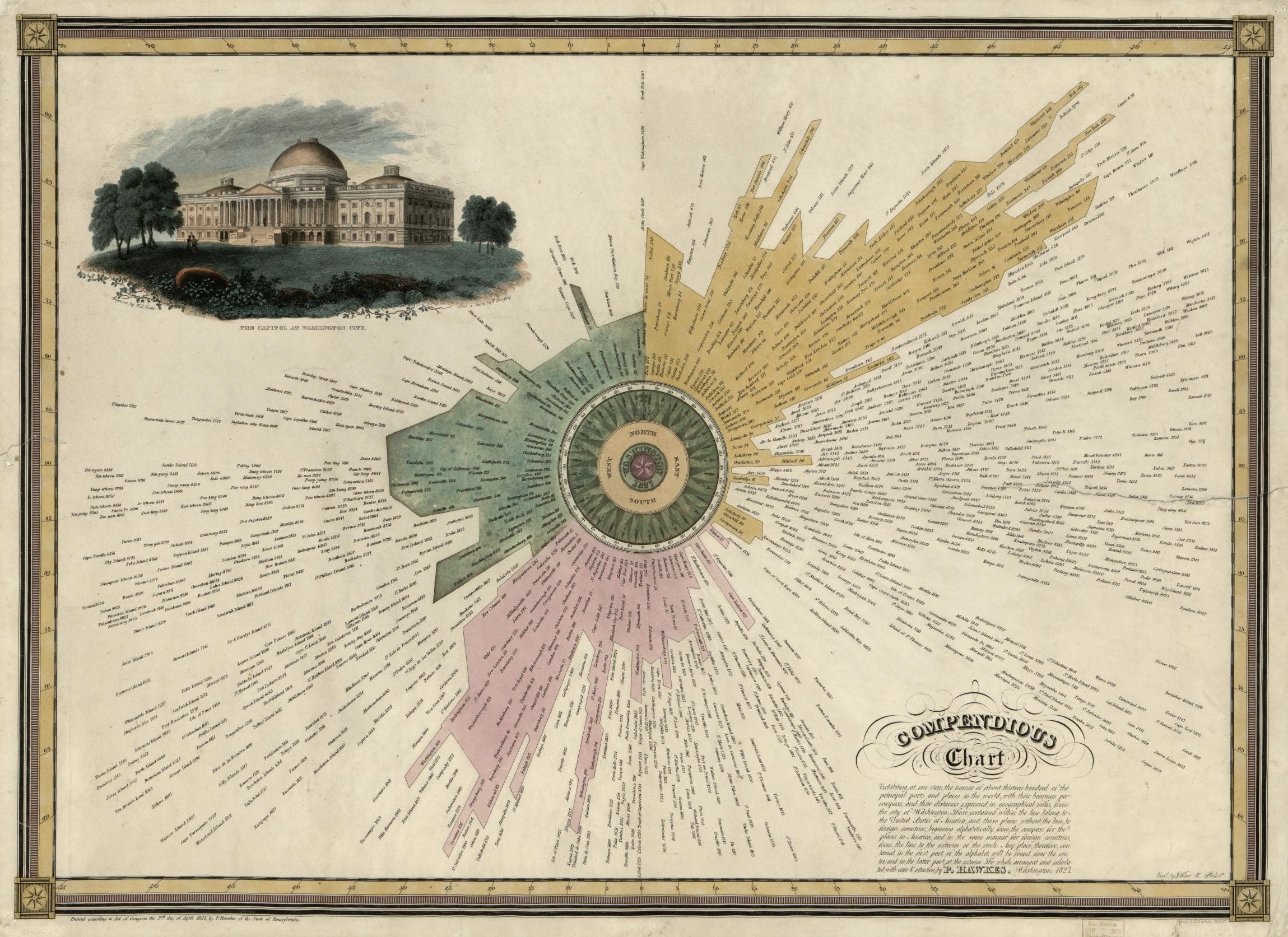
Map of the week
People have been making cool graphs long before computers. Here is one from the Library of Congress (11/8/2024) from 1827.
The center of the map is Washington D.C. surrounded by a compass. Each of the 1,300 ports and places are then arrayed around the compass dependent on their direction from Washington. All the ports within the pink, green, and yellow coloring are within the United States while all others are foreign ports. Interestingly, the ports are not arranged by distance from the city but in alphabetical order starting from the center with all the U.S. ports and then restarting the alphabet for all other ports.
Three countries dominate exports
Can you guess which three and by how much? The map here from World Population Review has the answer. The map is interactive if you want to learn more.

The spinning CD
Please share and like
Sharing and liking posts attracts new readers and boosts algorithm performance. Everything you do is appreciated.
Comments
Please point out if you think something was expressed wrongly or misinterpreted. I'd rather know the truth and understand the world than be correct. I welcome comments and disagreement. We should all be forced to express our opinions and change our minds, but we should also know how to respectfully disagree and move on. Send me article ideas, feedback, or other thoughts at briefedbydata@substack.com.
Bio
I am a tenured mathematics professor at Ithaca College (PhD Math: Stochastic Processes, MS Applied Statistics, MS Math, BS Math, BS Exercise Science), and I consider myself an accidental academic (opinions are my own). I'm a gardener, drummer, rower, runner, inline skater, 46er, and R user. I’ve written the textbooks R for College Mathematics and Statistics and Applied Calculus with R. I welcome any collaborations.
According to Our World In Data, the second-to-top decile's income/consumption threshold is $25.40 per day, or approx $9300 per year. In international dollars, whatever they are.
https://ourworldindata.org/grapher/threshold-income-or-consumption-for-each-decile