If you enjoyed this content, please press the like button above and share it. This really helps spread the word about Briefed by Data. Of course, if you are not already a subscriber, please consider becoming one.
Who has it easier?
The AEI post The Politics of Progress and Privilege: How America’s Gender Gap Is Reshaping the 2024 Election (9/24/2024) has this chart:
After looking at this chart, you might come away that men have it easier in the U.S., and I don’t think they should have posted this chart without gender breakdowns, although political affiliation differences here are worth noting. Here is one of the preceding paragraphs:
Men and women have distinct views about the difference that gender makes. A majority (56 percent) of women believe that men have an easier time than women, but only 38 percent of men agree that men are better off. Approximately one in five (19 percent) men say that women have it easier than men in the United States today. Notably, young men (age 18 to 29) are twice as likely as men age 65 or older to believe that women have it easier than men in American society today (22 percent vs. 11 percent).
Not surprising, women and men have a different view here. Unfortunately, they don’t give this breakdown for 2017. This is one of those questions where knowing opinions is nice, but effort should be put into figuring out if the perceptions are true or at least where they are coming from.
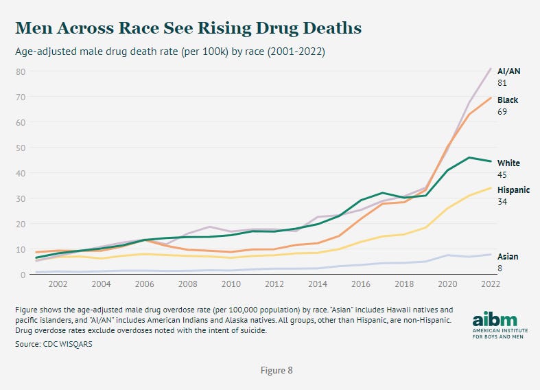
Here is one example from the aibm article Unnatural Male Deaths: Fatal Injuries and the Rise of Drug Overdoses (9/24/2024).
For the group that has it easier (68% of Dems think so), they sure do a good job of getting dead unnaturally, in particular by homicide, suicide, and poising, which suggests they don’t have it so easy. This is only one example, but context should be given and not just the opinions of people.
Now, some of this is due to differences in male and female behavior. For one, males tend to take more risks. Or when it comes to suicides, they are more successful at completing the task than women. This is not a statement people generally have an issue with. Yet…
Green jobs and STEM
We have the article Why Women Risk Losing Out in Shift to Green Jobs (10/7/2024), which shows women have fewer green jobs then men. The reason is largely because of this graph:
In some settings we are willing to accept men and women are different, yet in others there must be barriers.
Policymakers should lower these barriers by giving women incentives for STEM education and ensuring equal access to green jobs. This includes early STEM exposure, mentorship, and public-private partnerships.
Is it possible that women are just less interested in STEM fields in the same way that men might be less interested in health fields or teaching elementary school kids?
I think we need to ask what the natural ratio here might be if money and prestige weren’t an issue, and that might be the target, and that target may very well not be equal representation. Do we really think Sweden is a hot bed of discrimination keeping women out of STEM or many of the countries on the list?
Just to emphasize the bias here consider this paragraph from the article (bold mine).
The gender gap in STEM education is one of the biggest barriers to women getting green jobs. These skills are essential for engineering, renewable energy, and technology sectors that drive innovation. But women remain underrepresented in STEM fields despite making significant progress in higher education.
"Significant progress": Women become the majority in college in 1980 and are now almost 60% of undergraduates (Female vs Male Undergraduate Enrollment 8/15/2023). The quote here acts as if more progress is needed. By the language of this article, women are overrepresented in higher education. Isn’t that a problem? They are also 61.8% of master students and 56% of Ph.D. students (Female vs. Male PhD Degree Enrollment 10/10/2023). A little consistency in arguments would be nice. Maybe we shouldn’t be trying to social engineer either of these issues. If men don’t want to go to college, so be it. If women are less interested in STEM, that’s ok too.
Male drug deaths
From the same aibm article above, I want to point out this graph but make a different point.
One of the things I keep seeing in the data is that whenever race/ethnicity is compared, the order is the same. In order from good to bad, it is always Asian, White, and then Black. Hispanics vary a bit. I pointed this out in my Asian Success isn’t an Accident post (9/10/2024). This aibm graph is just another example.
Graph of the week
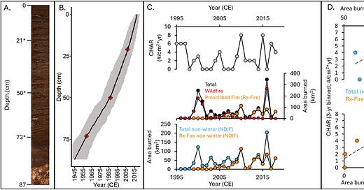
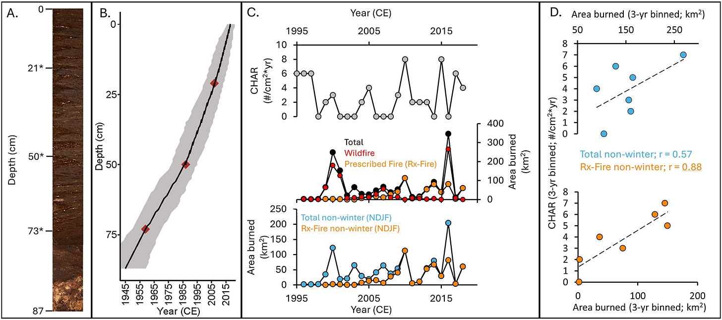
You may have heard of ice core samples to estimate past climate. I’m posting this just so I can say guano core from the paper Fire in Feces: Bats Reliably Record Fire History in Their Guano (10/4/2024).
Caption: (a) Photo of the Cripps Mill Cave guano core. Depths of radiocarbon samples (Table 1) are noted with asterisks. (b) Age-depth model of the guano core. The red diamonds note the depth and age of radiocarbon samples. The black line shows the mean of the ensemble of possible age-depth models generated by BACON and the gray shaded region depicts the 95% confidence envelope. (c) Comparison of Cripps Mill Cave guano charcoal accumulation rates (CHAR; gray) with total annual area burned (black), as well as by wildfire (red) prescribed fire (orange). The bottom plot shows the area burned in total (blue) and by prescribed fire (orange) in non-winter months (e.g., excluding November, December, January, February). (d) 3 year binned CHAR data share a strong correlation with both total area burned (blue; r = 0.57) and area burned by prescribed fire (orange; r = 0.88, p < 0.01) in non-winter months.
School spending and race
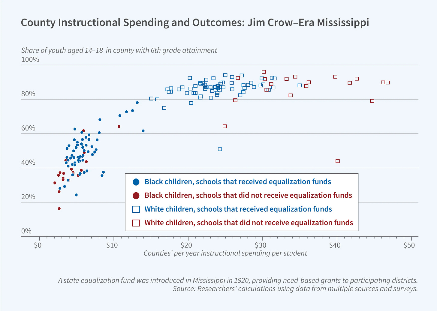
This graph is from an NBER summary of the working paper School Equalization in the Shadow of Jim Crow: Causes and Consequences of Resource Disparity in Mississippi circa 1940 (9/1/2024). What jumped out at me was how once spending reached $20 per year per student, there were no more gains by spending more money. This wasn’t the point of the summary but seemed worth noticing. It makes me wonder how much overspending, spending with no gains, we are doing in education today.
Lake sampling by race and ethnicity
The paper US lakes are monitored disproportionately less in communities of color (9/9/2024) makes a not unfair point.
Relative to lakes in White and non-Hispanic communities, lakes in communities of color and Hispanic communities were three times less likely to be monitored at least once.
When we look at the graph, the differences are generally small except for the Northeast for POC vs. White. For Hispanic or not, the difference for the first three regions is meaningful. In general, I don’t have issues with these types of studies. In fact, they are good. My issue comes when the immediate implication is some form of racism, structural or otherwise. Let’s take a look at some quotes from the discussions.
Monitoring programs tend to favor large, connected lakes and those surrounded by urban areas, agriculture, and forests (Wagner et al. 2008).
As far as I can tell, the study counts lakes all as the same regardless of size. It makes sense to study larger lakes with more water. Further, it makes more sense to monitor lakes that provide drinking water over those that don’t. Living on or near a large lake is more expensive than not, and the differences here may simply be due to economic differences.
Moreover, long-term lake water-quality data not only are very rare but also mostly come from citizen-science programs (Poisson et al. 2020). Across citizen-science programs and disciplines, the majority of volunteers are White, and for volunteer-driven programs, chosen sites may be of low EJ concern (Blake et al. 2020).
(EJ is environmental justice.) One possibility in this situation is that White volunteers are keeping an eye on some lakes, but the monitoring is not all that crucial. For example, a group may be doing it for fun on their nearby lake, but the results may not be important for any safety reasons.
We encourage local, state, or regional environmental monitoring programs to explicitly incorporate equity in their sampling designs by selecting sampling locations by stratifying not only on natural features (such as lake size or land cover) but also on the social environment.
Here is where I start to disagree. The top priority for lake monitoring would seem to be lakes that provide drinking water, and within that group, choose by how many people the lake serves. In this study, the lakes should be separated out by this factor. After that, maybe the second priority might be lakes important to wildlife. I’m not sure a social justice factor is all that important.
One last point here is that counts should have been part of the study. For example, one large lake might provide water for a large population. That population might have a low percentage of POC or Hispanics, but it may be more of them than a smaller lake with a lower population but a higher percentage of POC or Hispanics.
In the end, these studies are worth doing, but I become concerned when they become more about activism than facts.
Weekly eia graph
The spinning CD
Please share and like
Sharing and liking posts attracts new readers and boosts algorithm performance. Everything you do is appreciated.
Comments
Please point out if you think something was expressed wrongly or misinterpreted. I'd rather know the truth and understand the world than be correct. I welcome comments and disagreement. We should all be forced to express our opinions and change our minds, but we should also know how to respectfully disagree and move on. Send me article ideas, feedback, or other thoughts at briefedbydata@substack.com.
Bio
I am a tenured mathematics professor at Ithaca College (PhD Math: Stochastic Processes, MS Applied Statistics, MS Math, BS Math, BS Exercise Science), and I consider myself an accidental academic (opinions are my own). I'm a gardener, drummer, rower, runner, inline skater, 46er, and R user. I’ve written the textbooks R for College Mathematics and Statistics and Applied Calculus with R. I welcome any collaborations.


