


Quick takes and random stuff, Dec 21, 2023
Dragonflies, education, savings, curvy ads, police, and more

Are Americans tapped out?
The graph here is from the Federal Reserve article An update on Excess Savings in Selected Advanced Economies (12/15/2023). They define “excess savings as the amount of savings arising from above-trend savings rates.”
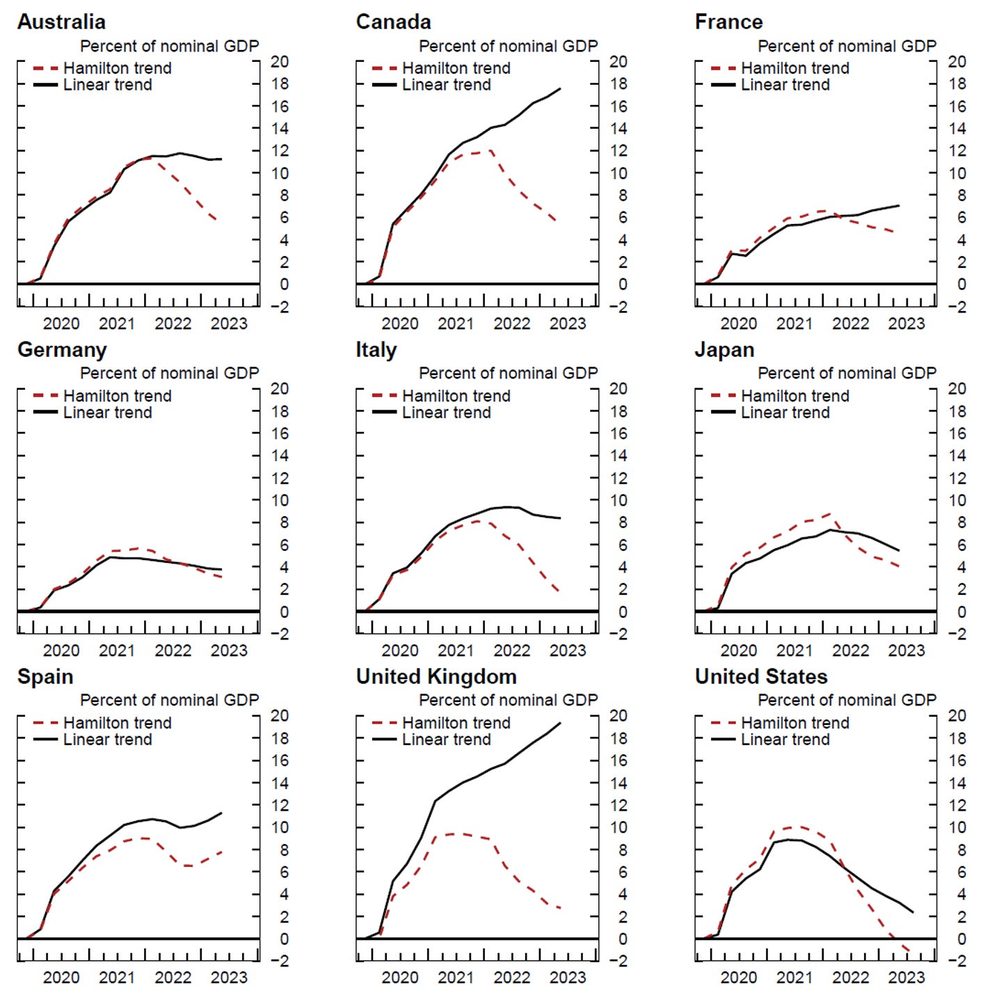
In Figure 1, we present our new results for the evolution of the accumulated stock of household excess savings in advanced economies. Our estimates suggest that level of excess savings stock on household's balance sheet remains high for most countries, with the notable exception of the U.S. In all foreign economies, the stock of excess savings remains firmly positive, which could imply that household balance sheets are strong and may support private consumption in the quarters to come. However, such a prediction would be based on the assumption that households are willing to spend their accumulated buffer of savings, even though they have not done so in recent quarters. In countries such as France, Germany or Spain, excess savings seem to plateau, suggesting that accumulated wealth is actually not being spent further.
The article doesn’t talk about what this might mean for the U.S. economy beyond the note above about the U.S. population having a weaker balance sheet. The article does talk a lot about the challenges and assumptions in the estimation of excess savings.
We need more information than average returns to college education
This is from the Brookings article Experts discuss whether college is still worth it (12/13/2023):
Research suggests that average returns to college are still high.
David Deming, Harvard University Professor of Political Economy, explained that after increasing for decades, the college wage premium—the difference in average earnings between college graduates and non-college graduates—has plateaued, but remains around 65%. That is, the average four-year college graduate earns about 65% more than the average high school graduate.
These experts need better information than simply averages like these. First, they simply should not report averages but instead report medians. This alone makes me question their status as “experts.”
In my post, Neither a liberal arts degree nor any other is a guarantee I note (recall, I used White students here to eliminate the race factor in this statement).
For example, the median liberal arts earnings in the White 23–32 cohort is $34,973, but the cutoff for the top 25% of high school earnings is $38,151. In other words, the top 25% of White 23–32 high school graduates make more than the bottom 50% of liberal arts majors and fare better than the bottom 25% of non-liberal arts degrees, which earn $24,000.
Our “experts” need more clear talking points; reporting means doesn’t cut it for me. Feel free to suggest me as an expert.
On police interactions
The Gallup article 4 Ways Police Encounters Shape Public Perceptions, Wellbeing (12/11/2023) notes
Despite what news reports may suggest, most Americans report that their dealings with police are relatively pleasant. Overall, 77% of Americans say that their most recent interaction with a member of their local police force was a positive experience, 85% say they were treated fairly, and 84% say they were treated with respect.
I appreciate the article starting out with a positive. I'd like to see those who are critical of the police discuss an appropriate goal for police interactions. Is 77% acceptable? Police are humans and have good and bad days like the rest of us, so it would seem that 100% positive interactions are not realistic, but what is? I’d like to see the media dig a little deeper and ask some real questions.
Related is this graph with racial breakdowns.

First, I’ll note that the last question seems weird. Yes, the cops stopped me for doing 90 in a 45 zone, and it was a positive experience. Really? The point here goes to my data rule: avoid making assumptions based on a single factor. Some people didn’t have a positive experience because they were caught doing something illegal. I would generally agree that the police should treat everyone fairly and with respect, but I can also understand some reasonable contexts where it is understandable that this didn’t happen.
For example, the police get called repeatedly to a household for domestic disturbances. The wife continually refuses to press charges, despite the bruises and black eye. One day, the wife finally speaks up, and the police take the guy away. What they should do is treat the guy fairly and with respect, as the police are not judges and juries, but I can also understand if the police, say, weren’t so gentle putting him in the back of the car. I’m not condoning this behavior, but some effort to understand the challenges and frustrations police face would go a long way. When I see a poll like this, I would say we need some more factors about the situations where interactions have happened.
This brings me to my main point. I noted in my post Media's focus of White supremacy harms Black communities that “If we combine the bottom row, we see that Black people commit 48.9% of all homicides, which is four times more than their population percentage.” Add to this the fact that crime is typically concentrated in certain, typically poor, areas of cities. I can see police being more on edge and being less fair and respectful in these areas, and these areas, depending on the city, may be disproportionately Black. It is not surprising that Black adults respond lower on the treated fairly question. Again, the point is not to condone bad behavior but to first try to understand it and then work to improve it, as opposed to those who just want to villainize the police.
The challenges of collecting data: crime statistics
Kudos to Jeff-alytics for the article Is Crime Underreporting Getting Worse?
If an officer takes longer to respond then the likelihood that an incident will be marked Gone on Arrival or Unfounded or Unable to Locate (or whatever verbiage an agency uses to describe an incident where they couldn’t find the victim or caller) rises. Longer response times can obfuscate crime trends though the obfuscation is typically reasonably narrow.
Seattle has pretty good Calls for Service data which lets us break down incidents by response time and disposition. As is clearly seen below, as response time goes up in Seattle so too does the likelihood that a call will be marked “Unable to Locate.”
The point here is that in many cities, the police have lost staff, making response times slower. If this is the case, then some crimes, such as petty theft or lower-level assault, will increase in their underreporting because when the police show up, no one is there. On the other hand, crimes like auto theft and homicide are pretty reliable in their reporting. There is plenty of nuance to this article, and it is worth reading.
Data you can use: watch the curvy ads
From Online shoppers more likely to click ads with curvy designs and spend more money, says study (12/19/2023):
"We studied a hotel search button and we consistently found the click rate was higher when the elements were curved," Biswas said. "It translated to an increase of nearly 15% in total revenue."
Curvy ads are on top. Don’t ever forget that smart people are using data to capture your money. This isn’t a fair fight, either.

Solar lifespan
Techxplore summarizes the paper Accelerated damp-heat testing at the cell-level of bifacial silicon HJT, PERC and TOPCon solar cells using sodium chloride (10/15/2023), which is behind a paywall in their article Why a new wave of solar panels may lose their spark too soon (12/13/2023). Key point:
Did you know that the newest solar panels on the commercial market, using the very latest cutting-edge technology, can decline in performance up to 50% inside just a few years in some cases?
The overall point seems to be that the focus on more efficient solar panels may be coming at the expense of the longevity of the panels. To me, this raises an important question regarding wind and solar. What is their upkeep, and more importantly, how long do they last? It seems to me that as we build up renewable capacity, at some point we will have to both add new generation while also replacing older panels and turbines. This just adds to my pessimism as to how long it would realistically take to get to net zero.
Graph of the week
This comes from the paper Seasonal variation in dragonfly assemblage colouration suggests a link between thermal melanism and phenology (12/19/2023). From the abstract:
Here we show that colour lightness of dragonfly assemblages varies in response to seasonal changes in solar radiation, with darker early- and late-season assemblages and lighter mid-season assemblages. This finding suggests a link between colour-based thermoregulation and insect phenology.
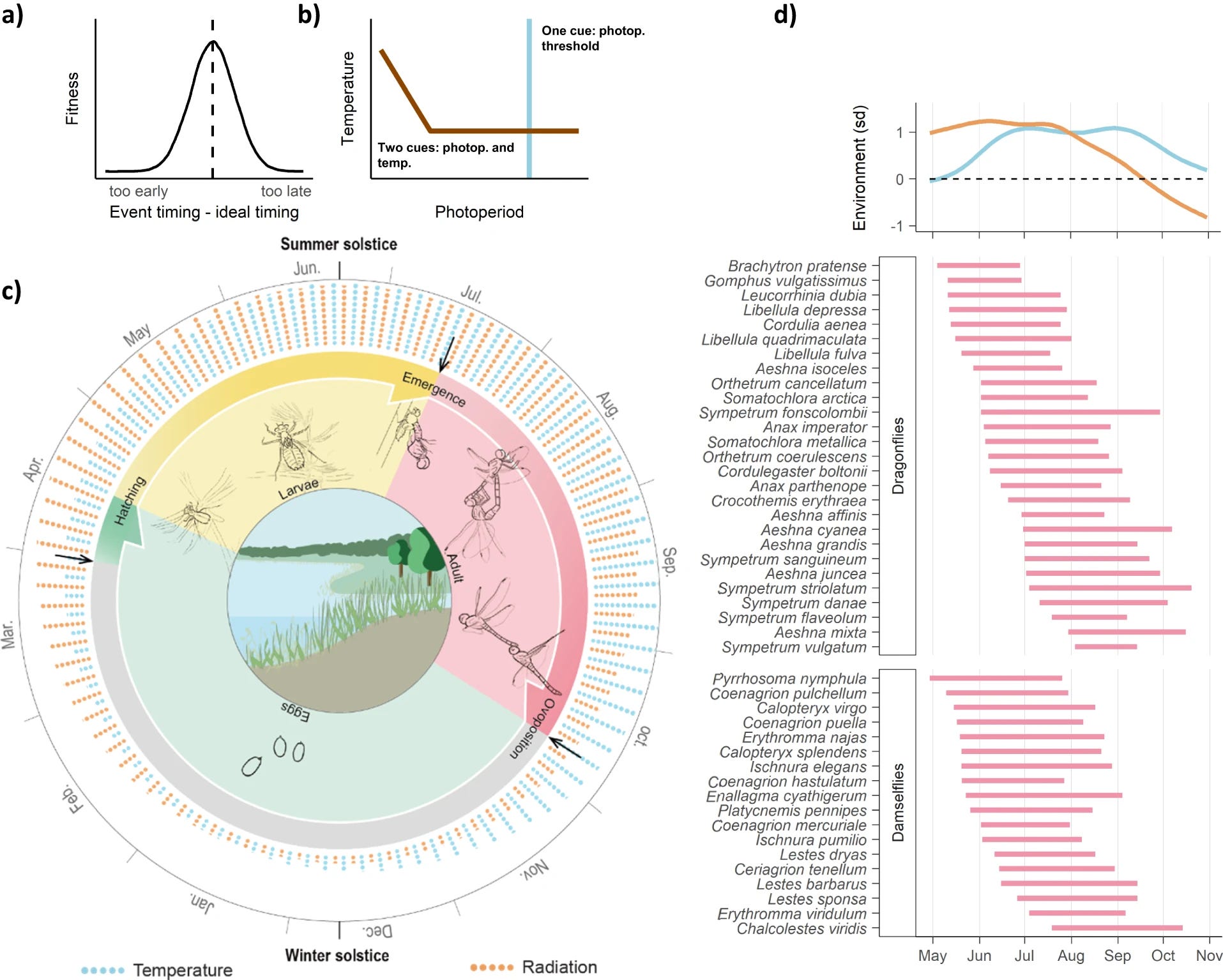
If you want to decipher this, here is the caption. There is a lot of information in this figure, and it looks neat, but it isn’t simple to understand. As a rule, the caption shouldn’t take up more space than the image.
a, b Phenological fundamental tracking regulates species´ life cycles by synchronising them to optimal seasonal moments. a Fitness increases when the timing of phenological events aligns to the timing of ideal environmental conditions. b Phenological responses are triggered by environmental cues, such as certain photoperiod threshold (blue line), or combined photoperiod and temperature thresholds (brown line). These environmental cues link to—unknown—underlying drivers of optimal timing (a and b adapted from11). c Example of the life cycle of the dragonfly Sympetrum striolatum which is regulated by seasonal environmental conditions. Arrows note phenological events triggered by environmental cues. Eggs are oviposited in October when cold temperatures induce a diapause in their embryonic development that lasts until spring, when development resumes triggered by photoperiod and temperature cues74. Larvae hatch and develop for two to four months, depending on water temperature. Last instar larvae emerge, again triggered by photoperiod and temperature cues. Adult complete maturation and reproduce74. Alternatively, if oviposition occurs earlier, eggs can develop without diapause and larvae hatch in autumn to enter a diapause that lasts until spring, when development resumes74. Other temperate odonates have different life cycles varying in length from less than a year to several years74, most of which are regulated by phenological fundamental tracking. d 5th and 95th percentile of dragonfly and damselfly flight periods in Great Britain, together with variation in radiation (orange) and temperature (blue) across the season (upper panel), indicated as standard deviation from the cross-year average (grey dashed line). Coenagrion scitulum is not shown because its rarity in the study system does not allow to derive a representative flight period. Artwork in (c) by Zijing Deng.
How do we measure median wage changes?
This is from the People’s Policy Project article What About Wages? (12/20/2023):
But there is another way to tackle the wages question that does not just compare one cross-section of the wages distribution to a prior cross-section of the wages distribution. In the Current Population Survey, you can actually track the wages of specific individuals over a one-year time period. This sort of longitudinal measure of wages does not suffer from the same kind of compositional problems as the cross-sectional measures do because it ensures that the composition of the individuals being measured is exactly the same across the two periods.
The point here is that reports on median wages (kudos for using median) are typically a sample of the population at a given date. The sample is different for each time period. The suggestion here is to follow the same people over time using the Current Population Survey to get a better picture of the change in wages. Here is the graph you get if you do that:

Here is what they say about this graph:
From this, it’s clear that most workers saw their real wages decline throughout nearly all of 2021 and 2022. Positive real wage growth only resumed in February of this year.
To repeat what I said above: unlike the first graph, this figure is not being driven by changes in the composition of the workforce as these are matched individuals that had positive earnings in one month and then again twelve months later.
This gives a good explanation of why the typical person sees the economy negatively. See, for example, the NTY article Even Most Biden Voters Don’t See a Thriving Economy (11/28/2023).
The spinning CD
Chemist by the Inevitables
Please share and like
Please help me find readers by forwarding this article to your friends (and even those who aren't your friends), sharing this post on social media, and clicking like. If you're on Twitter, you can find me at BriefedByData. If you have any article ideas, feedback, or other views, please email me at briefedbydata@substack.com.
Thank you
In a crowded media market, it's hard to get people to read your work. I have a long way to go, and I want to say thank you to everyone who has helped me find and attract subscribers.
Disagreeing and using comments
I'd rather know the truth and understand the world than always be right. I'm not writing to upset or antagonize anyone on purpose, though I guess that could happen. I welcome dissent and disagreement in the comments. We all should be forced to articulate our viewpoints and change our minds when we need to, but we should also know that we can respectfully disagree and move on. So, if you think something said is wrong or misrepresented, then please share your viewpoint in the comments.