

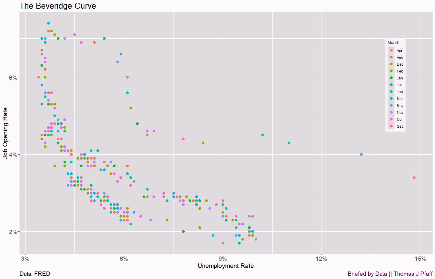
The Beveridge curve
Revealing information in a graph

This has been a busy semester, and so I haven’t written too many Saturday posts over the last month or so, but I ran into a good, but not great, graph on the FRED blog article The unusual shape of the Beveridge curve (1/9/205) that I thought was worth exploring. The Beveridge curve is the relationship between the unemployment rate and job posting rate. The graph in Figure 1 is similar to the one on the FRED blog.
Before moving forward, you can find the data on the FRED post or on my GitHub site, where I’ve started posting data for use in stats courses (csv data directly). I’ve added variables for Month and Year to the FRED data. This is great data for a stats course, a clear relationship that isn’t linear. All the graphs here are made with R, and you can find the R code on my BbD-Rcode page (direct link to the code).

In Figure 1, it makes sense that as the unemployment rate goes up, the job opening rate goes down and vice versa. The problem with the FRED graph is that there are three clear groupings here, and we’d like more information in the graph to help us understand the groupings. Figure 2 colors the dots by year, and we can see clear patterns by year, although there are so many years we don’t really have enough colors to help us distinguish the year precisely.

To add more information to the graph, we can label the dots by year, which is done in Figure 3. Note you can make the graph bigger to read the years better. The top grouping is COVID, which explains why it is different. On the other hand, the years from roughly 2004 to 2009 sit below the years 2010 to 2015.

There is another pattern in the graph, and that is the years 2022 through 2024, which is sitting higher on the job opening rate scale than we might expect. The FRED blog has this to say:
Paulina Restrepo-Echevarria and her coauthor studied why the Beveridge curve may have lost some of its shape and found that a growing proportion of job vacancies are filled by workers who are employed by other firms. Hiring currently employed workers is known as “poaching.” Since 2015, the fraction of workers poached from other firms to fill vacancies has risen significantly and has been as high as 80% of advertised job openings. The proportion of unemployed workers who have been making their way into existing jobs has gradually declined. Thus, the Beveridge curve is a bit out of shape.
Adding some color and labels uncovers underlying patterns that the original graph in Figure 1 partially conceals. Although we observe groupings, we are uncertain if there is a method to establish a connection between them.
I was curious, so I made one more graph. I colored the dots by month in Figure 4. In this case, the coloring lets us know that month doesn’t have any relationship with the two variables.
If you enjoyed this post, then please consider sharing and subscribing.
Please share and like
Sharing and liking posts attracts new readers and boosts algorithm performance. I appreciate everything you do to support Briefed by Data.
Comments
Please let me know if you believe I expressed something incorrectly or misinterpreted the data. I'd rather know the truth and understand the world than be correct. I welcome comments and disagreement. We should all be forced to express our opinions and change our minds, but we should also know how to respectfully disagree and move on. Send me article ideas, feedback, or other thoughts at briefedbydata@substack.com.
Bio
I am a tenured mathematics professor at Ithaca College (PhD Math: Stochastic Processes, MS Applied Statistics, MS Math, BS Math, BS Exercise Science), and I consider myself an accidental academic (opinions are my own). I'm a gardener, drummer, rower, runner, inline skater, 46er, and R user. I’ve written the textbooks “R for College Mathematics and Statistics” and “Applied Calculus with R.” I welcome any collaborations.
Outward shifts in the Beveridge curve indicate a bad turn for the labor market. The outward shift around 2019 is expected because a pandemic significantly reduces the labor force participation rate. The outward shift around 2010 is baffling. Improvements in job search (i.e. online job posting sites) should shift the curve inward. The outward shift in 2010 could be due to structural changes in the economy, such as the decline in certain industries or automation. If the displaced workers have a hard time finding new jobs the curve shifts out.