


The green energy hype
A response to Noahpinion and RMI

In Noahpinion’s post, At least five interesting things for your weekend (#41) (6/22/2024) the second point, which needs a reality check, was this: 2. Sorry, decels, but green energy is just going to win. The charts he highlights come from the report The Cleantech Revolution It’s exponential, disruptive, and now by RMI. Let’s debunk some of the hype with a dose of reality.
First, in Noahpinion’s title, he uses the word decel. I had to look it up, and here is his definition:
“Decel” is a derogatory slang word used by the e/acc community. It’s short for “decelerationist”, meaning someone who wants to slow down technological progress.
Let me just say that if you find me using derogatory descriptions of people or groups in anything I write, then please lay into me in the comments. To me, it makes it hard to take anything said afterwards seriously. In my worldview, the world, the country, etc. needs more understanding and fewer insults.
Now, who is RMI (Rocky Mountain Institute)? Here is a sentence from their about phrase.
RMI is an independent, nonpartisan, nonprofit that transforms global energy systems through market-driven solutions to align with a 1.5°C future and secure a clean, prosperous, zero-carbon future for all.
Any group that focuses on zero-carbon is likely not nonpartisan. There is nothing wrong with that, but why do all these think tanks insist on adding nonpartisan to their descriptions when they clearly aren’t? Now, let’s go to the data.
There are something like 80 graphs in this report, and I’ll only shed some light on a few.
Exponential hype
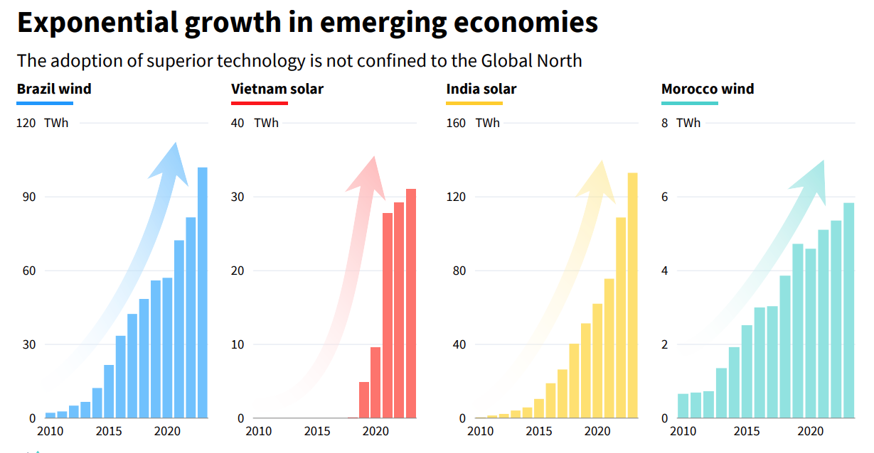
In order for a trend to be exponential, minimally it has to be increasing and concave up (the growth rate is increasing). Morocco is more linear (constant growth rate). Vietnam doesn’t have enough data to really make any determination. There was a jump in 2021 but the last few years look more like linear growth. Brazil, from 2015 to 2022 and maybe 2023, looks yet again closer to linear. India is the only one that looks exponential. In other words, the title of this chart is misleading, but that is really a minor infraction; it is more an indication that the report is pushing an agenda and not facts. (Side Note: I agree with Noahpinion in that the arrows are bad form.)
Here is India’s electricity generation by source from the IEA (note that it stops in 2021 while Figure 1 goes through 2023).

India’s solar generation is the light blue at the bottom. Does it look to you like India is rapidly adopting this “superior technology?” It looks to me like India is investing in coal. Here is the same data, but as a percentage of electricity generated.

Coal is about 70% of the electricity generated; solar is at best 5%. The thing is, at such a small amount, it is much easier to grow exponentially. I wouldn’t bet that would last very long, as it is really hard to do, and as I’ve mentioned, I would expect that the best and easiest locations for solar get chosen first.
Noahpinion wonders, “Whether this is fast enough to prevent catastrophic impacts from climate change is still an open question, of course.” With India as a base case, it generates about 130 TWh (130,000 GWh) of solar electricity in 2023, while it consumes over 1,500,000 GWh of electricity (even if we assume no growth in consumption over the last 2 years). Solar is yet to be a meaningful contributor to the electricity grid. No, this isn’t fast enough to prevent the impacts of climate change.
As to the report title, The Cleantech Revolution It’s exponential, disruptive, and now, there is nothing disruptive here, nor is it exponential or now.
China the electrostate?
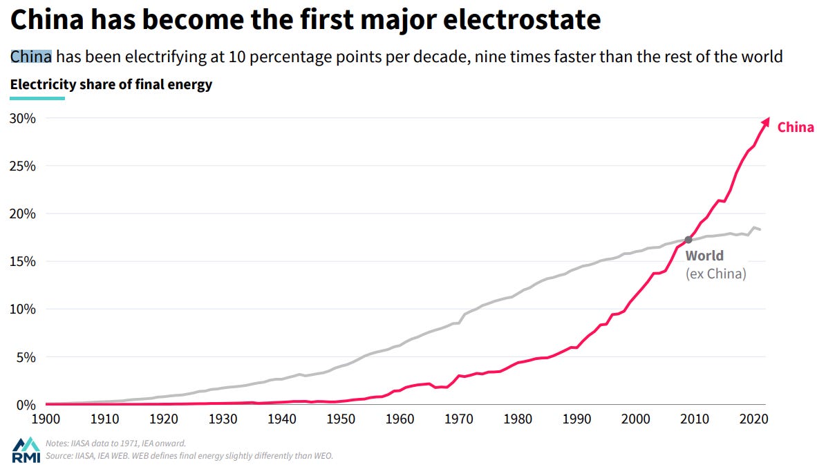
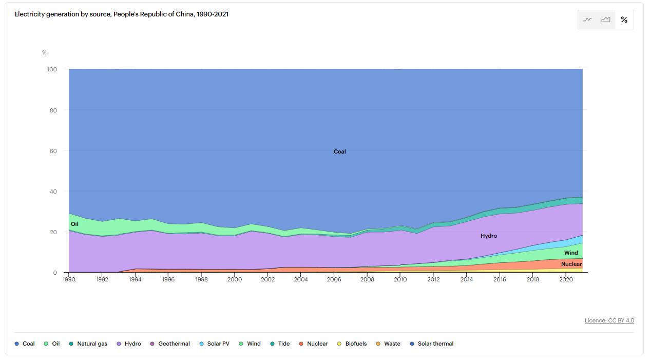
First, we need to be clear here: electricity is not an energy source. It has to come from somewhere. I think this is a bait and switch here to imply that China is moving away from fossil fuels. How does China generate electricity? It isn’t hard to find the answer. Figure 5 is again from the IEA.

Again, wind and solar are small slivers at the bottom. Coal is again the big player. What is really clear here is that China is increasing electricity generation, largely through coal. Figure 6 shows the same data by percentage of total generation.
Now, coal is down to about 62% of total electricity generation, and this is where someone can be easily misled, so let me add the third type of graph with this data the IEA offers, Figure 7.

Notice that China has been increasing coal generation. Two things can be true at the same time. Coal is a smaller percentage of total electricity, and China is burning more coal. If renewables are so “superior,” then why add so much coal? Maybe renewables are that great (yet?).
The future

This is the first graph in the RMI report. The left graph represents the “old guard,” or Exxon Mobil’s view of the future. The right side is, I suppose, the “new guard.” The language here is purposeful. Are you going to believe the old stuff or the new stuff? There is a glaring issue with both of these graph, but mostly the one on the right.
Both graphs have total energy used today at a little over 500 EJ (add both curves). The graph on the left has that total going up to about 550 EJ. The one on the right has that going down to about 450 EJ. I don’t buy that happening. Sure, maybe there will be some efficiency gains, but take a look at Figure 9.

Figure 9 shows energy use per capita for Canada, the United States, China, and India. I chose these four countries because I referenced China and India above, and Canada and the United States are good benchmarks. Canada and the United States have reduced per capita consumption a little since 1965, but not much. In general, everyone wants more energy. Given that the world population is still growing and there are limits to energy efficiency, how do we go from 500 EJ today to 450 EJ by 2050? Nuclear?
Worse, India and China represent about 1/3 of the world population. Do they never get to live with the energy the United States has? The scenario on the right doesn’t seem to allow it, and the one on the left maybe allows for some growth in their energy consumption. It seems that the “new” way of thinking keeps places like India and China poor.
As long as fossil fuels exist to be burned, they will be burned because countries like India and China want a better standard of living. If places like the United States add more solar and wind, then that just makes more fossil fuels available for other countries. If the right graph is correct for solar and wind (probably not), then my bet is that the left graph is correct for fossil fuels (better bet). Does that make me a decel?
Will green energy win? I’d actually say yes largely because fossil fuels will run out (in the sense that they is too expensive to extract) some day and likely sooner than people want to acknowledge.
Please share and like
Please help me find readers by forwarding this article to your friends (and even those who aren't your friends), sharing this post on social media, and clicking like. If you have any article ideas, feedback, or other views, please email me at briefedbydata@substack.com.
Thank you
In a crowded media market, it's hard to get people to read your work. I have a long way to go and I want to say thank you to everyone who has helped me find and attract subscribers.
Disagreeing and using comments
I'd rather know the truth and understand the world than always be right. I'm not writing to upset or antagonize anyone on purpose, though I guess that could happen. I welcome dissent and disagreement in the comments. We all should be forced to articulate our viewpoints and change our minds when we need to, but we should also know that we can respectfully disagree and move on. So, if you think something said is wrong or misrepresented, then please share your viewpoint in the comments.