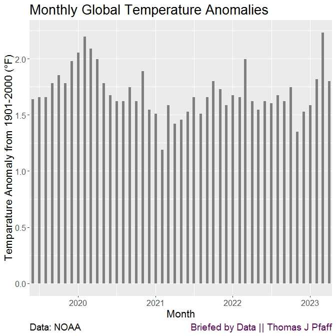
The monthly deviations from average world temperatures are depicted in Figure 2 for the past few years. According to the appearance of this graph, the world is not getting warmer. There is some variation, but there is most assuredly not a rising tendency.
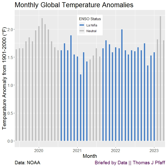
The third figure is an identical graph to the second, with the exception that it also includes the ENSO (El Niño and the Southern Oscillation) state for each month. Since we haven't experienced an El Niño era since the middle of 2019, there were no El Niño months during this time period. Instead, we only had neutral status or La Niña months. It is important to take note of the downward trend that occurs throughout the La Niña periods.
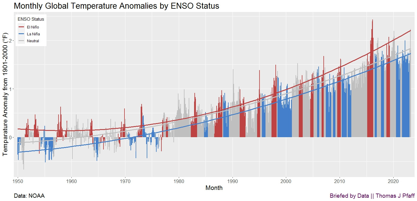
The entire tale is depicted in Figure 1, which can be found at the top of the page. This graph provides a visual representation of the three distinct yet similar patterns of climate change that the ENSO condition affects. Each bar depicts the monthly temperature deviations in comparison to the monthly baseline average that was calculated from 1901 to 2000. The colors of the bars represent ENSO conditions. A quadratic function that best fits the data given by each status has been added to the graph.
In general, record-breaking temperatures are more likely to occur during El Niño years, and the warming trend tends to become more pronounced as the period progresses. El Niño has a more pronounced bend in its curve than the other two conditions, which both have quadratic fits. The El Niño Southern Oscillation (ENSO) is a key variable in relation to global temperature, and we should not be misled by times in which it seems as though climate change has ceased. Take note of the fact that it is forecast that we will be moving into an El Niño, and if the patterns continue, we can anticipate that the temperature will rise to record highs.
That’s your ENSO climate change briefing.
Some Technical Info
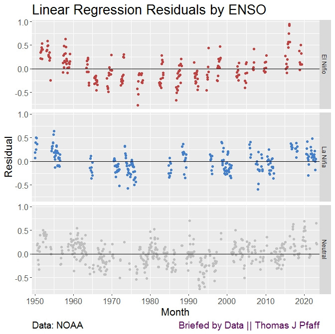
In Figure 4, you can see the residual plots for each state. There is no doubt that El Niño has a stronger curve.
It's important to know that ENSO status is a hard cutoff for a continuous range. The Golden Gate Weather Services has some more information. They provide more information about the levels of La Niña and El Niño, whereas here we don’t distinguish between levels.
Figure 1 here is a version of one that NOAA provides (see the April 2023 Global Climate Report as an example), with the key difference being the addition of the quadratic curves.
Data
ENSO status Oceanic Niño Index
References
NOAA National Centers for Environmental information, Climate at a Glance: Global Time Series, published May 2023, retrieved on June 8, 2023 from https://www.ncei.noaa.gov/access/monitoring/climate-at-a-glance/global/time-series
NOAA National Centers for Environmental Information, Monthly Global Climate Report for April 2023, published online May 2023, retrieved on June 8, 2023 from https://www.ncei.noaa.gov/access/monitoring/monthly-report/global/202304/supplemental/page-4.




This is great! It is really informative to see the trendlines separated by ENSO status!