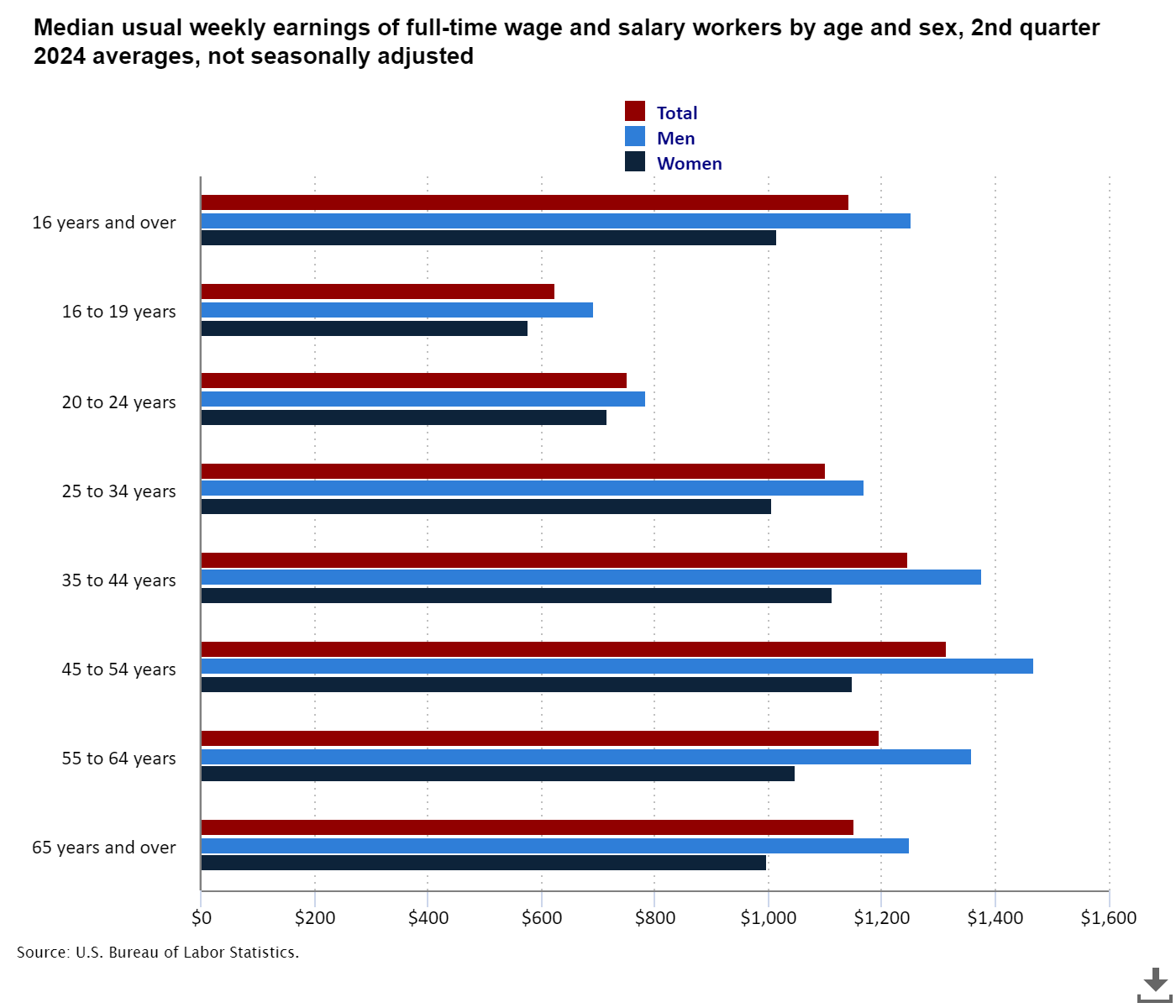
The Bureau of Labor Statistics (BLS) provides regular updates on a range of labor force statistics derived from its monthly Current Population Survey(CPS). In this post, we'll look at one of their graphs, as seen in Figure 1, analyze certain features, and try to give more information with better graphs.
Figure 1 depicts the usual median weekly wages during the second quarter of 2024 for various groups, where usual means:
Usual weekly earnings. Data represent earnings before taxes and other deductions and include any overtime pay, commissions, or tips usually received (at the main job in the case of multiple jobholders). Prior to 1994, respondents were asked how much they usually earned per week. Since January 1994, respondents have been asked to identify the easiest way for them to report earnings (hourly, weekly, biweekly, twice monthly, monthly, annually, or other) and how much they usually earn in the reported time period.

First, the word “average” at the end of the title causes confusion. Each bar in the graph shows the group's median value. Worse, below the graph, they state this (bold mine):
Among workers with less than a high school diploma, women had usual median weekly earnings of $634 while men's earnings averaged $776. High school graduates with no college that were women had median earnings of $794 per week and men had earnings of $1,024.
Avoid the word “averaged”; instead, use “mean” or “median.” In this situation, $776 represents the median, although most people will read the word averaged as the mean. Journalists and writers are instructed not to repeat words, but in this situation, they should repeat “median.” This is also seen when fractions and percentages are mixed together so that one is not used repeatedly. Again, this causes confusion.
The chart's colors are an interesting choice, and the graph's layout concentrates attention on variations between men and women within education categories rather than, say, discrepancies between education levels. There is nothing malicious about this, and the decision was most likely made unconsciously, but it is worth noting how the colors focus our attention.
One of my data rules is to know the distribution, not just the mean and median. According to Figure 1, people will make claims that college graduates earn more money than those with only a high school diploma in order to justify the cost of attending college. Technically, this is a correct statement, but someone will come along and point out that Bill makes more money than Bob, despite the fact that Bob has a college degree and Bill does not, and use that to argue that “college students make more money than high school graduates” is not accurate. I think colleges get themselves in trouble here because people will remember and talk about the example and use it to dismiss the potential value of college. Figure 1 would be better as a collection of boxplots that highlight the distributions and overlaps between the categories. Let's go to the data.
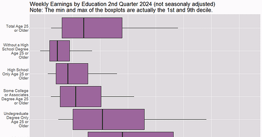
Figure 2 starts us off with box plots of usual weekly earnings by education level. The BLS has tables of data for their weekly earnings charts, but I couldn't find the original data. One thing to notice is that they aren't true boxplots because the minimum and maximum numbers required for a real boxplot aren't accessible, but the BLS did offer the first and ninth deciles, which I used. In actuality, the whiskers account for 15% of the data, with another 10% beyond the end of the whiskers.

Figure 2 concentrates on earnings and education levels, making it easy to compare the groups. We observe significant overlaps. In fact, the top 25% of people with only a high school diploma earn more than about the bottom 25% of those with an advanced degree. Similarly, the top 25% outperforms approximately 37% of those with a college degree; the third quartile of the high school group almost cuts the first box in the boxplot in half of the college group.
For many students, the return on investment argument for college use falls flat. It also leads students to believe that all they need to do is graduate to earn more, but in reality, they should be aiming to obtain as many skills and content knowledge as possible while in college to maximize their chances of earning more, if that is their objective. I believe that colleges should abandon the ROI argument in favor of pursuing a professional path that interests them. Even if you don't make more money, you'll be happier, which may be worth the cost.
II also hope you are thinking to yourself about the data rule “always consider other factors as single-factor explanations are rare” as you look at Figure 2. Age seems like an obvious factor. It's possible that the higher earners in each group are older, and comparing the same ages in each group would result in no overlap.
Age is undoubtedly a factor, and if I had the original data, I might be able to explore more, but the BLS does offer Figure 3. Note that the ages in Figure 2 are 25 and higher, and when we look at Figure 3, there is some difference in the groups beginning at age 25, but not as much as one might think. Unfortunately, I do not have quartiles for this dataset. Finally, some of the overlaps in Figure 2 are most certainly caused by aging, but certainly not all of them.

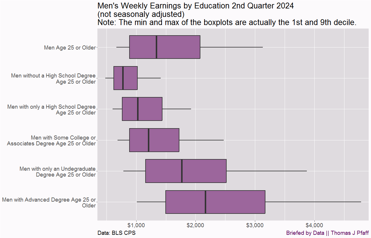
Three more charts to add context to the original chart from the BLS Figure 1. Figure 4 has the same type of boxplot by education but grouped by gender.

Men earn more than women on average at all levels of education, but there is a significant overlap. In fact, in most situations, men earn more per week than women at the next level of education. The primary factor here is most likely occupational choice. For example, a male without a high school diploma can still use his back to earn money and perform as effectively as a female with a high school diploma. (We can debate if this is a win or not for guys. As someone who has been roofing his house this summer, I understand how difficult it is to make a living off one's back.)
I have two additional graphs, Figures 5 and 6, which are identical to Figure 4, but for men and women separately. Figure 4 makes it difficult to compare weekly incomes by education for men and women separately. Even if you aren't interested, have a look and observe how much easier it is to read Figures 5 and 6 than to extract the same information from Figure 4. One of my concerns here is that the way someone organizes and presents graphical data may and does lead to particular comparisons and conclusions.


I appreciate the graph and data the BLS make publicly available, but at the same time, they need to step up their graph game. Figure 1 is simply too superficial and leads to unduly simplified assumptions, such as the fact that people with a college education earn more. On average, yes, but distributions matter. Hopefully, I filled in some of the gaps created by the BLS graph.
Please share and like
Sharing and liking posts attracts new readers and boosts algorithm performance. Everything you do is appreciated.
Comments
Please point out if you think something was expressed wrongly or misinterpreted. I'd rather know the truth and understand the world than be correct. I welcome comments and disagreement. We should all be forced to express our opinions and change our minds, but we should also know how to respectfully disagree and move on. Send me article ideas, feedback, or other thoughts at briefedbydata@substack.com.
Bio
I am a tenured mathematics professor at Ithaca College (PhD Math: Stochastic Processes, MS Applied Statistics, MS Math, BS Math, BS Exercise Science), and I consider myself an accidental academic (opinions are my own). I'm a gardener, drummer, rower, runner, inline skater, 46er, and R user. I welcome any collaboration.


