Classroom connections April 6, 2024
Links to data, modeling, and examples of math and statistics applications
Classroom connections are less something you can apply right away and more of me pointing out resources. I believe that there is a lot of amazing math, statistics, and data out there that might be used in math classrooms and is also interesting to the curious. Some of these examples may require some effort to be classroom-ready, and some of this has appeared in previous posts. I’m ordering this roughly based on the level of math. Please let me know if you or someone you know uses any of this in the classroom or has a relevant idea (email me at thomas.pfaff@sustainabilitymath.org). Really, leave a comment or send me an email if these classroom connection posts are useful. Similarly, if you have an opinion or concept that is relevant, please share it in the comments. Please share, like, subscribe, and feel free to comment.
Stats in schools
The Census Bureau has data and lesson plan resources for grades K–12 on its Statistics in Schools page.
Through topics such as family structures, immigration, and the value of education, show students how they can apply math and statistics to make real-life decisions and identify important changes in their community and country. Use the grade-range tabs below to explore math activities. Corresponding teachers' guides are available for each activity.
There are 9 activities for 9–12, most of which could be used in any introductory statistics course. Here is a screen shot of the 9–12 page:
Application of statistics to history
I mentioned this one in the March 14 Quick Takes. The paper Estimating the ‘Missing’ Houses of Silchester (11/24/2023) has the data in an Excel file in supplementary materials for the graph here and others in the paper.
The basic question about the Roman site Slichester is related to what appears to be a lot of empty space. Part of the analysis looks at the population size and space of other sites. The gray line represents a 95% confidence interval, while the red dotted lines represent a 95% prediction interval. Silchester is certainly an outlier.
A correlation matrix
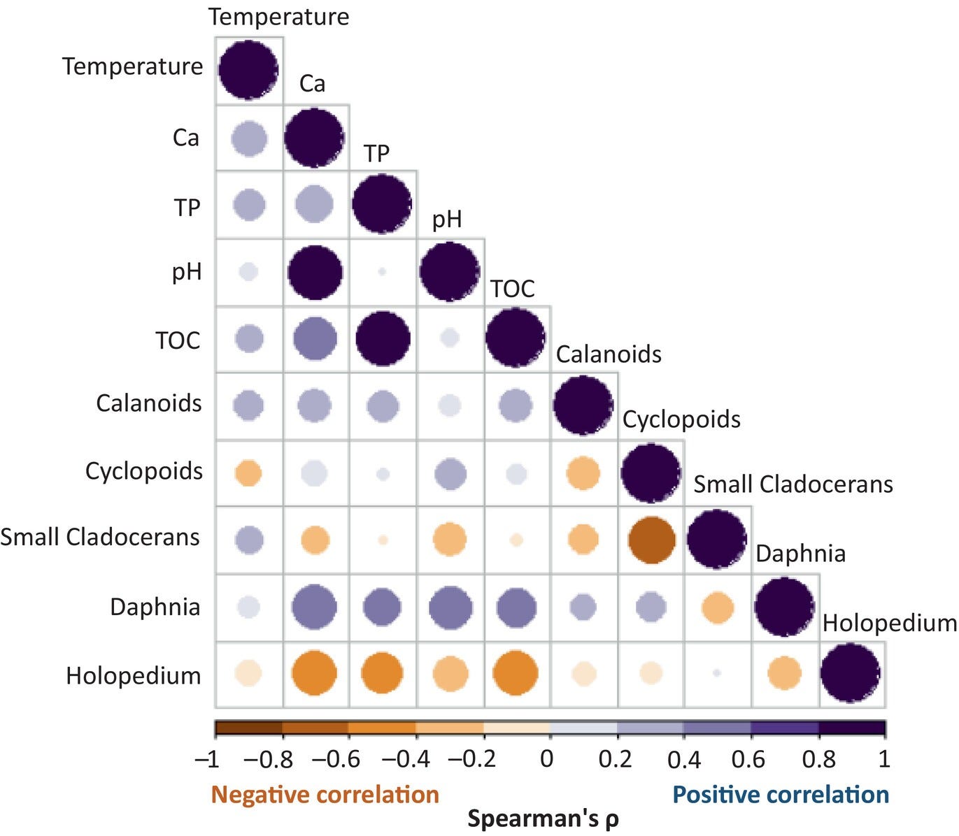
If you’d like an example of a correlation matrix for students to interpret, here is a nice one from the paper Declining calcium concentration drives shifts toward smaller and less nutritious zooplankton in northern lakes (3/3/2024). Or maybe you are teaching a data science class and want students to make the graph. Well, the data for this graph is available in the open research statement at the bottom of the paper.
Modeling
The paper Energy affordability across and within 26 European countries: Insights into the prevalence and depth of problems using microeconomic data (11/2023) is very approachable for an undergraduate modeling project or short assignments.
The logistic model by an ecologist
I published the paper How Ecologists Develop the Logistic Model (2/14/2024) in the journal PRIMUS (Problems, Resources, and Issues in Mathematics Undergraduate Studies). I get a link that provides free access to 50 people. If you are interested, go ahead and click the link.
Graphs, data, and statistical tests
If you are looking for graphs for students to interpret or data to make graphs, the paper Global emergent responses of stream microbial metabolism to glacier shrinkage (3/1/2024) is a place to explore. Data is available at the bottom, and some could likely be used for a t-test or ANOVA. Here are two graphs and a look at some formulas.
Modeling, probability, and a 3D graph
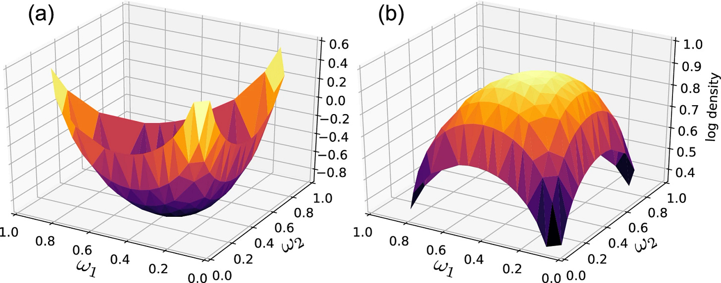
The paper Local Bayesian Dirichlet mixing of imperfect models (11/10/203) could be the basis for an independent study or example for a probability course, or more simply, an example of a 3D graph for a Calculus III course and examples of integrals being used.
General mixed models
From the paper Foraging habits of Northwest Atlantic hooded seals over the past 30 years: Future habitat suitability under global warming (3/7/2024)
We used Generalized Additive Mixed Models (GAMMs ‘gamm’ function in the R package ‘mgcv’; Wood, 2006) to build the distribution, temporal and habitat models assuming Gaussian error distributions in the response variables. Day of the year and/or oceanographic parameters were included as a smooth term (knot value k was set at 5, 7 and 4 for distribution, temporal and habitat models, respectively—values chosen based on a trade-off between enough degrees of freedom [edf] to fit the data reasonably well but few enough to maintain reasonable computational efficiency). If output edf was equal to 1 for a given parameter, it was switched to a linear term in the rerun model. We included decade (i.e. 1990s, 2000s and 2010s) as a “by” variable (interaction term) in the day of the year and/or oceanographic parameter terms in order to compare patterns over decades. The distribution, temporal and habitat use models were built as follows:
The supplementary materials has links to the data.
Network analysis
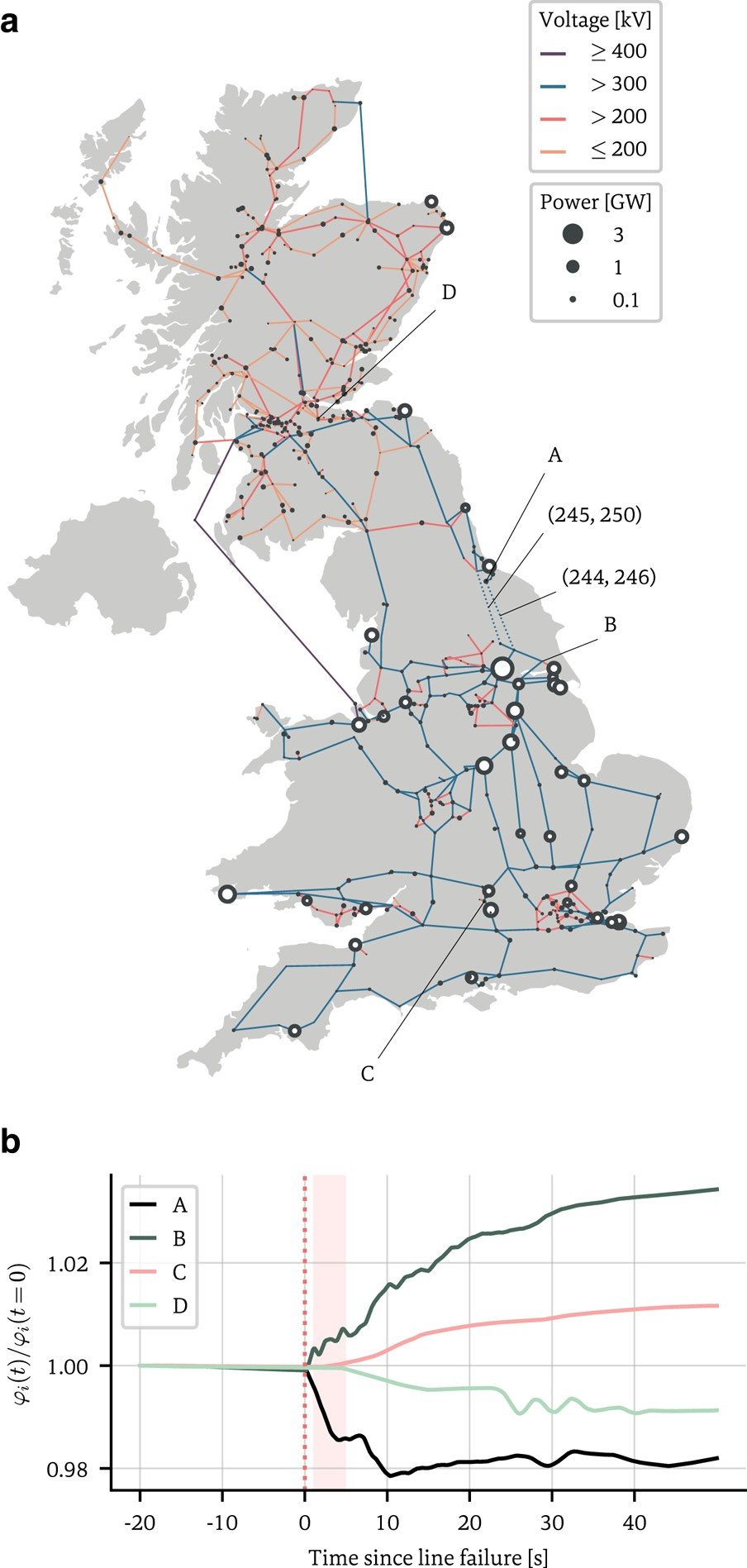
The paper Inferring networks from time series: A neural approach (4/2024) may be too much for an undergraduate course, but I’m putting it here because it is really interesting and maybe someone can make use of it. If nothing else, an example of the use of graphs.
Network structures underlie the dynamics of many complex phenomena, from gene regulation and foodwebs to power grids and social media. Yet, as they often cannot be observed directly, their connectivities must be inferred from observations of the dynamics to which they give rise. In this work, we present a powerful computational method to infer large network adjacency matrices from time series data using a neural network, in order to provide uncertainty quantification on the prediction in a manner that reflects both the degree to which the inference problem is underdetermined as well as the noise on the data.
Note
Please, if you have suggestions for the classroom connections post or have made use of anything, then please let me know. Just leave a comment.


