Classroom Connections December 16, 2023
Also, neat stuff if you aren't a teacher but are generally curious
Classroom connections are less something you can use immediately and more me trying to point out resources. I think there is a lot of great math, statistics, and data being used in the world that isn’t making it to the classroom. Some of these examples may take some effort to make classroom-ready. If you or someone you know uses any of this in a classroom or has a related idea, then know that I’m open to guest posts (email me: thomas.pfaff@sustainabilitymath.org). Similarly, if you have a related thought or idea, then please post it in the comments. According to Substack, you won't see the entirety of this post in your inbox because it is too long, so I’ll put the buttons here. Please share, comment, and subscribe:
Percentage change, projections, and uncertainty
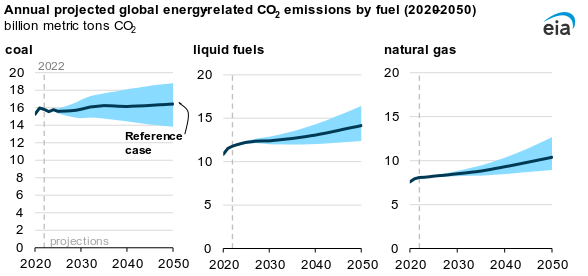
The EIA is a great source for basic graphs, percentages, and projections. The post Global CO2 emissions rise through 2050 in most IEO2023 cases (11/30/2023) provides all of this. Here is the graph with future CO2 projections, with the blue giving a range for their projections.
Here is a quote from the article with percentage change values:
By 2050, energy-related CO2 emissions vary between a 2% decrease and a 34% increase compared with 2022 in all cases we modeled. Growing populations and incomes increase fossil fuel consumption and emissions, particularly in the industrial and electric power sectors. These trends offset emissions reductions from improved energy efficiency, lower carbon intensity of fuel mix, and growth in non-fossil fuel energy.
If you teach statistics, read this
The phys.org article Time to abandon null hypothesis significance testing? Moving beyond the default approach summarizes key points from a paper in the Journal of Marketing (behind a paywall). Some key points (note that NHST is null hypothesis significance testing):
The authors propose a major transition in statistical analysis and reporting. Specifically, they propose abandoning NHST—and the P-value thresholds intrinsic to it—as the default approach to statistical analysis and reporting. Their recommendations are as follows:
"Statistical (non)significance" should never be used as a basis to make general and certain conclusions.
"Statistical (non)significance" should also never be used as a filter to select which results to publish.
Instead, all studies should be published in some form or another.
Reporting should focus on quantifying study results via point and interval estimates. All of the values inside conventional interval estimates are at least reasonably compatible with the data given all of the assumptions used to compute them; therefore, it makes no sense to single out a specific value, such as the null value.
General conclusions should be made based on the cumulative evidence from multiple studies.
Studies need to treat P-values continuously and as just one factor among many—including prior evidence, the plausibility of mechanism, study design, data quality, and others that vary by research domain—that require joint consideration and holistic integration.
Researchers must also respect the fact that such conclusions are necessarily tentative and subject to revision as new studies are conducted.
On sampling
Keeping with the statistics theme, classes tend to focus too much on the mechanics of hypothesis tests when sampling is more important. Here is a great example from the paper Estimating mortality of small passerine birds colliding with wind turbines (12/4/2023).
The basic idea is that to estimate the number of birds killed by wind turbines, you randomly select some turbines and count up the dead birds. Easy enough, except how do you know you found all the birds? It turns out that that is a problem. This study used dummy birds to see if the dogs used to help find the dead birds could find them. Not so much:
The dogs in the carcass surveys were more successful in locating the large than the small dummy birds (60–200 g), where they found 74% of the large dummy birds. Detecting the smaller category (5–24 g) was more demanding and the dogs only found 17% of the small dummy birds. Correcting the post-construction carcass survey outcome with the results from the experiment leads to an almost fourfold increase in estimated mortality rates, largely due to the low detection rate of the smallest category. The detection rates will naturally vary between wind farms, depending on the specific habitat characteristics, the efficiency of the carcass surveys and the search intervals. Thus, implementing a simple experiment with dummy birds to future post-construction surveys will produce more accurate estimates of the wind turbine mortality rates, and thus improve our understanding of the biodiversity effects of conforming to a more sustainable future.
Another problem is how long the birds have been dead. The longer the time period, the fewer that were found. The graph

The need for log scales and skewed distributions
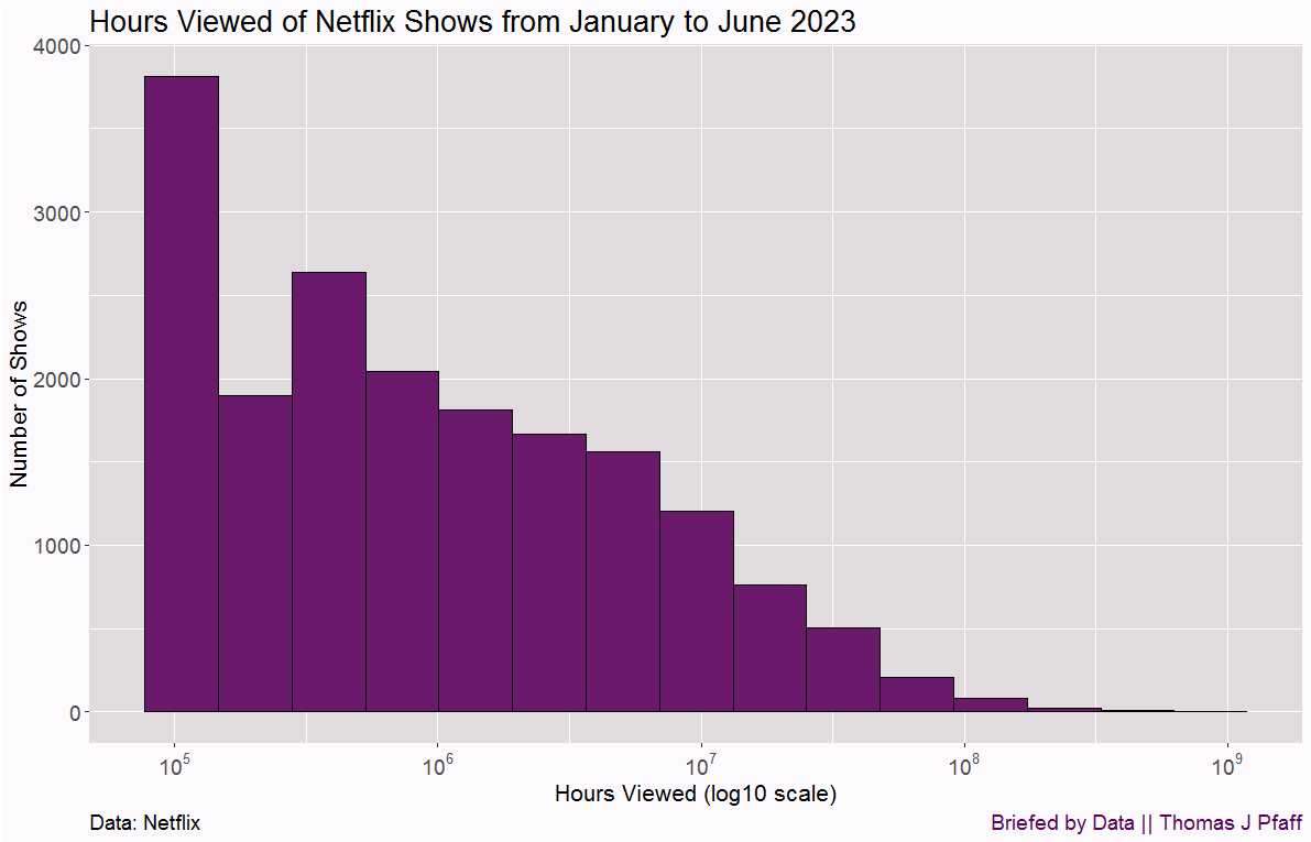
Along with the points above, introductory statistics courses need to make students better aware of different types of distributions. These courses focus too much on normal distributions. See my animation of different distributions with the same mean. In this week’s Quick Takes I have this graph of Netflix-viewed hours.
The x-axis is a log scale. Here is the same data without the log scale:
This is a very skewed distribution, and the two images drive home the need to use a log scale. Netflix posted the data and it may be useful in a classroom.
Here is another example of skewed distributions from the paper A global synthesis and assessment of free-ranging domestic cat diet (12/12/2023). Note again the log scale, which you need if the data is skewed a lot.

In a statistics class or quantitative literacy class, assignments could be centered on having students read information off the graph.
Regression models
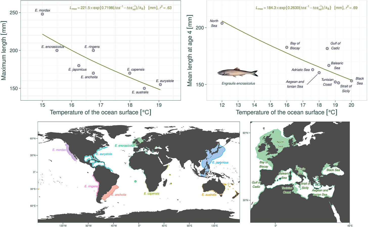
I used this graph in Quick Takes a couple of weeks ago, but I want to add that the paper has links to the data and explains their regression models. The data could also likely be repurposed for some t-tests or an ANOVA.
Partial differential equation models
There is a lot of neat mathematics going on in other disciplines. Some of which could be adapted for math classes or an independent study project, and in some cases, maybe just showing these to students would convince them that knowing math is a good thing. Here are two screen shots as an example from the paper Ocean deoxygenation caused non-linear responses in the structure and functioning of benthic ecosystems (11/2/2023).
Probability and integration
If you want an example of probability being used to model real-world stuff or to just point out to students in a calculus class that integration is used, then take a look at Performance of Fire Danger Indices and Their Utility in Predicting Future Wildfire Danger Over the Conterminous United States (Nov 2023). A screen shot:
and a graph
A surface
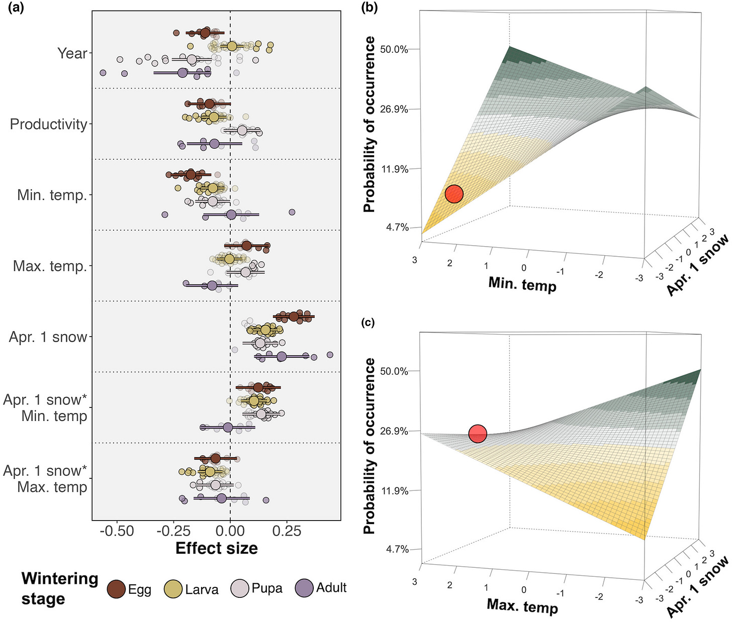
Coefficient estimates from the model focusing on Donner Pass. (a) The estimated effect (and 80% credible intervals) of each variable on butterflies. Small colored points show estimates from the lowest level in the hierarchy (a species) and are colored by overwintering stage. Points denoting estimates that are credibly different from 0 at a 0.8 level are opaque. Larger colored points with error bars show the wintering stage-level estimate with 80% credible intervals. (b) Visualization of the interaction between minimum temperature and April 1 snow for eggs and larvae. (c) Visualization of the interaction between maximum temperature and April 1 snow for eggs and larvae. The red point in panels b and c indicates observed conditions during the drought.
The data is available here. There are a lot of statistics, including a factor analysis, in this paper.
Please share and like
Please help me find readers by forwarding this article to your friends (and even those who aren't your friends), sharing this post on social media, and clicking like. If you're on Twitter, you can find me at BriefedByData. If you have any article ideas, feedback, or other views, please email me at briefedbydata@substack.com.
Thank you
In a crowded media market, it's hard to get people to read your work. I have a long way to go, and I want to say thank you to everyone who has helped me find and attract subscribers.
Disagreeing and using comments
I'd rather know the truth and understand the world than always be right. I'm not writing to upset or antagonize anyone on purpose, though I guess that could happen. I welcome dissent and disagreement in the comments. We all should be forced to articulate our viewpoints and change our minds when we need to, but we should also know that we can respectfully disagree and move on. So, if you think something said is wrong or misrepresented, then please share your viewpoint in the comments.


