Same Mean Different Distribution
A Probability and Statistics Post: Know the distribution, not just the mean and median.
I hope everyone had a great Thanksgiving.
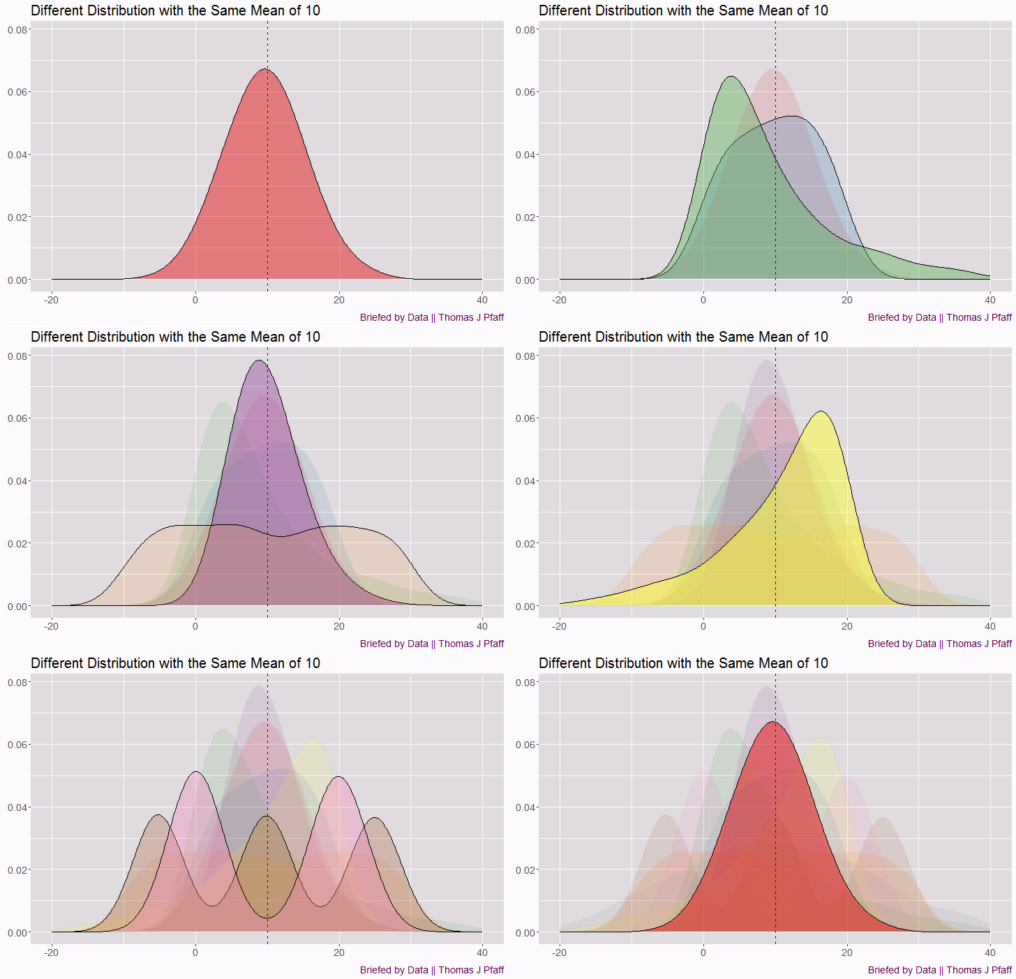
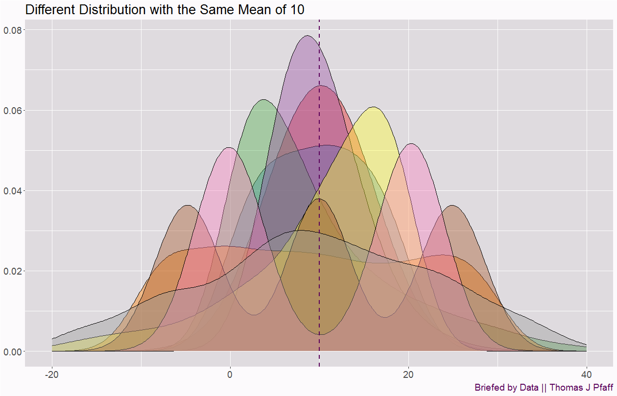
With so much attention given to normal distributions or bell curves (generally the main focus of an introductory statistics course), it is easy to have the normal distribution be our default view of all data. This is a mistake, and so today’s post is to illustrate the Data Rule: Know the distribution, not just the mean and median. Figure 1 is an animation where each distribution has the same mean. Notice how some distributions are symmetric around the mean, and even those might have no mode, one mode, two modes (bimodal), or three modes. Other distributions are skewed either to the right or the left.
For example, heights are roughly normally distributed, but if you group men and women together, it is more bimodal, although the modes can be hidden since there is enough overlap. A better example might be male and female grip strength. On the other hand, income and wealth are very skewed to the right. Similarly, distributions of maximums, such as the maximum height of a river each year, are skewed right. Also, see my post From a Normal Distribution to a Pareto for an example of a skewed distribution.
For an example of our collective misconception of distributions and how it could effect policy, take a moment to watch the video below. The video is a decade old, and the scary background music is unnecessary. But it makes a great point about our misconception of distributions.
Lastly, I leave you with two different static images of the distributions in the animation in Figure 1, just in case someone wants to make use of these in a classroom.
Please share and like
Please help me find readers by forwarding this article to your friends (and even those who aren't your friends), sharing this post on social media, and clicking like. If you're on Twitter, you can find me at BriefedByData. If you have any article ideas, feedback, or other views, please email me at briefedbydata@substack.com.
Thank you
In a crowded media market, it's hard to get people to read your work. I have a long way to go, and I want to say thank you to everyone who has helped me find and attract subscribers.
Disagreeing and using comments
I'd rather know the truth and understand the world than always be right. I'm not writing to upset or antagonize anyone on purpose, though I guess that could happen. I welcome dissent and disagreement in the comments. We all should be forced to articulate our viewpoints and change our minds when we need to, but we should also know that we can respectfully disagree and move on. So, if you think something said is wrong or misrepresented, then please share your viewpoint in the comments.
R Code for graphs
## Packages

library(dplyr)
library(ggplot2)
library(gganimate)

## create data
DataNorm10 <- data.frame( "Data" = rnorm(1000,10,5), "Type"= "Normal", "Number" = 1)
DataUniform <- data.frame( "Data" = runif(1000,0,20), "Type"= "Uniform", "Number"=2)
DataExp <- data.frame( "Data" = rexp(1000,0.1), "Type"= "Exponential", "Number"=3)
DataChi <- data.frame( "Data" = rchisq(1000,10), "Type"= "Chi Square", "Number"=4)
DataUniform2 <- data.frame( "Data" = runif(1000,-10,30), "Type"= "Uniform", "Number"=5)
DataNormTri <- data.frame( "Data" = c(rnorm(333,-5,2), rnorm(333,25,2),rnorm(334,10,2)), "Type"= "Tri Modal", "Number" = 7)
DataNormBi <- data.frame( "Data" = c(rnorm(500,0,2.5), rnorm(500,20,2.5)), "Type"= "Bi Modal", "Number" = 8)
DataNormWide <- data.frame( "Data" = rnorm(1000, 10, 15), "Type"= "Normal", "Number"=9)
DataExp2 <- data.frame( "DataT" = rexp(1000,0.1), "Type"= "Exponential", "Number"=6)
DataExp2 <- DataExp2 %>% mutate(Data = ifelse(DataT >= 10, 10 - (DataT-10), 10 + 10-DataT )) %>% select(Data, Type, Number)

DataFinal <- rbind(DataNorm10, DataUniform, DataExp, DataChi, DataUniform2, DataExp2, DataNormBi, DataNormTri, DataNormWide)

## Colors

MyColors <- c('#e41a1c', '#377eb8', '#4daf4a', '#984ea3', '#ff7f00', '#ffff33', '#a65628', '#f781bf', '#999999')

## Static Image

dev.new(width = 1456,height = 936,unit = "px")
ggplot(DataFinal, aes(Data, fill = factor(Number))) +
  geom_density(alpha = 0.4, bw = 3) +
  scale_x_continuous(limits = c(-20, 40)) +
  scale_fill_manual(values = MyColors) +
  geom_vline(xintercept = 10, linetype = "dashed", color = "#5B005B", linewidth = 1) +
  theme(strip.background = element_blank(), strip.text.x = element_blank()) +
  theme(axis.text = element_text(size = 14),
        axis.title = element_text(size = 16),
        plot.title = element_text(size = 20),
        plot.background = element_rect(fill = "#fcfafc"),
        panel.background = element_rect(fill = "#dfdbdf"),
        legend.background = element_rect(fill = "#f8f4f8"),
        plot.caption = element_text(hjust = c(1), size = c(14), color = c("#5B005B"))) +
  labs(title = "Different Distribution with the Same Mean of 10",
       y = NULL, x = NULL,
       caption = c("Briefed by Data || Thomas J Pfaff")) +
  theme(legend.position = "none")

## Faceted

dev.new(width = 1456,height = 936,unit = "px")
ggplot(DataFinal, aes(Data, fill = factor(Number))) +
  geom_density(alpha = 0.4, bw = 3) +
  scale_x_continuous(limits = c(-20, 40)) +
  scale_fill_manual(values = MyColors) +
  facet_wrap( ~ Number)+
  geom_vline(xintercept = 10, linetype = "dashed", color = "#5B005B", linewidth = 1) +
  theme(strip.background = element_blank(), strip.text.x = element_blank()) +
  theme(axis.text = element_text(size = 14),
        axis.title = element_text(size = 16),
        plot.title = element_text(size = 20),
        plot.background = element_rect(fill = "#fcfafc"),
        panel.background = element_rect(fill="#dfdbdf"),
        legend.background = element_rect(fill = "#f8f4f8"),
        plot.caption = element_text(hjust = c(1), size = c(14), color = c("#5B005B"))) +
  labs(title = "Different Distribution with the Same Mean of 10",
       y = NULL, x = NULL,
       caption = c("Briefed by Data || Thomas J Pfaff"))+
  theme(legend.position = "none")


### Animated

p <-  ggplot(DataFinal, aes(Data, fill = factor(Number))) +
  geom_density(alpha = 0.5, bw = 3) +
  scale_x_continuous(limits = c(-20, 40)) +
  scale_fill_manual(values = MyColors) +
  transition_states(Number, transition_length = 3, state_length = 1 ) +
  geom_vline(xintercept = 10, linetype = "dashed", color = "#5B005B", linewidth = 1) +
  enter_fade() +
  exit_fade() +
  shadow_mark(alpha = alpha/4, color = alpha("grey", .25)) +
  guides(fill = FALSE) +
  ease_aes('linear')+
  theme(axis.text = element_text(size = 14),
        axis.title = element_text(size = 16),
        plot.title = element_text(size = 20),
        plot.background = element_rect(fill = "#fcfafc"),
        panel.background = element_rect(fill = "#dfdbdf"),
        legend.background = element_rect(fill = "#f8f4f8"),
        plot.caption = element_text(hjust=c(1), size = c(14), color = c("#5B005B"))) +
  labs(title="Different Distribution with the Same Mean of 10",
       y = NULL, x = NULL,
       caption = c("Briefed by Data || Thomas J Pfaff")) +
  theme(legend.position = "none")

animate(p, fps = 5, duration = 10, width = 1456/2, height = 936/2)  #, rewind = F)


Great video