Classroom connections for February 3, 2024
Material for the curious and for possible use in a variety of math classrooms
Classroom connections are less something you can apply right away and more of me pointing out resources. I believe that there is a lot of amazing math, statistics, and data out there that might be used in math classrooms and is also interesting to the curious. Some of these examples may require some effort to be classroom-ready, and some of this has appeared in previous posts. I’m ordering this roughly based on the level of math. Please let me know if you or someone you know uses any of this in the classroom or has a relevant idea (email me at thomas.pfaff@sustainabilitymath.org). Really, leave a comment or send me an email if these classroom connection posts are useful. Similarly, if you have an opinion or concept that is relevant, please share it in the comments. Please share, like, subscribe, and feel free to comment.
Basic applied math
This paper, Electric and gasoline vehicle total cost of ownership across US cities (1/3/2024), goes through the calculations to estimate the return on investment of an electric vehicle. The math is just arithmetic, but a lot can be done with just arithmetic. Great for a project of some sort, and more can be done. For example, if the payoff for the care is 10 years, but you only plan to keep it for 5 years, is it worth it? Can it be resold to make up for the initial investment? What economic level does one need to be at to be able to make the investment in an EV as opposed to an ICE?
A bunch of charts
This BLS report compares women's and men’s earnings from a number of different perspectives. Below is one chart I used in a Quick Takes post. If you do use any of this data, then note this from the article.
The earnings comparisons in this report are on a broad level and do not control for many factors that can be important in explaining earnings differences, such as job skills and responsibilities, work experience, and specialization.
Percentages vs counts
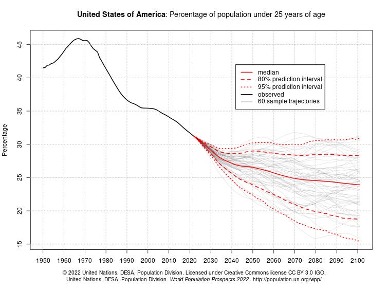
The Washington Post column How to Read This Chart compares counts of population of different ages and the percentages of the population. Great for a QL or stats class. The data comes from the United Nations Population Division. The page is interactive, with numerous choices of population by count and percentage for different age groups and countries. There are plenty of issues related to these graphs. For instance, the graph here shows the percentage of under-25-year-olds declining in the U.S. Does this create a problem in our ability to support older populations?
An interesting function
Sometimes you want a function that is not a polynomial and/or has some interesting meaning. Here is one from the paper Global reductions in manual agricultural work capacity due to climate change (1/19/2024). This is a formula for 1-h PWC (maximum physical work output that can be reasonably expected over an hour) given WBGT (wet-bulb globe temperature).
Differential equation
This is from Heat wave-induced microbial thermal trait adaptation and its reversal in the Subarctic (11/24/2023). I find it interesting that the square root is on the left as opposed to a square on the right-hand side.
The microbial temperature relationships were modeled in two steps. The square root relationship was first determined. We plotted the square root of microbial growth and respiration (y-axis) against temperature (x-axis), resulting in a linear relationship (between 0 and 20°C) according to Equation.
where R is the rate of bacterial growth (Leu incorporation), fungal growth (Ace incorporation), or respiration; a is the slope parameter; T is the screening temperature (°C), and Tmin is the minimum temperature (the x-axis intercept).
Time series, double sums, integration, and modeling
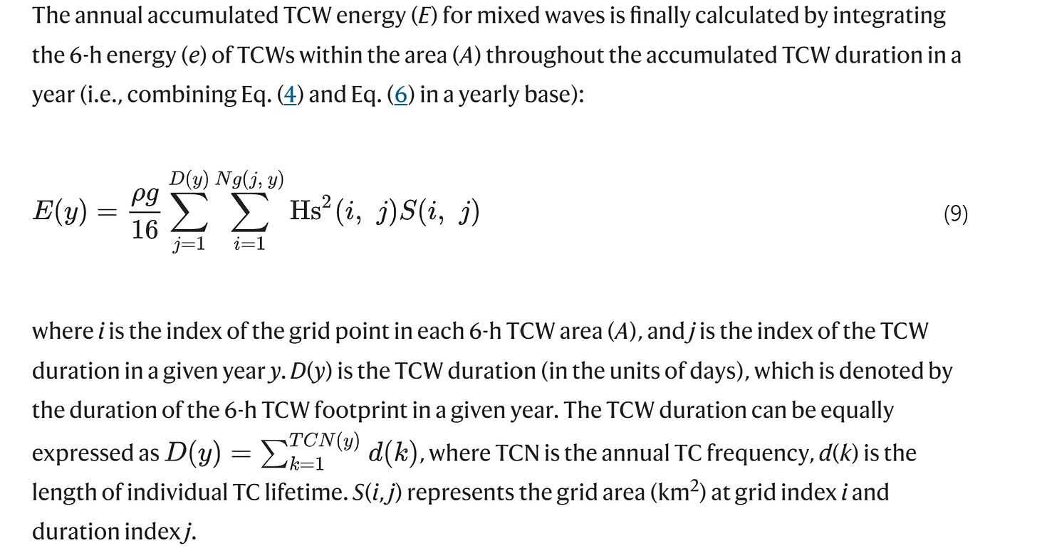
This paper, Global increase in tropical cyclone ocean surface waves (1/3/2024), has it all. There are links to the data for the regression in the graph below. If you want an example of double summation in an applied setting (see screenshot) or double integration, it’s there. I’ll keep saying that sometimes it is good to simply show students to demonstrate that math is actually used. There is also some nice modeling in the paper.
Reading density graph to modeling
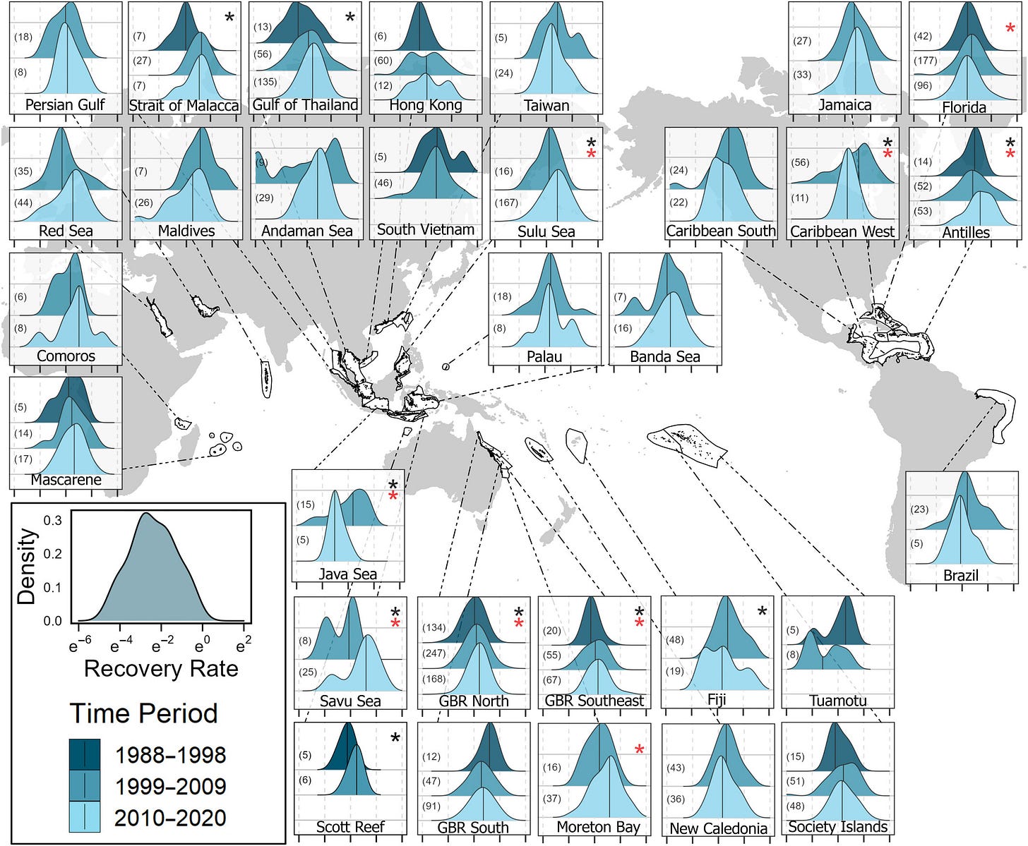
Past disturbances and local conditions influence the recovery rates of coral reefs (1/10/2024) can be used to learn how to read the densities in the graph below for a more advanced modeling example or project (see the screen shot below the graph). See this Quick Takes for comments and explanations about the graph.
Probability and modeling
From Functional changes across marine habitats due to ocean acidification (1/10/2024) with equations in the paper:
Bayesian modelling effectively handles the inherent uncertainties in ecological systems and for this study, it captures the uncertainty in species-trait associations, offering a nuanced understanding of how different species contribute to various trait categories. We applied a Bayesian Dirichlet-Multinomial model (DMM) to analyze benthic cover for the four functional traits (morphological form, feeding activity, growth rate, and calcification) using the brms package (Bürkner, 2017). We used this Bayesian model as it considers multiple possibilities, for example the trait morphology has four possibilities (categories: encrusting, filaments, massive, and tree-like forms). In this Bayesian analysis, model parameters are random variables, but they require careful specification of prior probability distributions that reflect a priori knowledge about the uncertainty in these parameters. These prior distributions are then combined with observed data using the likelihood, resulting in updated posterior probability distributions for all model parameters (i.e., the posteriors) (van de Schoot et al., 2021). Each model takes as input a matrix of counts (X). The rows of this matrix correspond to different quadrats from each habitat (��→) and the columns correspond to the group of species of the quadrat. Each count xi,j in this matrix corresponds to the jth group of species (of n group of species in total) in the composition observed in the ith quadrat, and quadrats are grouped into k groups, corresponding to pH conditions. Counts in each row of the matrix are multinomially distributed:
Principle component analysis
If you are teaching linear algebra, multivariate statistics, or some data science course, you can’t have enough PCA data. Here is one from The legacy of terrestrial plant evolution on cell wall fine structure (1/3/2024). A link at the bottom has the data.
Data science
If this graph makes sense to you, then know that the data is available in the article Contingency, repeatability, and predictability in the evolution of a prokaryotic pangenome (12/26/2023)
Neural network with data
The paper Coupling Physical Factors for Precipitation Forecast in China With Graph Neural Network (1/18/2024) provides a link to access the data used in the article.
Please share and like
Please help me find readers by forwarding this article to your friends (and even those who aren't your friends), sharing this post on social media, and clicking like. If you're on Twitter, you can find me at BriefedByData. If you have any article ideas, feedback, or other views, please email me at briefedbydata@substack.com.
Thank you
In a crowded media market, it's hard to get people to read your work. I have a long way to go, and I want to say thank you to everyone who has helped me find and attract subscribers.
Disagreeing and using comments
I'd rather know the truth and understand the world than always be right. I'm not writing to upset or antagonize anyone on purpose, though I guess that could happen. I welcome dissent and disagreement in the comments. We all should be forced to articulate our viewpoints and change our minds when we need to, but we should also know that we can respectfully disagree and move on. So, if you think something said is wrong or misrepresented, then please share your viewpoint in the comments.


