Quick takes and random stuff Jan 18, 2024
pipeline, maternal mortality data issues, education pay off, demographics, floods, and more
Canada’s trans-mountain pipeline (1/8/2024)
From the eia (1/8/2024):
Work on Canada’s Trans Mountain Pipeline expansion project is reportedly over 95% complete. When it comes onstream, the expansion will nearly triple the pipeline’s current 300,000 barrels per day (b/d) capacity to move crude oil from oil sands in landlocked Alberta to Canada’s Pacific Coast for export to new customers in Asia or along the U.S. West Coast. Although initially expected to come online early this year, the project could be delayed as much as two years by a recent ruling, according to the project’s owner.
Countries can talk about reducing fossil fuel use, but I’ll believe it when they stop investing in it.
NASA visualization
From NASA (1/12/2024)
The change in the distribution of land temperature anomalies over the years 1963 to 2023. This version is in Celsius, a Fahrenheit version is also available.
There are two things to notice here. First, if we focus on the tail, say an anomaly over 4 °C, it increases a lot. See my Normal Density Tail Differences post as to why this matters. Second, you can see the ENSO effect in the wobble in the density.
El Niño, La Nina, and ‘the Climate Jellyfish’: The bobbing back and forth of the curve shows the influence of El Niño and La Nina. El Niño is a natural climate phenomenon characterized by warmer than normal sea surface temperatures (and higher sea levels) in the central and eastern tropical Pacific Ocean. The planet is typically warmer in the El Niño phase and cooler in the La Nina phase. For context, 2020-2022 were all La Nina years, while 2015-16 were El Niño years.
Because of the nature of this movement, Mark SubbaRao, who leads NASA’s Scientific Visualization Studio and created the animation, gave it the nickname, “the climate jellyfish.”
“It looks like a jellyfish, right?” he said. “The jiggling back and forth, bobbing and weaving, there’s an organic nature to it.”
What the heck CDC?
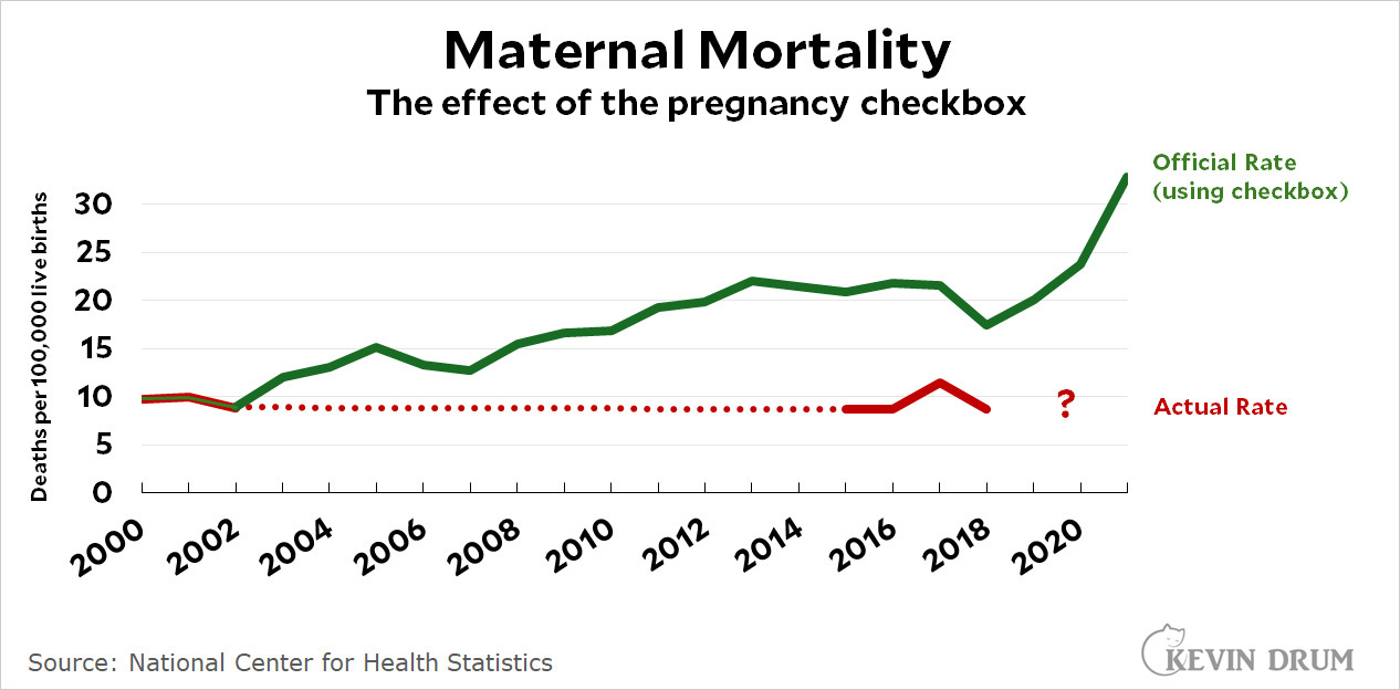
This comes from Drum’s post, Mind-blowing: The CDC is publishing maternal mortality figures it knows are wildly wrong (1/16/2024), which actually came first from Noah Smith:
The story is this: In 2003, the U.S. death certificate added a pregnancy checkbox. Over time, more and more states added this. Now any pregnant woman who died is added to the maternal mortality count, even if the death had nothing to do with the pregnancy. This was reviewed around 2018 (the red line stops there) by the CDC to clarify that maternal mortality, as commonly viewed as the mother dying due to pregnancy-related issues, had not gone up. The CDC doesn’t seem to say anything about this on their website. In other words, there isn’t a maternal mortality crisis. Institutions like the CDC will wonder why they have lost some public trust. Yeesh.
Graph of the week
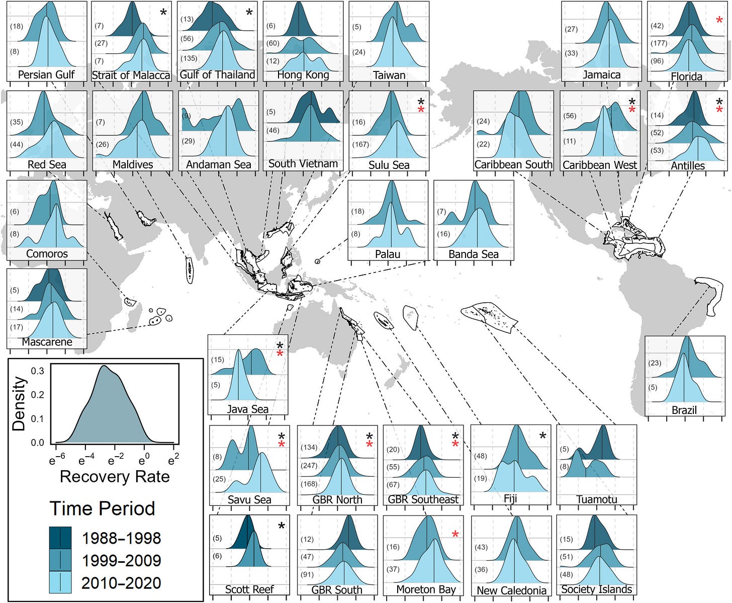
The honors go to this graph from the paper Past disturbances and local conditions influence the recovery rates of coral reefs (1/10/2024)
Here is the caption:
Density plots of recovery rates of coral cover in the Pacific, Indian, and Atlantic Oceans from 1988 to 2020. Map displaying the probability density functions of recovery rates of corals on a log-scale x-axis within ecoregions in the Pacific, Indian, and Atlantic Oceans. Recovery rates are grouped evenly by year with recovery rates from 1977 to 1987 not shown because of insufficient samples but these data were considered in the statistical analysis. The fill colors of probability density plots correspond to the time period, and the black vertical lines represent the medians. The sample size for each time period within an ecoregion is displayed in parentheses on the left side of each subplot. Black asterisks denote statistical significance in the change in the distributions over time (using an Anderson–Darling test), whereas red asterisks denote statistical significance in the change in the variance over time (using a Fligner–Killeen test). Black outlines on the map represent ecoregions.
I have one issue or caution here, and that is the log x-axis. I understand the need, but it makes it really hard to see if there are differences between one density and another. Some of this seems positive, as recovery rates in some cases have increased. This part of the conclusion gives a summary:
Since the 1970s, coral cover in the Atlantic Ocean has decreased fourfold, and recovery rates following disturbances have been relatively low, except in the Antilles where recovery rates have recently increased. By contrast, coral cover and recovery rates in the Pacific and Indian Oceans have remained moderate over time, and recovery rates have even increased in some ecoregions such as in the Coral Triangle region. The Coral Triangle region, which includes reefs of Indonesia, Malaysia, the Philippines, Papua New Guinea, the Democratic Republic of Timor-Leste, and the Solomon Islands, has also experienced relatively low coral bleaching over the past three decades (Shlesinger & van Woesik, 2023; Sully et al., 2022) and has been identified as a region with high-recovery potential (Novi & Bracco, 2022). Similarly, our study found that recovery rates have increased along the northern Great Barrier Reef, between 1998 and 2020, and on reefs in the Strait of Malacca, between 1988 and 2009. This increase in the northern Great Barrier Reef agrees with a recent study that showed rapid coral recovery in the northern Great Barrier Reef following 2020, 3 years after the 2015–2017 marine heatwave (AIMS, 2021). Therefore, contrary to theoretical expectations (Dakos et al., 2012; Livina et al., 2010; Scheffer et al., 2012; Scheffer & van Nes, 2006; Veraart et al., 2011), our study did not find an overall slowing of recovery rates with increased marine heatwaves in the Pacific Ocean.
Your data center update: another 800 acres
800-acre data center campus planned in northern Indiana - AWS potentially linked to Razor5 project (1/15/2024). I keep reporting on this partly out of curiosity but also because data centers are big electricity users.
Not enough young people
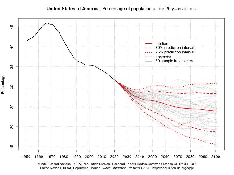
The Washington Post article How to Read this Chart (1/13/2024) is a nice tour of demographic changes. There are a number of graphs with clear explanations. This one is key to me:
What we are looking at is a future where a smaller percentage of young people will be supporting a larger proportion of older people, even though there will still be more 25 and under people as compared to 65 and older. For programs such as social security in the U.S., this seems like a bit of a problem, assuming the trend is roughly the same for the U.S., which it is:
All the graphs come from the United Nations.
Flood insurance
Here is a map from the Washington Post article Thousands of U.S. homes have flooded over and over again. Here’s where. (1/9/2024)
Properties that have repeatedly flooded account for only a small fraction — about 1 percent — of the flood insurance program’s nearly 5 million active policies across more than 22,000 communities. But they are responsible for more than 10 percent of the agency’s claims, according to the Natural Resources Defense Council, an advocacy group that sought the updated records from the federal government and maintains an online dashboard that tracks the issue.
I’ve maintained that we need to adapt to climate change. I don’t think we should keep insuring areas for floods that are going to not just keep flooding but get worse. The smart policy might be that if your home is in a flood-prone area, the next time it floods, the government buys the property from you. We can then use these properties as a buffer for rising sea levels and increasing extreme rain events. This seems nuts to me:
One property in Virginia Beach has flooded 52 times — including four floods in 2020 and another two in 2021 — with total payments amounting to $784,967. Another property on the Outer Banks of North Carolina has flooded 44 times, with payments totaling more than $2.2 million. There are 30 properties that have flooded at least 30 times, the data shows.
The value of higher education
The Economist article Was your degree really worth it? (4/3/2023) is behind a paywall, but here is the LinkedIn post that brought it to my attention.
For males, there is a 1 in 4 chance that going to college wasn’t worth it. In fact, not only is it not worth it, but it is worse than not getting a degree. Now, a 75% chance of making more money is still a good bet, but the decision to go to college or not is getting harder to make. Is there a tipping point here where the percent of people doing worse gets high enough to drive a big drop in males going to college? Females have a better bet for now, but the same question applies.
The spinning CD
The Boy Named Banjo album Dusk is one of my favorites from 2023. Here is another song from that album: Something ‘Bout A Sunset
Please share and like
Please help me find readers by forwarding this article to your friends (and even those who aren't your friends), sharing this post on social media, and clicking like. If you're on Twitter, you can find me at BriefedByData. If you have any article ideas, feedback, or other views, please email me at briefedbydata@substack.com.
Thank you
In a crowded media market, it's hard to get people to read your work. I have a long way to go, and I want to say thank you to everyone who has helped me find and attract subscribers.
Disagreeing and using comments
I'd rather know the truth and understand the world than always be right. I'm not writing to upset or antagonize anyone on purpose, though I guess that could happen. I welcome dissent and disagreement in the comments. We all should be forced to articulate our viewpoints and change our minds when we need to, but we should also know that we can respectfully disagree and move on. So, if you think something said is wrong or misrepresented, then please share your viewpoint in the comments.


