Classroom connections are less something you can apply right away and more of me pointing out resources. I believe that there is a lot of amazing math, statistics, and data out there that might be used in math classrooms and is also interesting to the curious. At the same time, the next time someone asks what math is used for, well, here are a bunch of examples.
Some of these examples may require some effort to be classroom-ready, and some of this has appeared in previous posts. I’m ordering this roughly based on the level of math. Please let me know if you or someone you know uses any of this in the classroom or has a relevant idea (email me at thomas.pfaff@sustainabilitymath.org). Really, leave a comment or send me an email if these classroom connection posts are useful. Similarly, if you have an opinion or concept that is relevant, please share it in the comments. Please share, like, subscribe, and feel free to comment.
Box plots, t-tests, and more
I used a different image from US lakes are monitored disproportionately less in communities of color (9/9/2024) than the one below in QTRS 10/10/204. That one had a bunch of bar graphs. In (b), you have the possibility of doing a t-test for each region or just interpreting the box plots. Data is available at a link at the bottom of the article. The maps are a bonus.
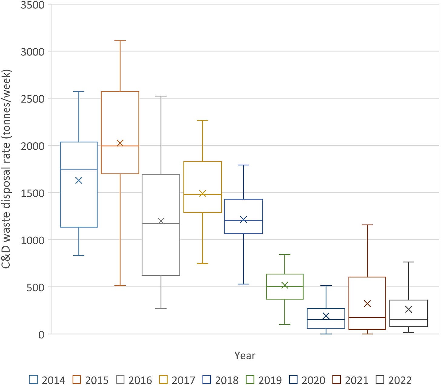
Regression, boxplots, ANOVA
These two images come from Quantification of Construction and Demolition waste disposal behaviors during COVID-19 using satellite imagery (10/9/2024). At the bottom of the article, it says the data is available by request. Anova maybe for the boxplot data? Exercises to read the regression plots?
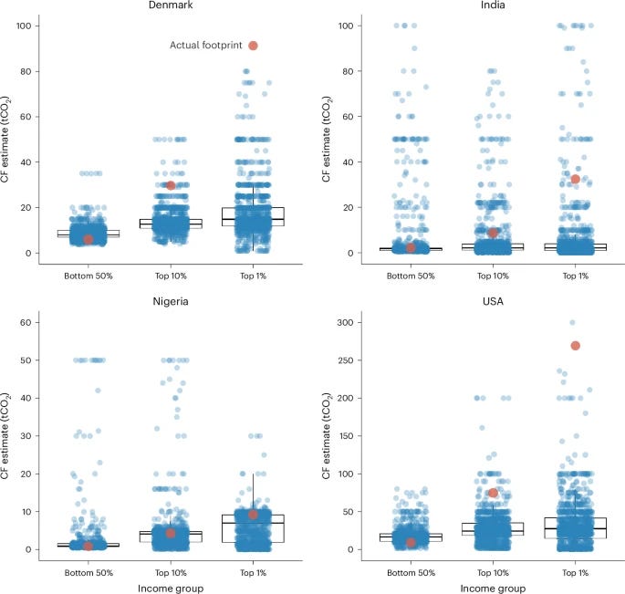
Good data
I referenced the paper Underestimation of personal carbon footprint inequality in four diverse countries (9/12/2024) in QTRS 10/3/2024 with the graph below. The data is available at OSFHome as a Rdata file. There are also other useful graphs in the paper.
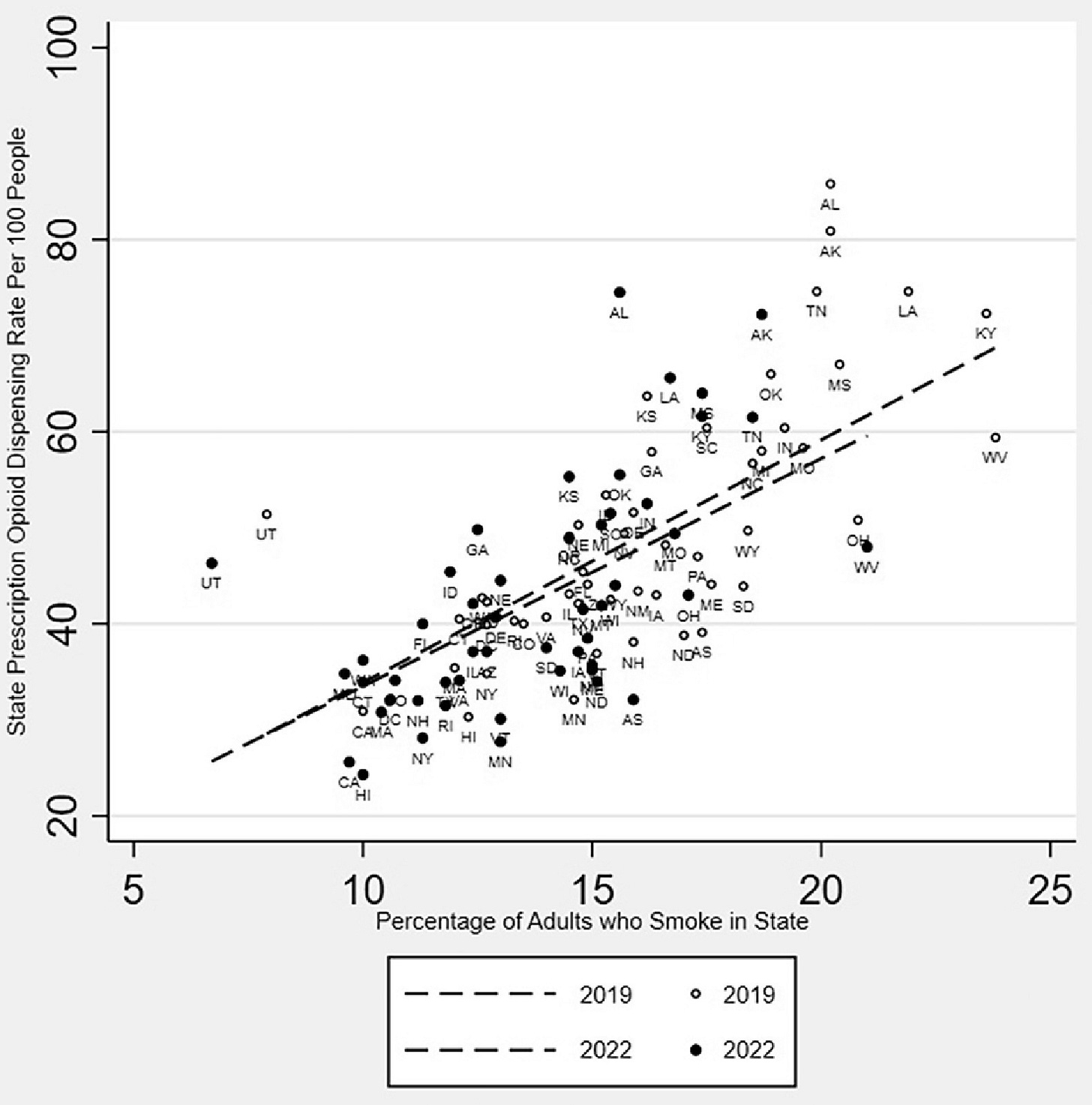
Regression and confidence intervals
The paper Heavy Versus Light Smoking: Its Association With Opioid Use, Chronic Pain, and Mental Health (7/16/2024) doesn’t provide the data for the regression below, but it does give a reference, so you might be able to get the data. The idea of comparing two variables by state is a good one and with a little creativity, you could probably come up with other examples. The paper also has a number of tables with confidence intervals that are compared that could be used as part of exercises or examples.
Surfaces and more
Might a little Calc III come in handy in drug studies? Apparently so in the paper Translational modeling-based evidence for enhanced efficacy of standard-of-care drugs in combination with anti-microRNA-155 in non-small-cell lung cancer (8/2/2024). This is another one where maybe the real value is just to show students.
Caption: Drug combination studies and synergy evaluation. 50 samples obtained using Latin hypercube sampling for two- and three-drug combinations each were investigated for predictions of median PFS under the Q3W regimen. 3D and 4D plots show median PFS corresponding to combinations of anti-miR-155 (AM) with A) cisplatin (Cis.), (B) atezolizumab (Ate.), (C) pembrolizumab (Pem.), (D) cisplatin and atezolizumab, and (E) cisplatin and pembrolizumab. (F) Combination indices (CI) for the various combinations are shown, with the combinations aligned in an ascending order of anti-miR-155 dose fractions. Note that CI < 0.9 denotes synergism, 0.9 < CI < 1.1 denotes additive combinations, and CI > 1.1 indicates antagonism. (G) Model-predicted time to progression and (H) PFS for various monotherapies and strongly synergistic combination therapies following Q3W regimen
Modeling
There is higher level modeling in the paper Multiscale mushy layer model for Arctic marginal ice zone dynamics (9/3/2024) that might be suitable for an independent study project. Still, there is value in showing the paper to students to see where math is being used to understand the world. Here is one screenshot of just one equation and a set of graphs.
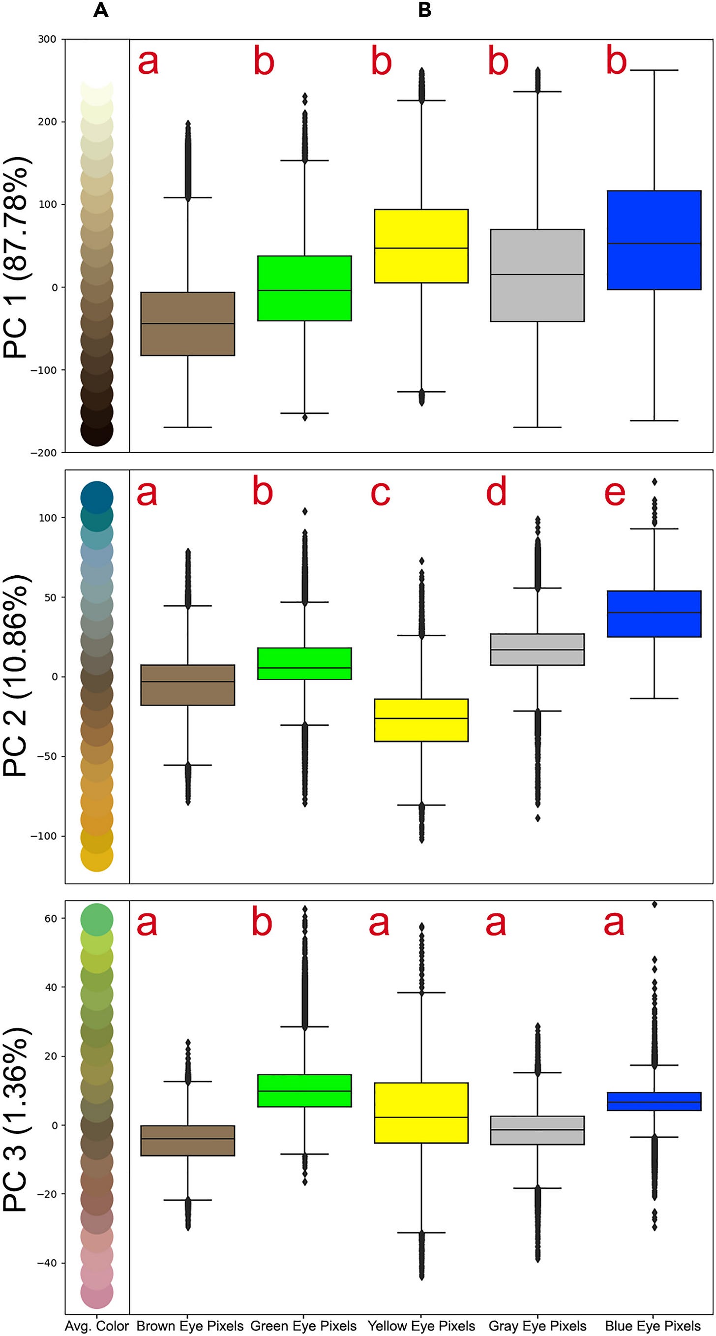
PCA with box plots and more
What could be more interesting than Evolutionary insights into Felidae iris color through ancestral state reconstruction (10/18/2024)? Data is available (see the bottom), and just reading the second graph could be used in a basic statistics course.
Caption: The five-wedge pie charts indicate the presence (color) or absence (white) of the various iris colors. Colors were considered present if there was >50% support as determined by maximum likelihood methods (probabilities plotted in Figure S5). Exact branch lengths are not plotted and lineage names are given on the right.
Please share and like
Sharing and liking posts attracts new readers and boosts algorithm performance. Everything you do is appreciated.
Comments
Please point out if you think something was expressed wrongly or misinterpreted. I'd rather know the truth and understand the world than be correct. I welcome comments and disagreement. We should all be forced to express our opinions and change our minds, but we should also know how to respectfully disagree and move on. Send me article ideas, feedback, or other thoughts at briefedbydata@substack.com.
Bio
I am a tenured mathematics professor at Ithaca College (PhD Math: Stochastic Processes, MS Applied Statistics, MS Math, BS Math, BS Exercise Science), and I consider myself an accidental academic (opinions are my own). I'm a gardener, drummer, rower, runner, inline skater, 46er, and R user. I’ve written the textbooks R for College Mathematics and Statistics and Applied Calculus with R. I welcome any collaborations.


