


Honest Mauna Loa CO2 analysis
A response to the Washington Post

I realize that journalists have to produce material on a deadline every week (I’ve learned that isn’t so easy over the past year) and that doom and gloom sells, but it is frustrating when they peddle nonsense. Let me provide an honest look at the Mauna Loa CO2 data in response to the Washington Post’s article Hawaii’s Mauna Loa observatory just captured ominous signals about the planet’s health: Carbon dioxide is accumulating in the atmosphere faster than ever (5/10/2024). Just like the title, the first paragraph is technically true but highly misleading, and there has been little to no change in future CO2 projections.
Atmospheric levels of planet-warming carbon dioxide aren’t just on their way to yet another record high this year — they’re rising faster than ever, according to the latest in a 66-year-long series of observations.
If you read my post, A Response to a NYT Climate Article (10/14/2024), you’ll find this post to be very similar. Here is Figure 1, the graph from the Post article.
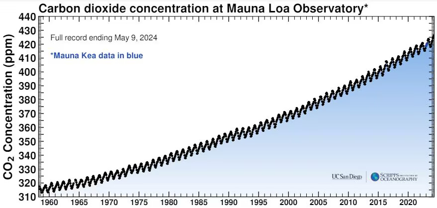
Figure 1 is the Mauna Loa data; I take no issue with this, and each May we do hit a new peak. The peak happens in May because, as trees leaf out, they lower CO2 levels. It is really neat to see the tree cycle in this data. It isn’t clear why we should expect that CO2 is rising “faster than ever,” because this is too fine of a detail. So, let’s take a look at the yearly average CO2 values at Mauna Loa (Figure 2).

In Figure 2, I’ve added a linear fit to the data, and it is clear that the data isn’t growing linearly. In other words, the data is increasing and concave up (taking calculus I is a good idea, and journalists should be required to do so). The other curve is a quadratic function, specifically 310.52384950 + 0.50788954 x + 0.01375526 x^2. It is actually quite astonishing to have real-world data with such a good fit to a quadratic function (see Calculus Materials for how to use this in a classroom).
The key point to make here is that, given that the trend in the data is quadratic, we will see record increases every year. There is nothing surprising about this, and I made the animation in Figure 3, which I used in A Response to a NYT Climate Article, to illustrate the point.

I used a moving 20-year secant line in Figure 3 to illustrate how the slope increases as it moves along the quadratic function. In fact, the slope increases linearly, as shown in the inset graph.
Now the fact that the Washington Post is using daily measurements adds a little noise to the calculation of comparing annual maximum measurements. Due to this, you get sensational writing like this:
For decades, CO2 concentrations at Mauna Loa in the month of May have broken previous records. But the recent acceleration in atmospheric CO2, surpassing a record-setting increase observed in 2016, is perhaps a more ominous signal of failing efforts to reduce global greenhouse gas emissions and the damage they cause to Earth’s climate.
There has been no recent acceleration. Mauna Loa CO2 measurements, viewed as yearly averages, have been growing quadratically and, in fact, steadily for decades. The real question that should be asked and answered, and I’ll do both, is: have future projects of CO2 levels changed?
I used the yearly average Mauna Loa CO2 measurement and did a quadratic fit from 1950 to 1970, and then to 1971, and then to 1972, etc. For each curve fit, I extrapolated to see what the function predicted for 2030 and 2050. If things are getting worse, our future projections should be going up. If we are reducing CO2 emissions, we would see a decrease. Figure 4 has the results.

In reading the graph in Figure 4, for example, consider 1985 on the x-axis. A quadratic function was used to fit the CO2 data from 1950 to 1985, and the dark purple dot is the prediction for CO2 levels in 2030 based on this function: about 463 ppm. The lighter purple dot is the prediction for 2050 from this same function: about 540 ppm.
I would say using data from 1950 to 1970 isn’t a great idea as the time period is too short. But it is illustrative since we see more variability early on, as we might expect, but really only in a few years. By 1976, we have a clear, smooth pattern. In both cases, future predictions were going up until the mid-1980s. By 1990, the future predictions started going down, and by 2005, they had stabilized for 2030. For 2050, they kept dropping until around 2015, but rose so that by 2023, the prediction was back to the 2005 value. Still, it is largely stable.
Now, in both cases, there has been a little rise for the last few years, but I don’t think it qualifies as an “ominous signal.” Taken at face value, this is all a positive, as future predictions aren’t getting meaningfully worse, although saying that isn’t as scary.
The caveat I’ll add is that maybe there are reasons for this that are bad. I noted in World energy consumption (3/5/204) that we keep increasing our fossil fuel consumption. I was actually surprised that Figure 4 wasn’t going noticeably up. Why? I don’t know, but there are examples, such as the oceans absorbing more CO2 (I don’t know if this is true or not), that might explain this.
What do we take away from all of this? The Washington Post article is nonsense. We can basically write it every May because, to date, CO2 is increasing quadratically. This isn’t news. Figure 4 is a more honest look at the future. The good news is that future predictions of CO2 levels aren’t getting worse, although maybe the last few years are the beginning of higher future predictions, and there could be underlying issues here. The bad news is that it isn't getting better, but this shouldn't surprise us. What concerns me is that those writing the Washington Post article don’t get this and are scaring people with misinformation. In the end, I suppose a Washington Post article titled “There is nothing new to report about Mauna Loa CO2 trends” isn’t exciting and wouldn’t get published.
Please share and like
Please help me find readers by forwarding this article to your friends (and even those who aren't your friends), sharing this post on social media, and clicking like. If you're on Twitter, you can find me at BriefedByData. If you have any article ideas, feedback, or other views, please email me at briefedbydata@substack.com.
Thank you
In a crowded media market, it's hard to get people to read your work. I have a long way to go and I want to say thank you to everyone who has helped me find and attract subscribers.
Disagreeing and using comments
I'd rather know the truth and understand the world than always be right. I'm not writing to upset or antagonize anyone on purpose, though I guess that could happen. I welcome dissent and disagreement in the comments. We all should be forced to articulate our viewpoints and change our minds when we need to, but we should also know that we can respectfully disagree and move on. So, if you think something said is wrong or misrepresented, then please share your viewpoint in the comments.