Low-wage workers and related issues
Challenges in shifting from fossil fuels and relationships with race and low wages by states.
If you enjoyed this content, please press the like button above and share it. This really helps spread the word about Briefed by Data. Of course, if you are not already a subscriber, please consider becoming one.
The Bureau of Labor Statistics (BLS) has a fantastic post with 15 charts entitled A Look at Jobs Paying Less Than $15.00 Per Hour (September 2024). Two of these charts had data that allowed me to make some connections to other issues. Let’s go to the data.
People make less money than we think
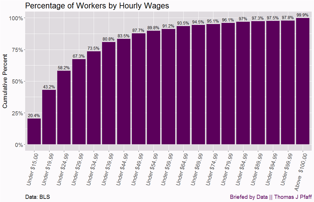
Their first chart, Figure 1, looks at the distribution of wages by $5 an hour groupings. It is an interactive chart that, if you hover over a bar, you will get the actual percentage. To me this is more a gimmick than anything, as one could just put that number over the bar, but I digress. I think this data is more valuable as a cumulative percentage graph. Figure 2 does just this.

My point in making a cumulative percentage graph in Figure 2 is that I think the information is more valuable. For example, 58.2% of workers make under 24.99 an hour. At the top of this bracket, workers are making $52k a year. At the same time, 43.3% of workers make less than $19.99 an hour or $41,500 a year. Why does this matter?

For example, RMI has a recent article, Making Decarbonization Financing Work for Homeowners and Contractors (2024), with the chart in Figure 3.

The idea here is to provide home owners with lower interest rates to make moving to a heat pump for heating and cooling more affordable. I appreciate that they are acknowledging that the heat pump is more expensive, although you also get cooling, which can be a challenge for a lot of people. The list the up-front cost as $12,800 for the heat pump would represent at least 25% of the annual salary for 58% of workers, twice that of the gas furnace. Even at 5% interest over 10 years, they would pay $3,491.66 in interest. One caveat here is that these are individual incomes and not household incomes.
My point is this isn’t so simple for a large portion of the population to “go green.” Heat pumps, electric cars, etc. are financially out of reach for much of the population, and if society wants to move to using less fossil fuels, incentives like RMI is suggesting are necessary. The people writing about reducing CO2 emissions are not in the bottom 58% and are more like in the higher-income levels.
I encourage you to take a look at the chart and compare your income to see where you land (here is a quick annual to hourly calculator for convenience). Most of us don’t realize how high we are on the income scale. I’ll add the caveat here that these wages are not adjusted for local cost of living; they should be, but I haven’t seen that done yet.
Regional differences and race
I noted in my post U.S. Demographics, the "Cliff", and wages (9/3/2024) that
The point here is that anyone talking about the White-Black wage gap (or any wage gap between groups) without adjusting for the median age of the population as well as other differences such as geography and career choices isn’t being honest.
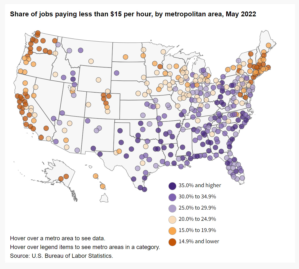
The BLS has a map of percentages of jobs paying less than $15 by city. See Figure 4. We can see more purple dots, representing a higher proportion of sub-15 hour workers, in the south. They also have a map like this by state and I was able to find percentage of Black population by state from the Census Reporter.

Figure 5 shows the relationship between the percentage of workers making under $15 an hour and the Black population in a state. Before I go on, I need to make it clear that the relationship in Figure 5 should not be construed as causation in any way, nor should we immediately conclude that this is due to racism, as more than likely there are a multitude of reasons for this relationship.

If we remove DC (their minimum wage is $17.50 an hour) from the data set, we do get a linear relationship with a p-value = 0.002471 and adjusted R-squared = 0.1582. Interestingly, this is also an example of how one outlier can impact a linear relationship. If we leave DC in the dataset, we get p-value = 0.1725 and adjusted R-squared = 0.01801.
The point here is that the Black population lives in places where more of the population makes under $15 an hour. This likely accounts for some of the differences in overall wages between the Black and White populations. Interestingly, we don’t have a relationship with the Hispanic population, as seen in Figure 6.

Please share and like
Sharing and liking posts attracts new readers and boosts algorithm performance. Everything you do is appreciated.
Comments
Please point out if you think something was expressed wrongly or misinterpreted. I'd rather know the truth and understand the world than be correct. I welcome comments and disagreement. We should all be forced to express our opinions and change our minds, but we should also know how to respectfully disagree and move on. Send me article ideas, feedback, or other thoughts at briefedbydata@substack.com.
Bio
I am a tenured mathematics professor at Ithaca College (PhD Math: Stochastic Processes, MS Applied Statistics, MS Math, BS Math, BS Exercise Science), and I consider myself an accidental academic (opinions are my own). I'm a gardener, drummer, rower, runner, inline skater, 46er, and R user. I’ve written the textbooks R for College Mathematics and Statistics and Applied Calculus with R. I welcome any collaborations.


