


QTRS July 11, 2024
Interesting content for the curious

Commercial
I appreciate you taking the time to read this, but if you aren’t a subscriber, it would be helpful to me if you became one, as you can do it for free and get these directly in your inbox. Algorithms being what they are, the number of subscribers matters. For the same reason, please consider sharing this post with someone you think might find it interesting. Thank you.
Another misleading but true title
The title of the Carbon Brief article Analysis: Wind and solar added more to global energy than any other source in 2023 (6/20/2024) is true, but if you are a regular reader, you know it is misleading. See, for example, my post, The Green Energy Hype, from a couple of weeks ago.
But, buried inside the article, which actually does an honest job of presenting the data, we have this (bold mine):
Energy Institute chief executive Nick Wayth told a pre-release press briefing that the data could be interpreted to suggest that the global energy transition “has not even started”:
“At the global level, today’s new data provides little encouragement in terms of global climate change mitigation. Clean energy is still not even meeting the entirety of demand growth and therefore at a global level not displacing fossil fuels. Arguably, the transition has not even started.”
However, this interpretation hides a “lopsided” picture for different parts of the world, Wayth said. “Fossil demand is likely to be peaking” in the major economies of Europe and the US, he explained, even as countries in the Global South are “still carbonising”.
Now, you might be thinking that the Energy Institute is some pro fossil fuel organization, but here is what they say about themselves:
The Energy Institute (EI) is the chartered professional membership body for people who work across the world of energy. Our purpose is creating a better energy future for our members and society by accelerating a just global energy transition to net zero.
Kudos to chief executive Nick Wayth for being direct and honest. Adaptation, just saying.
Graph of the week
This is from Co-evolutionary dynamics of mammalian brain and body size (7/8/2024). BBM is Brain Body Mass.
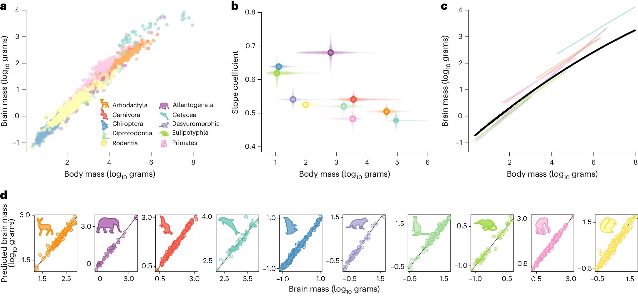
a, Brain and body size data used in this study coloured by mammalian taxonomic group. b, Slope coefficient (and percentiles of posterior distributions plotted as transparent lines) for each taxonomic group from a, plotted against body mass (percentiles of body mass range plotted as transparent lines) for each group. c, The median model prediction for our curvilinear BBM relationship across mammals from the variable rates regression model (black) with the variable-slope model predictions for comparison. d, Actual brain mass against predicted brain mass from the curvilinear model, highlighting the accuracy of the fit to the data. In all panels, points and lines are coloured according to orders as shown by representative silhouettes (see legend, not to scale).
I think the key graph here and the insights of this paper are that on an individual species level, the log-log relationship seems linear, but taken all together, the relationship has some curvature; the black line in graph c. There is a second graph to emphasize from this article:
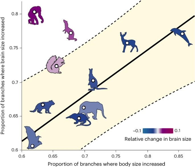
The proportion of branches where brain mass increased compared with the proportion of branches where body mass increased is plotted per taxonomic group. The fitted line and 95% prediction intervals (shaded) highlight primates and carnivores as outliers. A representative silhouette for each order (see Fig. 1) is shown and coloured according to the median amount of total relative change in brain size for that order (estimated difference in the standardized magnitude of change in brain mass compared to body mass, Zbrain−Zbody).
Branches here refer to evolutionary branches throughout time. In short, primates have had more brain size increases (80%) than body size increases (~63%) over time.
Natural selection has decoupled brain and body mass evolution in primates to a unique extent, producing sustained and directional increase in relative brain mass for over 55 million years (Myr). This trend set the stage for rapid increase in hominins, leading ultimately to modern humans’ unprecedentedly large brains34,38. Hence, the emergence of human-like cognitive capacities was facilitated by a shift in the fundamental pattern of brain evolution at the origin of the primates.
Basically, it seems that humans are an evolutionary outlier. The article includes the data.
The headwinds of wind energy
As the EIA points out, you can’t count on planned projects in the article Cancellations reduce expected U.S. capacity of offshore wind facilities (7/9/2024).

What’s up with NJ?
In late 2023, developer Orsted canceled the 2,400-MW Ocean Wind 1 and 2 projects in New Jersey, citing rising interest rates, high inflation, and supply chain delays.
What isn’t shown in the graph:
Planned and scaled down or on hold
Other projects in Maryland and Ohio, which developers still report as active, have faced some setbacks.In January, Orsted withdrew from commitments to the Maryland Public Service Commission to build the Skipjack 1 and 2 projects, totaling 966 MW, but is still continuing with advanced development and permitting.
Late last year, the developer of the 20-MW Icebreaker Wind project on the Ohio coast of Lake Erie halted the project amid rising costs and loss of funding.
Don’t plan on using planned wind energy until maybe the turbines are being installed.
Baby chicks have color preferences
This is the graphical abstract (first time I’ve seen the phrase graphical abstract) from the paper Spontaneous biases enhance generalization in the neonate brain (7/6/2024)
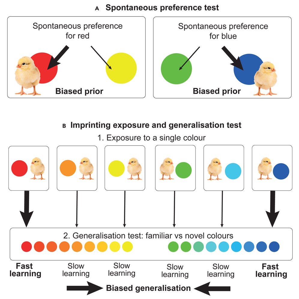
The short story here is that chicks can recognize an object faster if it is red or blue and slower if it is yellow or green. Who knew.
From the gardens
A variety of lilies.


CO2 emissions of traveling
The paper Understanding the large role of long-distance travel in carbon emissions from passenger travel (7/2/2024) provides the graph below, which gives information on the number of trips, miles travelled, and CO2e (CO2 equivalent in green house gas emissions) for England for domestic (a), international (b), and both trips (c).
The important part of the graph is the relationship between the yellow bars (% of miles) and the black dot (CO2e). If they are about equal, then that distance band has a proportional amount of miles and CO2e. In graph a the 50+ miles start to have the black do fall within the yellow bar. This is a distance where people are more likely to take a bus or rail, but the differences aren’t much. Now take a look at graph b.
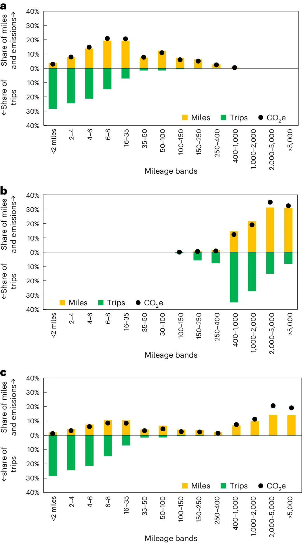
In graph b the 2000–5000 distance has the black dot well above the yellow bar. Air travel. Put it all together in c and we see that the long-distance trips represent very few trips, lots of miles, and even more CO2e. (Emphasis mine)
Combining domestic and international travel (Fig. 1), an average England resident makes 21.5 long distance (LD) trips over 50 miles (one-way) a year covering 7,278 miles and emitting 1,929 kg of CO2e in the process. This means that LDT accounts for only 2.7% of annual trips per capita yet is responsible for a staggering 61.3% of all passenger miles travelled and 69.3% of GHG emissions from personal travel.
If you want to cut CO2 emissions from personal travel, you have to cut air travel, which is primarily for wealthier people. You might say fine; they don’t need to travel. Fair enough, but then what does that do to the economies of the places they visit? Cutting CO2 isn’t so simple.
Where are the tallest people?
The graphs are interactive at the World Population Review, where you can choose different age groups and scroll over countries. I don’t understand why there isn’t U.S. data, but I found the results interesting. Apparently they eat well in those Scandinavian countries, or maybe it helped to be bigger to make it during the time of the Vikings.


The spinning CD
Please share and like
Please help me find readers by forwarding this article to your friends (and even those who aren't your friends), sharing this post on social media, and clicking like. If you have any article ideas, feedback, or other views, please email me at briefedbydata@substack.com.
Thank you
In a crowded media market, it's hard to get people to read your work. I have a long way to go and I want to say thank you to everyone who has helped me find and attract subscribers.
Disagreeing and using comments
I'd rather know the truth and understand the world than always be right. I'm not writing to upset or antagonize anyone on purpose, though I guess that could happen. I welcome dissent and disagreement in the comments. We all should be forced to articulate our viewpoints and change our minds when we need to, but we should also know that we can respectfully disagree and move on. So, if you think something said is wrong or misrepresented, then please share your viewpoint in the comments.