


QTRS June 19, 2025
Graphs, commentary, and interesting content for the curious
As I see it…
The Doomberg post Fog Lights (6/16/2025) starts off with a paragraph where they explain the difference between an analyst and an advocate. I've attempted to distill this crucial distinction into a single sentence.
As I see it, the difference between an analyst and an advocate is that an analyst uses data that contradicts their worldview to adjust it, while an advocate disregards or explains away such facts.
For example, the right is doing its best to explain away the relationship between CO₂ emissions and climate change. The left is ignoring numerous issues with solar and wind power.
I don’t see advocacy as a way toward progress. The world isn’t helped by pretending CO₂ emissions don’t increase temperature, effectively ignoring a problem. The world also isn’t helped by ignoring shortfalls in wind and solar, effectively shutting down paths for other solutions. While some forms of advocacy may pose greater risks than others, it is important to recognize that all advocacy has its blind spots. I’d like to think that I’m an analyst and not an advocate.
Consider this a new data rule: Be an analyst and not an advocate. Keep this in mind as you read the news and always be the biggest critic of your viewpoints.
Let’s go to some data.
Retirement and social security
This week, I came across three related graphs. The first two come from the USA Facts article, What Does the Social Security Administration Do? (6/16/2025 in my inbox). The first graph shows how much funding the agency gets as a percentage with a scary yellow highlight. Here is what SSA does.
Its functions include managing the distribution of monthly payments to beneficiaries, enrolling Medicare recipients, and overseeing the issuance of Social Security numbers and cards.
Yes, social security is an expensive agency.

They also point out how spending has increased over time.

One problem with this graph is related to a data rule: Normalize properly; ask, “Per what?” This second graph really should be normalized by the number of people receiving benefits, and in particular, the number of those over 65. A substantial portion of the growth is retiring boomers. The underlying tone of this article is that the agency spends too much money; advocacy is going on here.
Related is this chart from data in the Gallup article What Percentage of Americans Have a Retirement Savings Account? (6/2/2025)

It would have been helpful if this data were in a two-way table so we would know, for example, how much money the No College group is making to get a better sense of the relationship between income, education, and retirement money. Either way, overall 59% of Americans have a retirement plan. Let’s assume, probably not a great assumption, that all 59% of these folks don’t need any extra money from Social Security to retire. Many of the 41% without a retirement fund don't have extra money to save.
If you are in the camp of wanting to cut Social Security, my read of the USA Facts article is that they are, then you need to answer some key questions. What should you do with a 70-year-old who does not have a retirement account? Sorry, work until you die? Do you prevent this by forcing all people to have a retirement account? Remember, one purpose of Social Security was to address these issues.
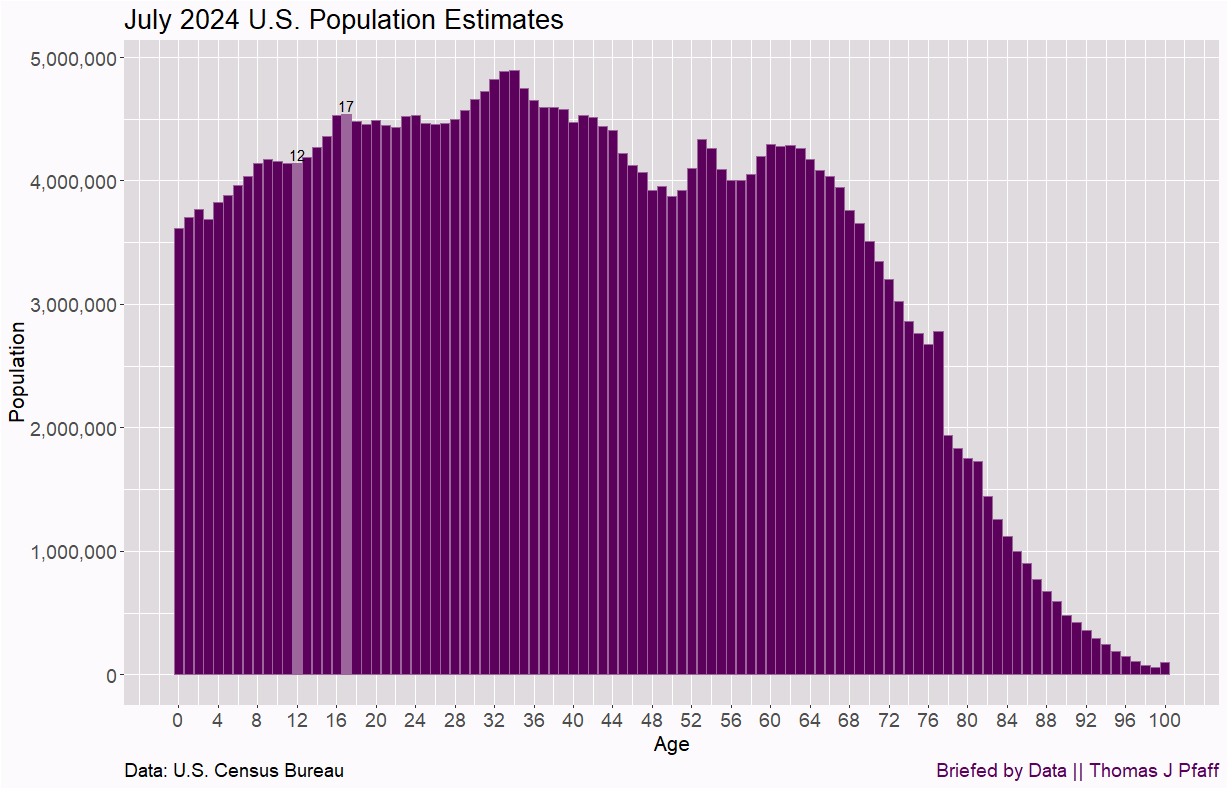
If you are in the camp of don’t touch Social Security. You also have a problem. Here is a graph of U.S. population declines by age (5/6/2025). Currently, there is an increase in the number of baby boomers reaching retirement age, followed by a slight decline in the overall population. But, with declining birth rates, we are going to have fewer working-age people and more retirement-age people. Social security is going to be challenging to support. This problem really starts to kick in in about 20 years.
That was a long quick take, but a serious one.
Lonely Americans
A chart and a stat from World Population Review (6/17/2025) This is sad and suggests something is wrong in the U.S.

Just cool
From the Library of Congress’s Out of This World – Vopell’s Exquisite Armillary Sphere post (6/13/2025). An armillary sphere is “a model of the heavens featuring a central globe with a framework of rings around it that represent celestial bodies and features.”
One of my favorite items in our collection is the division’s oldest globe, and one of its rarest, the armillary sphere of Caspar Vopell. It was produced by Vopell, a Cologne-based mathematician and geographer in 1543. Born in 1511, Vopell set up a workshop to produce celestial and terrestrial globes, armillary spheres, sundials, quadrants and astrolabes in the early 1530s, becoming a prominent map and globe maker. Nine of his globes are known to still exist, including the one in our collection seen below.

Data Center update
The spinning CD
In memory of Brian Wilson, here is one of my favorite Beach Boys songs that you might not have heard.
Please share and like
Sharing and liking posts attracts new readers and boosts algorithm performance. I appreciate everything you do to support Briefed by Data.
Comments
Please tell me if you believe I expressed something incorrectly or misinterpreted the data. I'd rather know the truth and understand the world than be correct. I welcome comments and disagreement. I encourage you to share article ideas, feedback, or any other thoughts at briefedbydata@substack.com.
Bio
I am a tenured mathematics professor at Ithaca College (PhD in Math: Stochastic Processes, MS in Applied Statistics, MS in Math, BS in Math, BS in Exercise Science), and I consider myself an accidental academic (opinions are my own). I'm a gardener, drummer, rower, runner, inline skater, 46er, and R user. I’ve written the textbooks “R for College Mathematics and Statistics” and “Applied Calculus with R.” I welcome any collaborations.