

State Emigration and Migration
Are there blue and red state differences?
After last week’s post, Population changes by state, and a reader comment, I got curious about state emigration and migration. Today you get three tile grid maps similar to last week, courtesy of data from the U.S. Census Bureau and Cook’s Partisan Voting Index. Let’s go straight to the data.
First up is emigration in Figure 1. Two cautions in reading the data. The years for each bar in the graph are not consecutive. They are 2010, 2015, 2021, 2022, 2023, and 2024. I wanted to provide some historical perspective while focusing on current years.
Second, these are counts, and, of course, more populated states are likely to have more people leaving. I considered a graph relative to the population but decided to go with counts for all graphs for better comparison for each state.
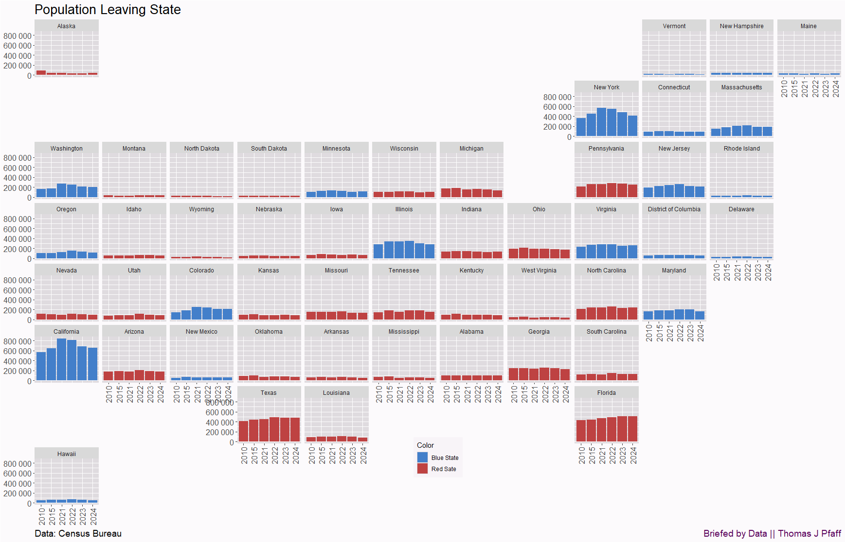
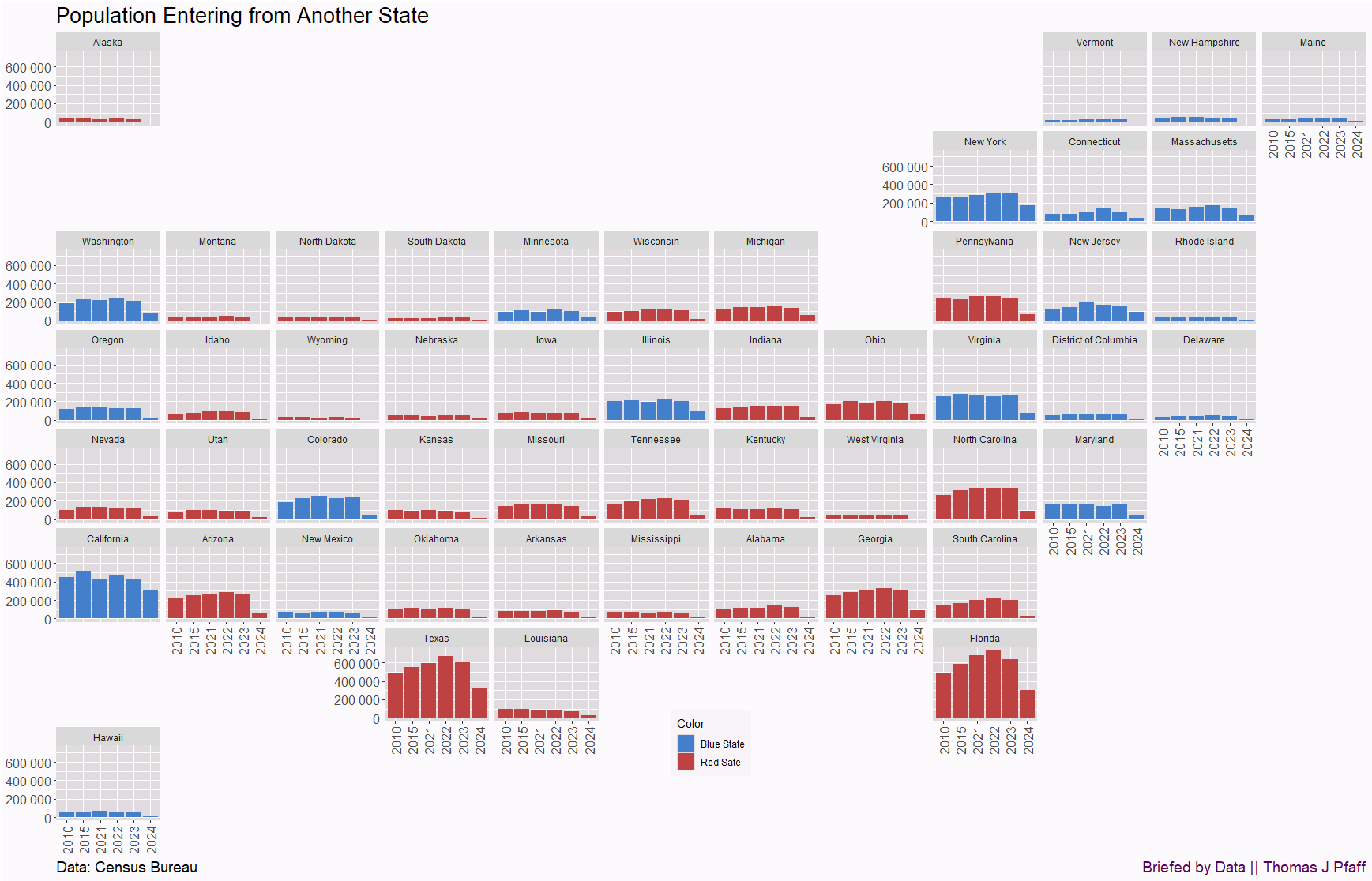
Figure 1 alone isn’t that compelling. We need more. Figure 2 is domestic migration, in other words, people moving in from another state. Comparing the two graphs, we see that, for example, in 2024 CA had about half as many people leave as entered. In all years, more people left CA than entered. On the other hand, except for 2024, more people were entering Texas than leaving (be cautious, as the y-axis scales aren’t the same). NY also has more people leaving than entering.
One more map. Figure 3 is the immigrant population, including PR and U.S. islands. The jump in 2024 is clearly noticeable. Texas and Florida had about 600,000 immigrants. California did not spike as much, and they are close to breaking even between those coming and those going. Yes, I should have done a final graph for net change. Maybe next week.
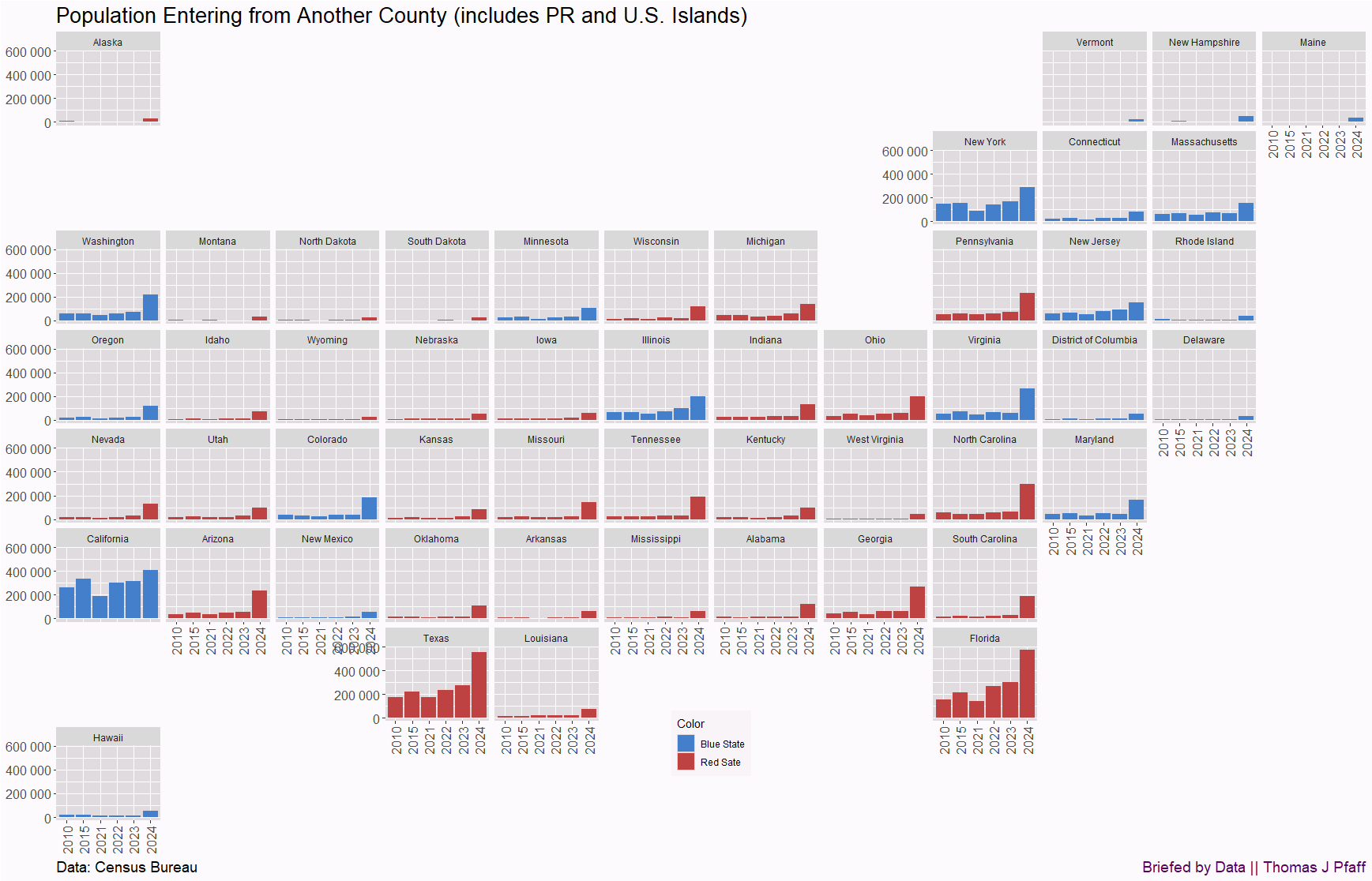
I can see how someone living in Texas would be frustrated by such a large influx of immigrants, on top of the state attracting people from other states. Similar to Florida. On the other hand, California and New York really needed immigration to maintain some population growth. This is all worth noting. Let me know what you thought of by looking at this data in the comments.
Please share and like
Sharing and liking posts attracts new readers and boosts algorithm performance. I appreciate everything you do to support Briefed by Data.
Comments
Please tell me if you believe I expressed something incorrectly or misinterpreted the data. I'd rather know the truth and understand the world than be correct. I welcome comments and disagreement. I encourage you to share article ideas, feedback, or any other thoughts at briefedbydata@substack.com.
Bio
I am a tenured mathematics professor at Ithaca College (PhD in Math: Stochastic Processes, MS in Applied Statistics, MS in Math, BS in Math, BS in Exercise Science), and I consider myself an accidental academic (opinions are my own). I'm a gardener, drummer, rower, runner, inline skater, 46er, and R user. I’ve written the textbooks “R for College Mathematics and Statistics” and “Applied Calculus with R.” I welcome any collaborations, and I’m open to job offers (a full vita is available on my faculty page).
The tile grid maps are impressive. May I ask which tool you used and how you created the maps? Thanks!