The Mean and Median in a Skewed Distribution
A Probability and Statistics Post: An animation skewing a distribution
Measures of the central tendency of data are meant to try and describe the middle of the data with one number. The mean and median are two such measures. If the data is symmetric, then the mean and median are the same. What happens when the data is skewed? The mean is pulled in the direction of the skew. Figure 1 (R code at the bottom) shows how the mean is pulled as the data set becomes increasingly skewed right. Note that in Figure 1, the x-axis is cut off at 300.

Figure 2 is the same graph, but the x-axis is allowed to stretch as needed. I think Figure 2 isn’t as nice to view as Figure 1. As a rule, if someone doesn’t report both the mean and the median, you should consider the reporting suspect. Here are two examples.

Example 1: Netflix data
Figure 3 is the Netflix data on hours viewed by show for the first half of 2023. I’ve used this data before (see Classroom Connections). Note the log scale on the x-axis. If you worked for Netflix and wanted to express the popularity of Netflix, you would report the mean. It would be accurate to say that the average show is viewed for 5,130,954 hours. It would also be highly misleading, as half of the shows are viewed for 700,000 or fewer hours, and 80% of the shows are below the mean.

Example 2: Income
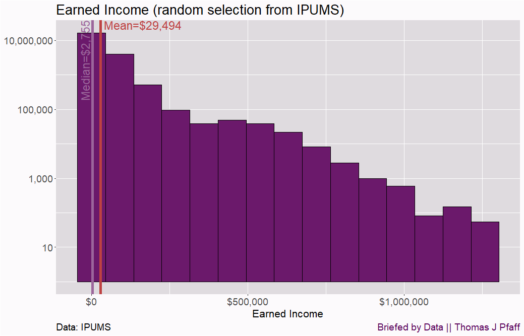
I used the IPUMS Community Survey data and randomly selected 1,000,000 rows of the data (I had some memory issues when trying to plot all of the data) to illustrate the skewness in income data. I then plotted earned income, as can be seen in Figure 4. Note that the IPUMS data is weighted; each row represents multiple people.

There is a big difference between the median earned income and the mean earned income. Looking at Figure 4, we don’t have a clear idea of how many people are in the higher-income brackets. To deal with this, we can log scale the y-axis (Figure 5), but be cautious because this can be deceiving.
As I’ve said before, the focus on normal or bell-shaped distributions is something that needs to change in introductory statistics courses. Important distributions are skewed, often by a lot. Knowing the mean and the median at all times can help in making public policy decisions.
Please share and like
Please help me find readers by forwarding this article to your friends (and even those who aren't your friends), sharing this post on social media, and clicking like. If you're on Twitter, you can find me at BriefedByData. If you have any article ideas, feedback, or other views, please email me at briefedbydata@substack.com.
Thank you
In a crowded media market, it's hard to get people to read your work. I have a long way to go, and I want to say thank you to everyone who has helped me find and attract subscribers.
Disagreeing and using comments
I'd rather know the truth and understand the world than always be right. I'm not writing to upset or antagonize anyone on purpose, though I guess that could happen. I welcome dissent and disagreement in the comments. We all should be forced to articulate our viewpoints and change our minds when we need to, but we should also know that we can respectfully disagree and move on. So, if you think something said is wrong or misrepresented, then please share your viewpoint in the comments.
R code for Figures 1 and 2
## Packages

library(dplyr)
library(ggplot2)
library(animation)

## Colors

MyBlue <- "#437fca"
MyRed <- "#be4242"
MyPurple <- "#5B005B"
MyLightP <- "#dfdbdf"
MyLightP2 <-  "#f8f4f8"
MyLightP3 <- "#fcfafc"
MyPurple2 <- "#6b196b"
MyPurple5 <-  "#9c669c"

## Function to skew data

f <- function(i,x){ ifelse( x > 100,x + i*(x-100)^2/100, x)}

## Starting data

data <- data.frame("Data" = rnorm(5000, 100, 5))

## Set graph frame

dev.new(width = 1456,height = 936,unit = "px")

## Generate animation

saveGIF(
{
ani.options(interval = 0.20, nmax = 50)

for (i in 0:100){

data <- data %>% mutate(Data2 = f(i,data$Data))

g1 <- ggplot(data, aes(x = Data2)) +
  geom_histogram(binwidth = 5, fill = MyPurple2, color = "black") +
  geom_vline(aes(xintercept = median(data$Data2)), size = 3, color = MyPurple5) +
  annotate("text", x = 99, y = Inf,
           label = paste("Median=",round(median(data$Data2),0),sep = ""),
           hjust = 1, vjust = 0, size = 6, angle = 90, color = MyPurple5) +
  geom_vline(aes(xintercept = mean(data$Data2)), size = 2, color = MyRed)+
  annotate("text", x = mean(data$Data2)+ 1,y = Inf,
           label = paste("Mean=",round(mean(data$Data2),0), sep = ""),
           hjust = 0, vjust = 1, size = 6, color = MyRed) +
  theme(axis.text = element_text(size = 14),
    axis.title = element_text(size = 16),
    plot.title = element_text(size = 20),
    plot.background = element_rect(fill = MyLightP3),
    panel.background = element_rect(fill = MyLightP),
    legend.background = element_rect(fill = MyLightP2),
    plot.caption = element_text(hjust = c(1), size = c(14),
                                color = c(MyPurple))) +
    labs(title = "The Mean/Median Relationship as Data is Skewed",
		  y = "Count",
		  x = NULL,
		  caption = c("Briefed by Data || Thomas J Pfaff"))+
    scale_x_continuous(limits=c(80,300)) # remove to not fix x-axis

plot(g1)

ani.pause()

}

for (k in 1:5){
  print(g1)
  ani.pause() }

}, movie.name = "MeanMedian.gif", ani.width =1456, ani.height = 936)


