

Changes in Household Income
Who can pay for college?
I’m still trying to understand the disconnect between the narrative that college has become too expensive, which is tied to the student debt crisis narrative, and the data that shows that the net cost of college has been stable for about 15 years. I made some observations in the two posts Private College is More Expensive; Public Less So (1/6/2026) and Is College Affordable? (12/30/2025). In the former, I gave an example where it is possible for net tuition to be stable, but all income groups pay more. Here it is:
I have a college with 10 students; 9 of them pay $20,000, and 1 pays $10,000. The total revenue is $190,000. Next year we bring in two students that pay below $20,000. To maintain the $190,000, those two students now pay $11,000; the other 8 students now pay $21,000 to maintain the same revenue (8 * $21,000 + 2 * $11,000 = $190,000). Every student pays more, but the college is bringing in the same revenue.
For this hypothesis to be true in reality, college would have to have a higher percentage of students in lower income brackets or those that pay below the net price. This is possible as colleges look to attract students who didn’t attend college in the past, but I don’t have the data to prove this one way or another.
I’m also open to the possibility that perception and reality are at odds, in which case, why are people more vocal about the cost of college and college debt now? It might be as simple as reaching a critical mass of people upset about the cost of college. Peter Turchin's elite overproduction hypothesis may also have a connection to the debt issue (Wikipedia provides a good summary). In the case of college debt, maybe we have reached a point where there are enough graduates that aren’t getting the jobs they expect to obtain as college grads.
Anyway, my quest to understand the seeming disconnect between perceptions and the reality of college tuition has led me to understand changes in household income, while recognizing that the changes in household income for those attending college may not be the same as the general population. Let’s go to the data.
Figure 1 is household income in 2024 dollars from the Census Bureau (Table A-4a). The blue line is the median, and the median household income has increased from $54,880 in 1967 to $83,730 in 2024, relative to 2024 dollars. The striking feature of this graph is the significant disparity in changes in median income, with those in the 95th percentile experiencing an increase of more than $189,700 (over double), while those in the bottom 10% saw a 59% increase, amounting to only $7,380.
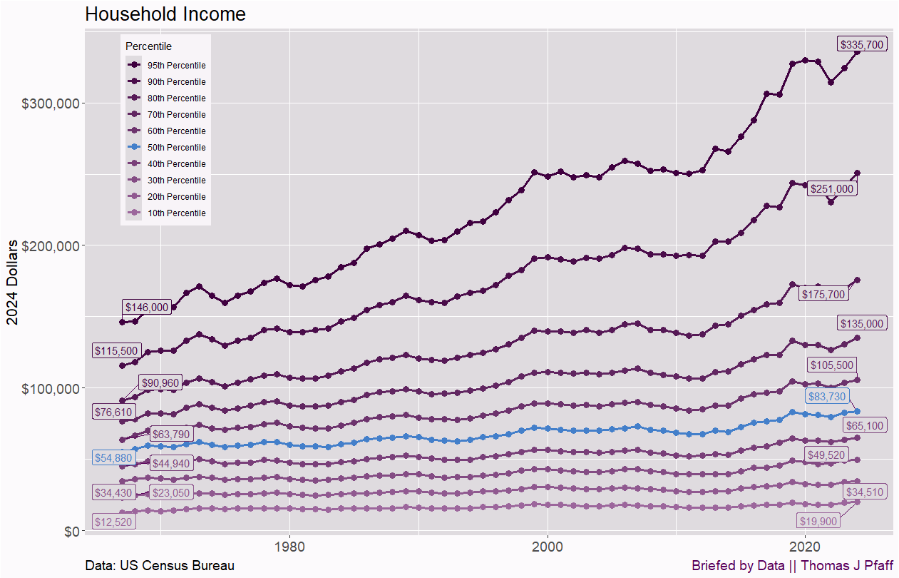
If you look at the net cost by income bracket in my post, Private College is More Expensive; Public Less So, we gain a sense of what percentage of the population pays. For private colleges, those families earning up to $48,000 (in 2023) pay about $17,500. That is just about the bottom 30% of households. For public colleges, the cost of this group is about $10,000. It seems to me that the bottom 30% are going to have a challenging time paying for college.
On the other end, the top group in the net cost data is $110,000+, which entails almost the top 40% of households. For private colleges the next cost is $27,000, and for public colleges it is a little over $19,000. If you are in the top 10%, the price tag seems affordable, depending on your local cost of living, but for those in the 60th or 70th percentile, it seems less affordable, again depending on where one lives.
The middle-income groups aren’t better off. It would also be helpful to have more detail in the college costs of those making $110,000+. The data here reflects our current situation and does not indicate whether it has worsened, yet it raises the question of why anyone from households outside the top 20% would choose to attend a private college. At the same time, paying for public school isn’t easy.
One more graph of this data because it is illustrative. Is knowing the percentage increase of income more or less important than looking at amounts? Well, Figure 2 illustrates the percentage change of household income relative to 1967.
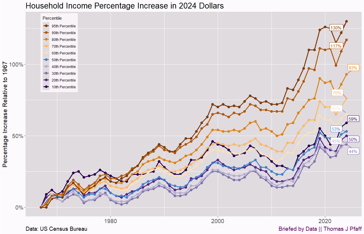
I had to change the color scheme to make it more readable. One interesting note is that the bottom 10% had a household income increase of 59%, above the median household. On one hand, that seems wonderful, but going from $12,520 to $19,900, or $7,380, isn’t very exciting.
One might also look at Figure 2 and note that, well, the top went up 130%, but the bottom still increased by at least 44%. It isn’t that big of a difference until you realize that their increase, $189,700, is more than over 80% of households actually earn in 2024. The main takeaway is that percentages can be misleading. Relatedly, we need data that reflects what I might call changes in disposable income. If your income goes up but is still short of some measure of a living wage, you are less worse off more than better off. If wages increase significantly beyond what is needed, then that extra money is somewhat of a bonus. I’d like to see a metric that captures this, all relative to the local cost of living.
I want to make one final point. I’ve said this before, but I do think getting a four-year degree is doable, but maybe differently than people would like. Two years at a local community college or nearby state school can cut costs. Then transfer to a four-year school. Staying local for a couple of years also makes it easier to keep a part-time job. This all assumes a four-year degree is the right move.
Please share and like
Sharing and liking posts attracts new readers and boosts algorithm performance. I appreciate everything you do to support Briefed by Data.
Comments
Please tell me if you believe I expressed something incorrectly or misinterpreted the data. I'd rather know the truth and understand the world than be correct. I welcome comments and disagreement. I encourage you to share article ideas, feedback, or any other thoughts at briefedbydata@substack.com.
Bio
I am a tenured mathematics professor at Ithaca College (PhD in Math: Stochastic Processes, MS in Applied Statistics, MS in Math, BS in Math, BS in Exercise Science), and I consider myself an accidental academic (opinions are my own). I'm a gardener, drummer, rower, runner, inline skater, 46er, and R user. I’ve written the textbooks “R for College Mathematics and Statistics” and “Applied Calculus with R.” I welcome any collaborations, and I’m open to job offers (a full vita is available on my faculty page).
"The media frequently uses data in ways that are superficial, incomplete, or potentially misleading. Briefed by Data aims to provide complete and accurate data-informed articles about current events, as well as to promote data literacy."
100% correct. When it comes to men's issues. they do that constantly.
do we know if there is an increase in median income households sending their kids to private colleges that cost more?